Yesterday, 5th February 2017, marked seven years since I launched visualisingdata.com. It genuinely feels like only yesterday when I first clicked on ‘Add New’ and began the long journey towards composing over 750 posts. One of the things I sometimes neglect to remember is that not all visitors are returning visitors: 65% of pages viewed come from new visitors. Indeed, not all return visitors are religiously following my every post nor may they have been aware of the site for as long as it been going.
Therefore, to mark this anniversary, I decided to compile a brief guide to new or infrequent visitors to help them understand what visualisingdata.com is about, to profile some of the main content you can expect to find on the site (both now and in the future), and to share some reflections on my own journey through this period as a site editor.
FIRSTLY, A THANK YOU
To begin with, an important acknowledgement. Launching and sustaining this site has fundamentally changed the course of my professional life. I will never be able to fully express my appreciation for how much the new, returning or long-standing visitors have contributed to the amazing opportunities I have experienced and I therefore want to sincerely thank you all so so much for your continued interest and support. I also must acknowledge the fundamental role played by the hundreds of visualisation creators, designers and practitioners who have created the brilliant work about which I have largely based my articles and collections.
ORIGIN STORY
Visualisingdata.com was launched in February 2010 primarily as a blogging platform for me to continue the momentum of learning about the subject that I had built up during the previous two years of studying data visualisation (through a Masters by research programme whilst working at the University of Leeds). Back then, social media was still in its infancy and blogs/RSS feeds were all the rage. I believed that through writing publicly blogging would help to sharpen my convictions and give me a reason to continue to immerse myself in this subject. At the time I still had a full-time job so this was very much a side interest/part-time pursuit but something I felt would be worthwhile attempting to do for as long as I had the motivation.
My initial focus was to share details of the new projects I came across or to offer thoughts about my reaction to different design choices I was seeing employed. Often very simple, rather unsophisticated analysis about topics like the problems of a 3D pie chart. Back in in 2010 data visualisation was clearly starting to become popular but was perhaps still somewhat in the fringes. I was determined to make the site as useful as possible for people like me, looking to find a route into learning about this subject, and so I put lots of effort right from the outset into compiling collections of relevant references and resources, for both beginners and more established practitioners, which continue to be immensely popular today.
Over time, as the field unquestionably began to command greater attention and demonstrate increasing maturity it seemed to enter far more into the mainstream consciousness (it has still a long way to go, by the way). During the period I believe we’ll look back on as a ‘golden age’, perhaps between 2011 and 2015, the strong presence of this field on Twitter in particular offered a new medium to track new techniques, discover new projects, and trigger more-informed discourse about the key issues emerging. This gave light to a constant stream of new developers, designers and agencies to be inspired by. On the flip side, this period also saw the rise of the “infographic”. I use quotation marks because much of it was just trash and not representative of the true craft of the infographic. The increased quantity but diluted quality heightened the need to separate the wheat from the chaff. It also frequently caused me a diplomatic headache as I sought new polite ways of declining suggestions from people requesting to have their/their agency’s infographic work published on the site…
Over time I have noticed my editorial style and content focus evolve significantly. This is both inevitable and desirable as the clarity of my intent and perspective becomes more established. I do rather cringe looking back at some of the posts I wrote and the low-level topics I covered but, taking a wider view, it’s probably a good thing to see improvement. In recent times I have gradually moved away from the pressures of trying to keep chasing and showcasing new projects. The incredibly prolific publishing and sharing of new output we see today is too hard for one person to keep ahead of.
I have also had to find a coping strategy to help me maintain a manageable rate of posting new content. During different periods over the past seven years I have found the frequency of my posting has dropped far more than I would have liked, though this has entirely been due to being preoccupied by the working opportunities generated by doing the posts in the first place and never, thankfully, caused by a diminishing interest for the subject nor a lack of ideas for how to cover it. The self-imposed burden of feeling I should post every other day is one that still exists today but is never realistically observed for much longer than a week or two. Additionally, I often feel a pressure that each post must represent some profound long-form think-piece. Developing repeatable ongoing series, like some of those mentioned below, is one of the neat solutions I have found to dealing with this pressure.
In 2014 I finally got round (with plenty of technical and design help) to redesigning and rebranding the site to give it a far more professional look and feel, moving away from the endlessly vertical ‘off the shelf’ WordPress experience. I was really happy with this redesign and the two ‘Information is Beautiful’ awards (gold ’15, silver ’16) I have been extremely grateful to receive since then perhaps supports that view.
Hopefully the site as it exists today offers something for everyone, regardless of whether you were a seasoned practitioner, an informed enthusiast or maybe a casual, but interested, passer-by. I am not resting on my laurels, though, and am already looking to make some further changes. A new design will be launching in a few short months’ time as I seek to strip back some superfluous things, enhance the site’s mobile compatibility and generally make the task of consuming and creating content a little more elegant.
A VISITOR’S STARTER PACK
You may be a new or infrequent visitor to the site, so what might be the best content to start exploring? To mark the seventh year, here’s a short compilation of seven of the most popular and/or my favourite items of content on the site:
1. Monthly ‘Best ofs…’
At the end of each month I pull together a collection of links to some of the most relevant, interesting or thought-provoking web content I’ve come across during the previous month. I’ve been doing this every month since the site launched so it has developed into quite an interesting lineage of the history of the field (albeit through my entirely subjective selective lens). Here’s the latest collection from December 2016, so maybe start there and work backwards! See you in a few weeks…
2. Six-Monthly ’10 Most Significant Developments’
To mark each mid-year and end-of-year milestone I take a reflective glance over the previous 6-month period in the data visualisation field and compile a collection of some of the most significant developments. These are the main projects, events, new sites, trends, personalities and general observations that have struck me as being important to help further the development of this field or are things I simply liked a great deal. I have been doing this for six years now so, like the monthly collections, there’s an interesting story about the historical trends (some called, others missed!) of this field’s growth. This summary post conveniently houses links to each individual posting.
3. ‘The Little of Visualisation Design’
This is a collection of an ongoing series of posts about the ‘little of visualisation design’, respecting the small decisions that make a big difference towards the good and bad of this discipline. In each post I focus on just one small matter – a singular good or bad design choice – as demonstrated by a sample project. This summary compiles all the individual posts in once place.
4. Book Companion Site
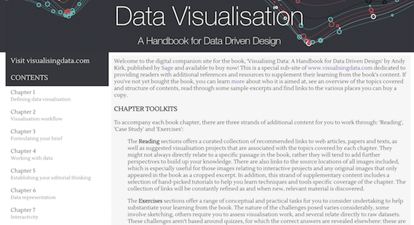
This sub-site offers a (freely accessible) digital companion site for my recently released book, ‘Visualising Data: A Handbook for Data Driven Design‘ dedicated to providing book readers with additional references and resources to supplement their learning from the book’s content.
5. ‘Six Questions With…’ Interviews
In working on my book I wanted to include voices and opinions from various professionals from the world of data visualisation, spanning the spectrum of industries, backgrounds, roles and perspectives. I gave each interviewee a selection of questions from which to choose six to respond. For convenience, here is the full collection of the interview posts.
6. Book References
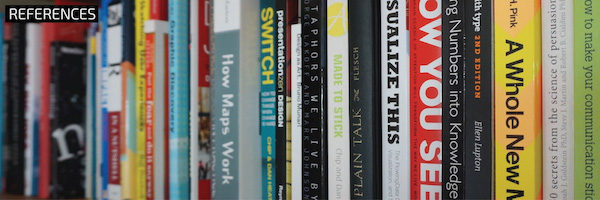
This page offers a collection of books that cover data visualisation, visual design, communication and other closely-related subject areas, largely comprising books I own or I have read.
7. Visualisation Resources
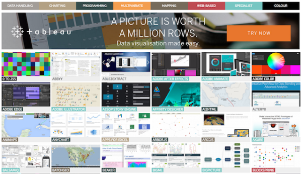
A collection that has been shaped by around six years of constant adding, removing and refining (with an update due again soon), simply put this page this compiles the myriad tools and applications that help you develop your data visualisations.
WHAT ELSE IS ON VISUALISINGDATA.COM?
What else can you find around the site? Here’s a brief page-by-page overview to acquaint you with each component:
HOME PAGE
On the home page you will find a profile of the latest content published on the site. On the left side of the page you have a collection of the latest featured blog posts with the most recent afforded the prominently placed and sized window at the top. At the bottom are a few ads for my latest offerings (book, training events). On the right of the page you will find an interactive bubble chart to explore the most popular 100 posts as measured over the last 100 days. The bubbles are sized by the number of hits and coloured by the blog post categories. Click for a preview of the post and then click on ‘VIEW ARTICLE’ to read the full post. Latest announcements (new blog posts, status updates on training events etc.) are also provided in the news ticker at the top of the page.
BLOG
The blog posts are organised into six content categories with a couple of additional menu filters:
- The Latest 50 presents the most recent 50 published blog posts.
- Collections houses the often popular postings that monthly ‘best of’ digests, 6-monthly reviews and other curated collections
- Design feature profiles of the latest contemporary designs and design techniques from across the field.
- Articles covers discourse pieces commenting on key aspects of visualisation design thinking and may include items such as interviews with prominent practitioners.
- External is a home for all the other articles, interviews, presentations and recordings I have participated in but published elsewhere on other blogs and websites.
- Field News tracks relevant news items from across the field.
- Announcements concerns more specific new items related to my site/services, including new training events, offers, requests etc.
- The Months item provides a month-by-month view through the archives chronological order.
RESOURCES
Already mentioned above, this collection of resources has been one of the most popular content items published on the site. This page provides a interactive navigable database of over 300 tools, applications and programmes that have an important role to play in data visualisation design. As new tools arrive on the scene, this collection will be kept entirely up-to-date to maintain the latest catalogue of options. The categories are a best fit grouping, though some tools inevitably do cut across several in theory.
REFERENCES
The references collection provides further useful sources of material for data visualisation enthusiasts. Already mentioned above is the gallery of ‘Books’ covering some of the most important and influential books on data visualisation and related subjects. The collection is limited to those I have personally read or own. The ‘Education’ tab offers a compilation of the growing range of educational programmes and qualifications in data visualisation and associated subjects. I will be shortly be focusing on refining the contents of both these items to ensure they are current and will be adding further tabs of collected, useful references.
TRAINING
This page provides an overview of the data visualisation training workshops I offer. There is an overview of the training content, a profile of the types of training available, a list of locations in my current public training schedule, an interactive map to explore previous events, and a form for interested parties to make a request for a future public or private/on-site event.
SERVICES
The services page describes the diverse range of professional offerings and engagement models I provided, beyond just training workshops, covering consultancy, research, teaching, speaking and writing. There is also a gallery showing a selection of previous clients.
BOOK
This page promotes details of my latest book book ‘Data Visualization: A Handbook for Data Driven Design’.
ABOUT
The about page provides several profiles: about me, about the site and about Visualising Data Ltd, providing contact details and links to my social media profiles.

