
A new dawn
That might seem like a rather a pompous section header – after all it is just a new site design – but for me it feels like a really significant milestone. The new version of visualisingdata.com was launched yesterday without too many bumps in the road, thankfully. I want to share a little bit more information about the thinking behind this new site’s design and functionality. I appreciate all the feedback and comments that have been aired so far and hope this responds to some of the curiosities that were expressed.
Motivation for change
Visualisingdata.com was launched in February 2010 shortly after I graduated from a Masters research programme that had enthused me to want to continue to learn and discover much more about the data visualisation field. I decided that setting up a quick and lightweight blogging platform like WordPress and writing publicly about the subject was a great way to continue learning. You are forced to research, think and carefully establish your convictions.
At that time the field was experiencing a very evident increase in popularity and mainstream coverage. (I will always look back as being very fortunate to arrive in it when I did). Over time, as the field has continued to mature and spread, hopefully, the site’s content has reflected a similar development providing value to new enthusiasts and seasoned pros along the way.
I was always mindful that the look, feel and functionality of the site was somewhat stuck in the vertical, scrolling wilderness of the particular WordPress theme I’d chosen. New stuff gets seen, older stuff gathers dust. It did an entirely worthy job for a long time, particularly prior to me a being a full-time freelance professional, but over the past couple of years I’ve felt an increasing friction between the style of the site and the things I’m teaching, preaching and practicing. As a shop-window to what I’m about it was no longer a good enough fit.
I don’t have sufficient web programming literacy to do much more than tweaking so any significant development have been very hard to find space to move up the priority list. However, at the end of 2013 I decided the time was right to draw together a brains trust and start working towards an entirely fresh design. Not only a website reboot but something that extended to a whole new visual design and brand identity across all outputs.
Whats on this site
Here’s an outline of the contents and features that you will now find on the site.
HOME PAGE
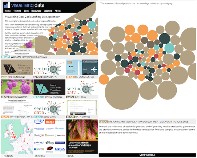
Creating a home page was one of the most important additions I wanted to introduce in this new version. I wanted to move away from the home page being the beginning of a stream of blog posts. This very final single image of what was essentially the previous home page view is illustrative of the old experience. I was also seeking a more dynamic front landing page that would encourage people to explore different parts of the site and offer a slightly different experience each day they come back to the site. I accept many people still tend to consume site content through RSS, google discoveries and links from social media but it is still nice to be able to offer a home page experience for those new arrivals and/or those who stick around for a browse.
So, on the home page you will find a convenient profile of the latest and most relevant content on the site.
- Along the top you have a ticker strip with latest announcements (new blog posts, status updates on training events etc.) that appears on each page. There will typically be a max of 3/4 items looping on here. We have tried to minimise the visible animation effects so that it isn’t too distracting.
- On the left side of the page you find a curated arrangement of featured content items, blog posts and news. The main featured post is self-evident at the top, with other recent items beneath. These items may include just the most recent new postings or might be older content elevated to the front page if it has current relevance.
- On the right you have an interactive device in the form of 100 packed bubbles to explore the most popular posts over the last 100 days. The bubbles are sized by the number of hits and coloured by the blog post categories. Click for a preview of the post and then click on ‘VIEW ARTICLE’ to read the full post. The idea of this is to provide visitors with perhaps a more serendipitous entry point into the site’s content. At the very least it is nice to occasionally just batter the bubbles around with one of the big bruisers.
We are still exploring ways to ensure the layout and functionality is optimised for large screen vs. small screen, for desktop vs. mobile/tablet. More on this further down.
BLOG
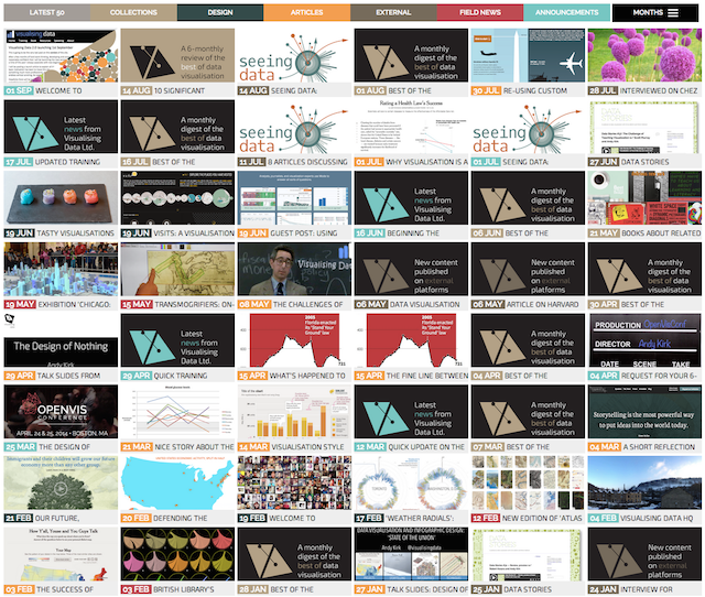
The blog posts on this site date back to February 2010 and are really the heart and soul of this site. As I’ve already described, one of my motivations was to make the older content more immediately visible and accessible, getting away from that very linear, vertical journey of the previous WordPress template. Now you can move around nearly 5 years of content in just one or two clicks of the button. You also have the featured images to better inform your browsing choices and preview text to decide whether to continue to visit the full article. The blog page takes a couple of seconds to load up the content of the database – we’re going to continue looking at ways to shave time of this loading. The content is presented in reverse chronology and is categorised by seven content groups.
- Latest 50 – presents the most recent 50 published blog posts
- Collections – the popular monthly ‘best of’ digests, 6-monthly reviews and other curated collections
- Design – featuring profiles of the latest contemporary designs from the field
- Articles – written pieces discussing key aspects of visualisation design thinking
- External – pointers to other articles, interviews and recordings involving me but published elsewhere on the web
- Field News – latest news from across the field
- Announcements – general announcements about the site/services, including new training events, offers, requests etc.
- There is also a menu to browse through the archives in month-by-month chronology.
BLOG POSTS
For the individual blog posts there is now a cleaner design with a more striking banner image for each blog (with the flanking colours auto generated from the dominant image colours to blend in) and a more integrated ‘related posts’ feature. The comments are tidied away until you wish to view them and you can browse backwards and forwards, as usual, to proximate posts. The social media buttons enable the sharing of the post links to the main 4 destinations. The tally counts for each post have hopefully been pulled through in most cases but some have not.
In my current blog post database there are 529 published posts. In the process of migrating to this new site design I have had to go through each post to reconfigure it slightly, set up excerpt text, update to the new categories and also assign a featured image. I have managed to get through over half of these but still have 200+ to complete so you will see some blank tiles in the blog page and in the blog posts themselves a ‘Page Under Construction’ banner image. I’ll be working through these as quickly as possible to tidy up all the content.
RESOURCES

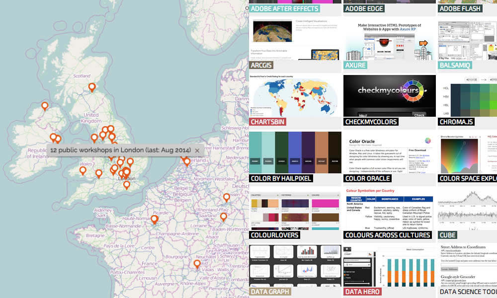
The collection of resources has been one of the most popular content items published on the site down the years. This page now provides a interactive navigable database of over 200 tools, applications and programmes that have an important role to play in data visualisation design. As new tools arrive on the scene, this collection will be kept entirely up-to-date to maintain the latest catalogue of options: I will shortly be finally getting round to the extra 70/80 or so outstanding items that need adding. The categories are a best fit grouping, though some tools inevitably do cut across several in scope. The preview text wording is often drawn from a tool’s native site, rather than being my own. Also, I may not have actually used all the tools, I may not even personally think all of them a particularly great, but I will have seen evidence of others who have endorsed them or found them useful in different contexts to make them worthy of including in this collection. I would also like to take the opportunity thank Tableau Software who are the exclusive sponsors of this resources page.
REFERENCES
The references collection provides further useful resources for data visualisation enthusiasts. As above I will endeavour to add all the outstanding content that I’ve been bookmarking as soon as possible and keep it more up-to-date going forward. Some of the background widgets we have created in the WordPress admin dashboard will make this task much easier than before.
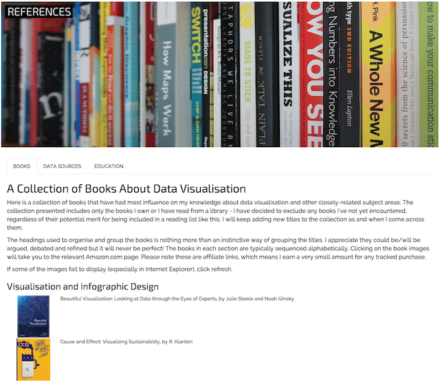
- Books – A gallery of some of the most important and influential books on data visualisation and related subjects. The collection is limited to those I have personally read or own.
- Data sources – A big collection of sites and services that provide access to data, across many different domains
- Education – A compilation of the growing range of educational programmes and qualifications in data visualisation
TRAINING
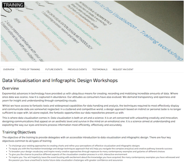
This page provides an overview of the data visualisation training workshops I run on behalf of Visualising Data Ltd. There is an overview of the training content, a profile of the types of training available, a list of the current training schedule, an interactive map to explore the location and type of previous events, a selection of participant testimonials (still needs another 100+ adding) and a form for interested parties to make a request for a future event. I am still exploring the potential use of a new training event registration tool (as an alternative to Eventbrite) that will be more integrated into WordPress.
SERVICES
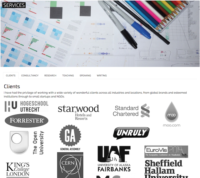
The services page presents the range of professional services I offer on behalf of Visualising Data Ltd covering consultancy, research, teaching, speaking and writing. There is also a gallery showing the logos of previous clients.
BOOK
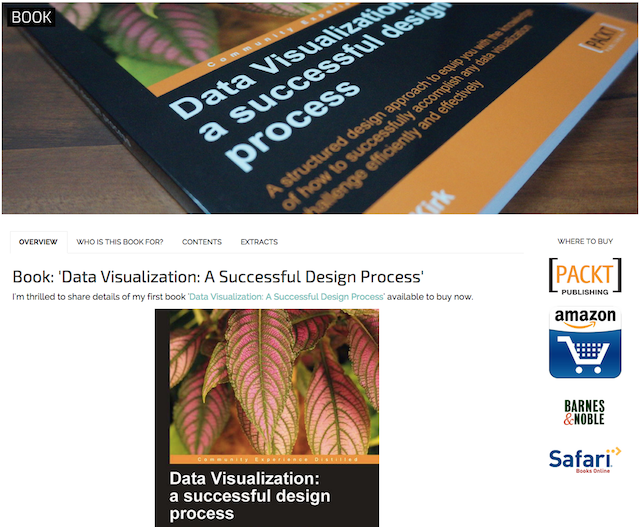
This page promotes details of my first book ‘Data Visualization: A Successful Design Process’ and, as the development progresses, will also eventually show information about my second title.
ABOUT
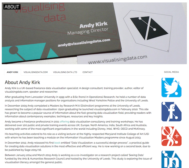
The about page profiles me, provides an outline of the workings and content of this site, some brief details about Visualising Data Ltd and a contact details page with links to my more prominent social media profiles.
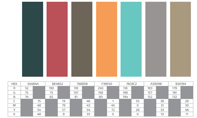
VISUAL IDENTITY
The type used in the new site includes Exo 2, used mainly for titles and headings, and Raleway, mainly for the body text. The colour palette was developed by Matt (see below) and comprises the following:
“Every screen according to its needs”
As with any worthwhile site development, we have sought a solution that works as well as possible across all platforms. There is a view that modern web site design should have a ‘mobile first’ objective. I recognise and agree that content is increasingly shared and accessed from smaller, mobile devices. However, my motivation for the redesign of this site has been focused foremost on an enhanced desktop experience, translatable where possible to tablet and then stripped back to be as accessible and light as possible for mobile. You will not see the same level of functionality available on a mobile browser compared to desktop because the screen real-estate and scope for interaction doesn’t lend itself to achieve this. This tweet and comment from Al Shaw expresses my views perfectly: “Instead of ‘mobile first’ I like ‘to every screen according to its needs'”.
This does not mean that there is not more work to be done to maximise the effectiveness of the design across the different platforms, we have several things to fix and possible avenues to explore to make the site as responsive, accessible and well-performing as possible.
The brains trust
This photo was taken at the first project meeting between myself (camera operator), Andrew Witherley (left) and Matt Knott (right) in October 2013.
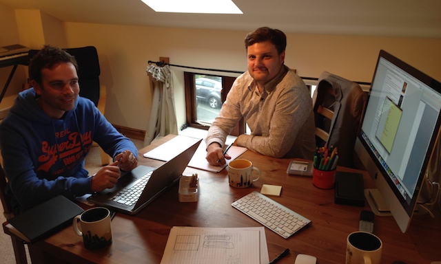
Matt led the way in facilitating the new design thinking: developing the new branding ideas around logos, typography and colour palette and helping to formulate the initial mockup sketches ideas of the site. Matt will be contributing to a future article about the thinking and design process specifically behind the new logo.
Andrew led on the development side, bringing his considerable technical talent and sharp eye to entirely translate my hopes for the site’s structure and capability in to reality. Over the past few months especially he has gone above and beyond to help me get over the line with this new launch, particularly as my often limited spare capacity has led to a very stochastic pattern of progress.
Its been an immense pleasure working with both of these splendid chaps and I am hugely grateful for their contributions.
