Best of the visualisation web… May 2010
Here are some of the most relevant, interesting and useful articles I’ve come across during May 2010.
Best of the visualisation web… May 2010 Read More »
Here are some of the most relevant, interesting and useful articles I’ve come across during May 2010.
Best of the visualisation web… May 2010 Read More »
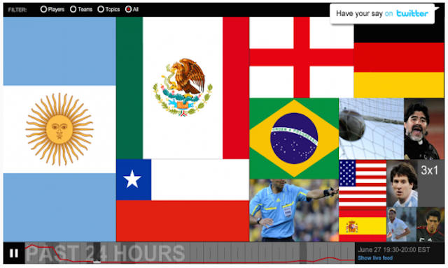
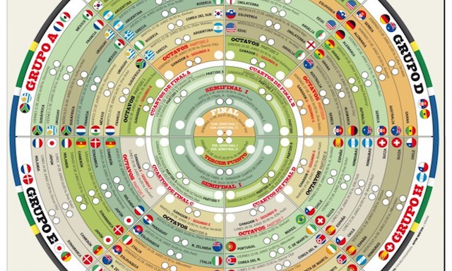
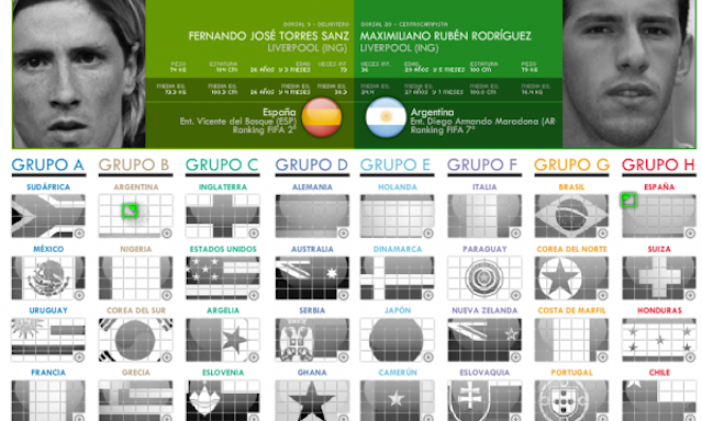
Following the popularity of the Visualising the World Cup 2010 post I published last week, here is something of a sequel presenting a whole host of further examples. Many thanks to all who submitted comments, tweets and sent me emails with suggested links to some of the items displayed below.
Visualising the World Cup 2010 (Part 2) Read More »
Over the past couple of years we have experienced a number of key world events and stories that have triggered vast amounts of data and information outputs – the US elections, the financial crisis, Haiti earthquake, UK elections and the Iceland volcano are just a few that spring to mind.
Visualising the World Cup 2010 (Part 1) Read More »
Picked up via an article on a BBC tech blog, below is a video from the Mashable’s YouTube channel showing the Apple App Store visualisation ‘hyperwall’ they’ve on show at the Worldwide Developers Conference in San Francisco. This visualisation shows the live progress of the 50,000 most popular app downloads from the Apple App Store. As each
Apple ‘Hyperwall’ at WWDC Read More »
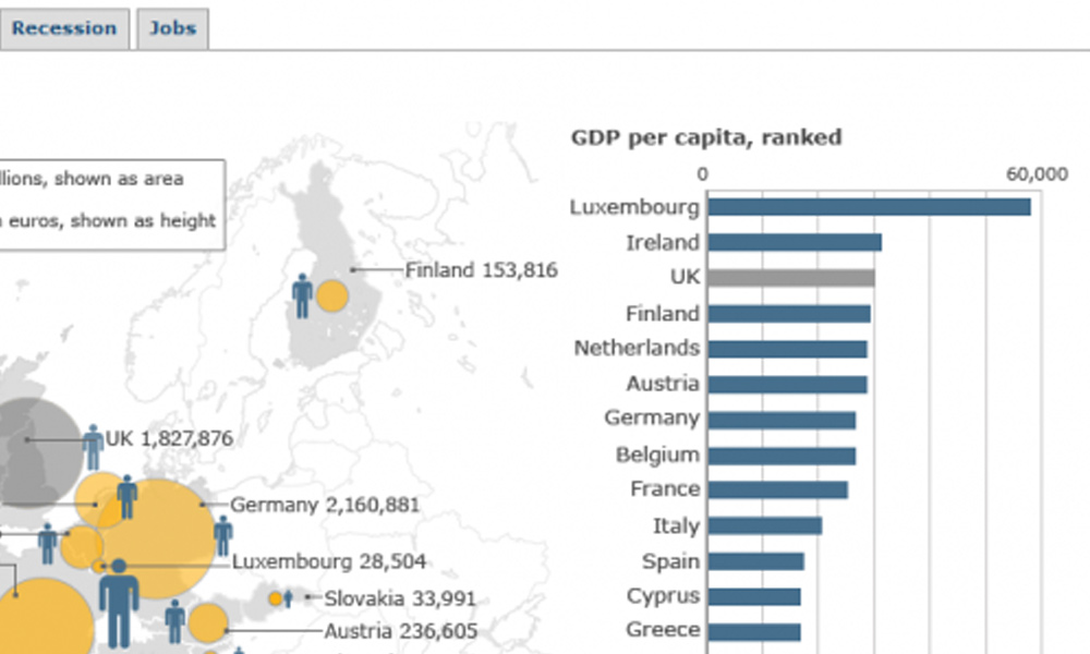
The BBC has published a set of graphics to support their analysis of the (re-) increasing financial crisis across the Eurozone. The first graphic (debt) presents both the national debt and deficit as a % of GDP. Wisely the values are presented on a colour-coded scale using only a single colour. This makes it easier for
Eurozone in crisis: BBC graphics Read More »
Lazy pun, I know, but it’s hard not to be lethargic after the fantastic weather we’ve had here in England. According to records it is the first consecutive Friday, Saturday and Sunday sequence where we have had nice weather since 1836. That’s not entirely true but it feels like it. Anyway, whilst this post is
Having picked up a recent blog post by Stephen Few about a graph that had been promoted as an example of good practice by Oracle’s BI suite, I was searching around for reports on BI vendors and came across a decision matrix report by DataMonitor from 2007. The report I unearthed was on the SAS site,
I’ve been sent a link to an interesting new service offered by 3M (who despite apparently having a portfolio of 55,000 products I still think of as the Post-it Note company). It is called the ‘Visual Attention Service’ and is pitched around the tag line “You’ve got seconds to engage a viewer. Be sure they count”: As
3M visual attention service Read More »
Not sure how and why I’ve missed this publication for so long but today I’ve come across Information Age magazine having unearthed links to a couple of very interesting articles which I recommend you read. Firstly, one published today entitled “The Analytical Eye” talks about the as-yet untapped potential of data visualisation across business. It contains discussions
Information Age article Read More »
Via The Big Picture website I’ve come across a New York Times graphic sequence explaining the national debt levels across European states. The sequence presents seven different graphics that build a story of the debt crisis across the continent and I want to comment on a couple of aspects of these displays which I feel
NYT European debt levels Read More »