
Field News
Visualisation in the news
The last 72 hours or has been fairly crazy in the land of Visualising Data, with some notable visualisation stories and discussions popping up in

The last 72 hours or has been fairly crazy in the land of Visualising Data, with some notable visualisation stories and discussions popping up in

I’m allowing a bit of self indulgence today as I celebrate 6 months of Visualising Data. These first 6 months have seen a steady but

At the end of each month I pull together a collection of links to some of the most relevant, interesting and useful articles I’ve come across during the previous month. Here’s the latest collection from July 2010.

This is a follow-up post to my first article in the Visualisation Insights series which I published last week. The purpose of this companion series
This post is the first in a series I am commencing called Visualisation Insights. The purpose of this series is to provide readers with unique
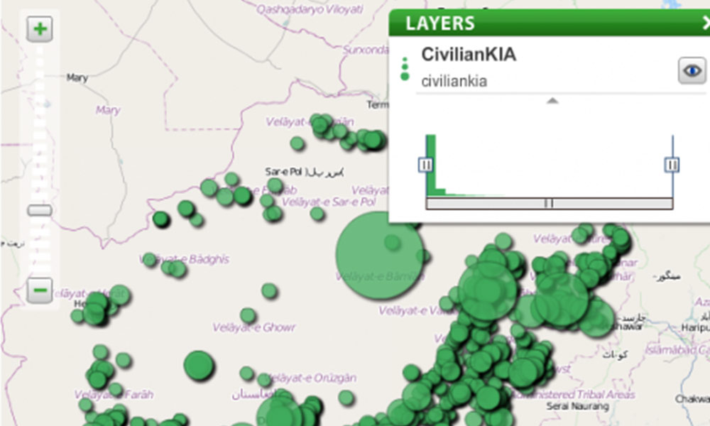
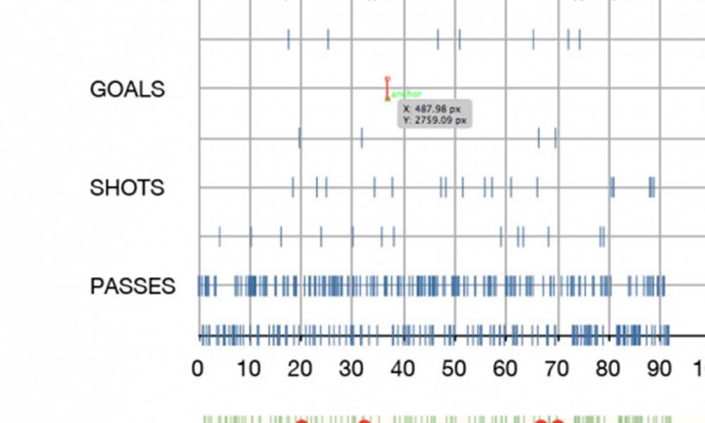
Further to yesterday’s post about the Wikileaks Afghanistan War Logs, the Guardian datablog has published a post today describing how their data journalism operation worked.
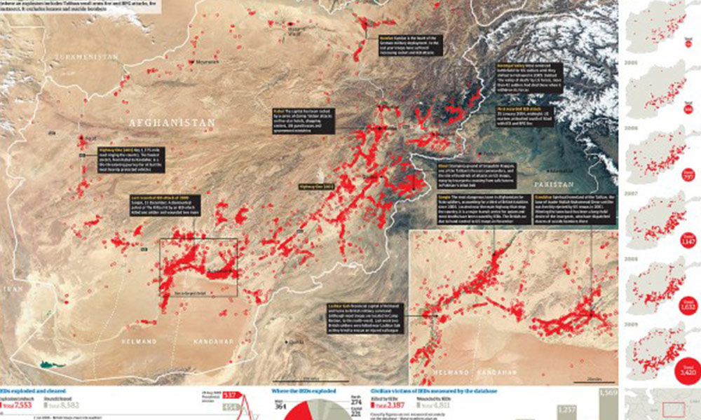
The New York Times, the Guardian (UK) and Der Spiegel (Ger) have published details of a huge set of war logs from the whistleblowing website
A series of charts by Jeremy Christopher depicting the history, worth and composition of the FTSE 100 share index have been doing the rounds over

The San Francisco Chronicle presents a visualisation developed by Alan Mislove, a researcher at Northwestern University. His study looks at 300 million tweets measuring mood
In my recent post ‘Worst graph design ever?’ I provided a very brief review of the ‘The Little Book of Shocking Global Facts’. As the title
At the end of each month I pull together a collection of links to some of the most relevant, interesting and useful articles I’ve come across. Here’s the latest collection from June 2010

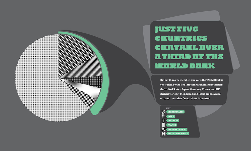
Access to Data I have spoken recently about the status of the world of visualisation and how the juxtaposition of a number of factors is
Yesterday, I came across a graphic which I believe to be possibly the worst graph I have ever seen. I’ve seen some stinkers but this has cleared out the room. Now hold your nose…
On the excellent DataVisualization.ch site, Benjamin has posted an interview that shares some of his thought about the various World Cup visualisations, infographics and interactives
A couple of months ago I discussed the issue of how the excitement and hype around the visualisation/information design field, whilst justified, was a bit

The waiting room A few weeks ago I was sat in a doctor’s waiting room area trying to kill time before an appointment. Normally, my
As reported by ResellerNews, Microsoft has today released PivotViewer – an interactive visualisation tool designed to help browse, organise and analyse massive image collections and
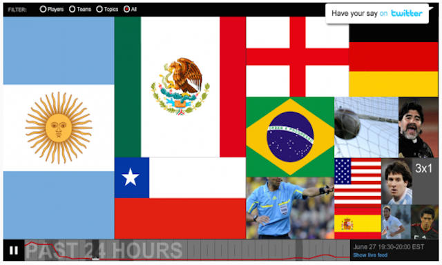
Following the popularity of my recent posts about visualisations and information designs relating to the World Cup, here is a third instalment. I wasn’t intending to produce a third collection, because you can only get so much mileage from the same subject matter, however, I’ve been lucky to have received many additional suggestions.

No, I’m not launching a career in the blues, but as I have done on a couple of occasions in the past, and more for my
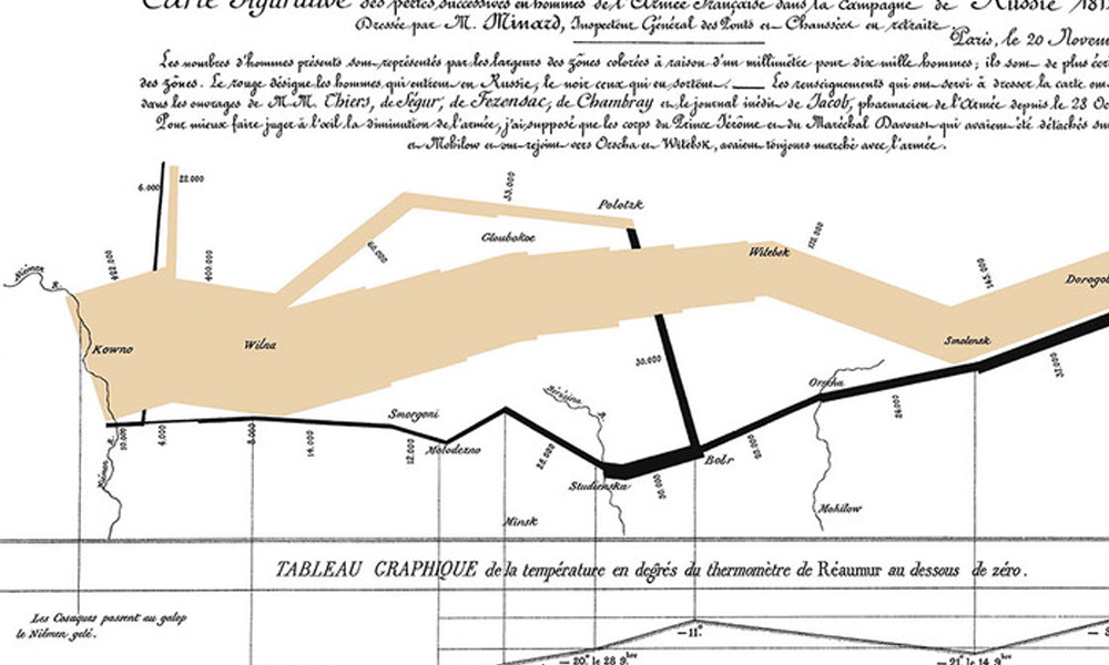
Well I’ve managed to hold off for 53 posts but finally I’m compelled to discuss Minard’s 1869 graph depicting Napoleon’s 1812 march on Moscow, a graph
Here are some of the most relevant, interesting and useful articles I’ve come across during May 2010.
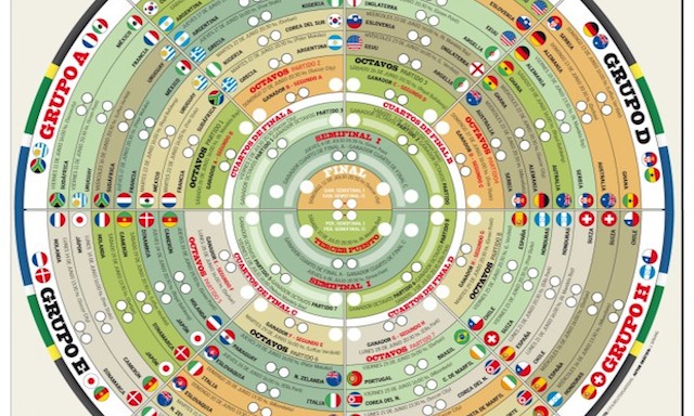
Following the popularity of the Visualising the World Cup 2010 post I published last week, here is something of a sequel presenting a whole host of further examples. Many thanks to all who submitted comments, tweets and sent me emails with suggested links to some of the items displayed below.
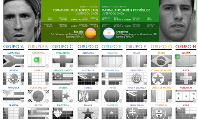
Over the past couple of years we have experienced a number of key world events and stories that have triggered vast amounts of data and information outputs – the US elections, the financial crisis, Haiti earthquake, UK elections and the Iceland volcano are just a few that spring to mind.

Picked up via an article on a BBC tech blog, below is a video from the Mashable’s YouTube channel showing the Apple App Store visualisation ‘hyperwall’
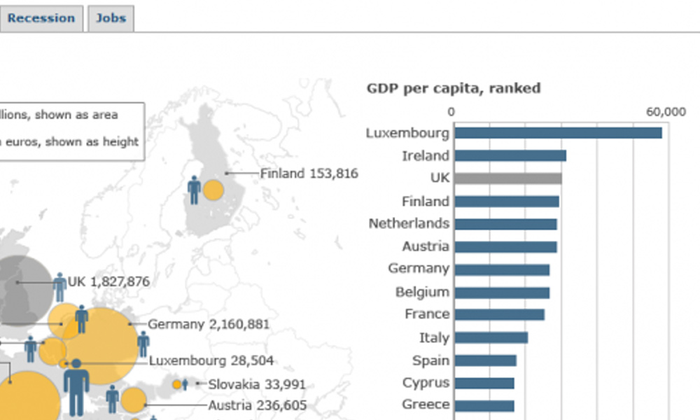
The BBC has published a set of graphics to support their analysis of the (re-) increasing financial crisis across the Eurozone. The first graphic (debt) presents

Lazy pun, I know, but it’s hard not to be lethargic after the fantastic weather we’ve had here in England. According to records it is

Having picked up a recent blog post by Stephen Few about a graph that had been promoted as an example of good practice by Oracle’s

I’ve been sent a link to an interesting new service offered by 3M (who despite apparently having a portfolio of 55,000 products I still think

Not sure how and why I’ve missed this publication for so long but today I’ve come across Information Age magazine having unearthed links to a couple
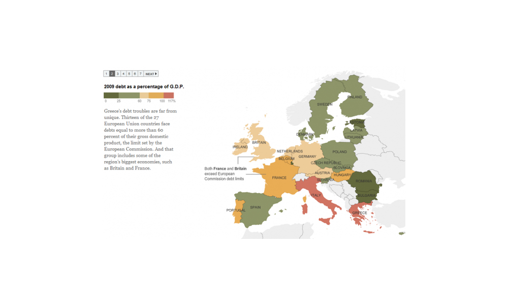
Via The Big Picture website I’ve come across a New York Times graphic sequence explaining the national debt levels across European states. The sequence presents