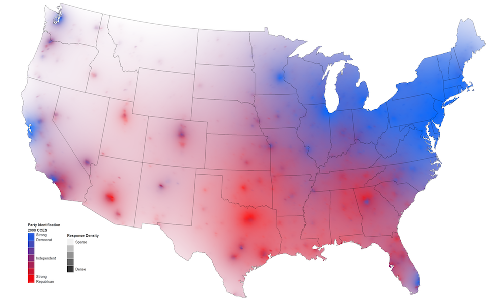
Applying Augmented Reality to a text book
Reader Mark Lukas has been in touch to share details of an interesting Augmented Reality (AR) project he has been working on. For those of
Visualisingdata.com was originally launched in 2010 originally to serve as a blog to help continue the momentum of my learning from studying the subject via a Masters degree. I continue to publish articles and share announcements that track developments in my professional experiences as well as developments in the data visualisation field at large.
This is a collection of all my published posts, starting with the newest and dating back to 2010, tracking. These posts include articles, design commentaries, podcast updates, professional updates, and general news from across the data visualisation field.
Reader Mark Lukas has been in touch to share details of an interesting Augmented Reality (AR) project he has been working on. For those of
At the end of each month I pull together a collection of links to some of the most relevant, interesting and useful articles I’ve come across during the previous month. Here’s the latest collection from September 2010.
This is a follow-up post to my third article in the Visualisation Insights series which I published earlier this week. The purpose of this companion
This is the third part in my Visualisation Insights series. The purpose of these posts is to provide readers with unique insights into the field
“You must come round and look at my holiday photos” is a phrase that sends shivers down most spines, mine included. Nevertheless, I wanted to
On 2 November, the US holds midterm elections to Congress. To allow UK readers (in particular) to learn more about what these midterms involve and
I’m very excited to be making my first ever visit to New York in a few days time. Besides trying to fit in 2 weeks
One of the many RSS subscriptions that keep my Google Reader working overtime is Jan Schultink’s Sticky Slides blog, which provides a lot of useful
Over the several years I have been immersed in data visualisation there have been many occasions when I’ve come across a graphic that is largely
Spotted on Wired, the developers responsible for Last.fm’s ‘VIP playground’ have announced the launch of a visualisation service that plots subscribers’ listening habits over a
At the end of each month I pull together a collection of links to some of the most relevant, interesting and useful articles I’ve come across during the previous month. Here’s the latest collection from August 2010
A new political blog/sub-domain of the New York Times website officially launched this week and you should keep your eyes on its progress – the
This is a follow-up post to my second article in the Visualisation Insights series which I published early this week. The purpose of this companion
This is the second part of my recently launched Visualisation Insights series. The purpose of this series is to provide readers with unique insights into
The OFCOM Communications Market Report 2010 has been published today. For those who don’t know about OFCOM it is the independent regulator and competition authority for
Over the past couple of months I’ve noticed a number of new examples of streamgraphs working their way around the web. It has prompted me to finally get around to visiting this subject because these graphs always seem to stir great debate, one which seems to perfectly encapsulate the ongoing challenges faced within the visualisation field
The last 72 hours or has been fairly crazy in the land of Visualising Data, with some notable visualisation stories and discussions popping up in
I’m allowing a bit of self indulgence today as I celebrate 6 months of Visualising Data. These first 6 months have seen a steady but
At the end of each month I pull together a collection of links to some of the most relevant, interesting and useful articles I’ve come across during the previous month. Here’s the latest collection from July 2010.
This is a follow-up post to my first article in the Visualisation Insights series which I published last week. The purpose of this companion series
This post is the first in a series I am commencing called Visualisation Insights. The purpose of this series is to provide readers with unique
Further to yesterday’s post about the Wikileaks Afghanistan War Logs, the Guardian datablog has published a post today describing how their data journalism operation worked.
The New York Times, the Guardian (UK) and Der Spiegel (Ger) have published details of a huge set of war logs from the whistleblowing website
A series of charts by Jeremy Christopher depicting the history, worth and composition of the FTSE 100 share index have been doing the rounds over
The San Francisco Chronicle presents a visualisation developed by Alan Mislove, a researcher at Northwestern University. His study looks at 300 million tweets measuring mood
In my recent post ‘Worst graph design ever?’ I provided a very brief review of the ‘The Little Book of Shocking Global Facts’. As the title
At the end of each month I pull together a collection of links to some of the most relevant, interesting and useful articles I’ve come across. Here’s the latest collection from June 2010
Access to Data I have spoken recently about the status of the world of visualisation and how the juxtaposition of a number of factors is
Yesterday, I came across a graphic which I believe to be possibly the worst graph I have ever seen. I’ve seen some stinkers but this has cleared out the room. Now hold your nose…
On the excellent DataVisualization.ch site, Benjamin has posted an interview that shares some of his thought about the various World Cup visualisations, infographics and interactives