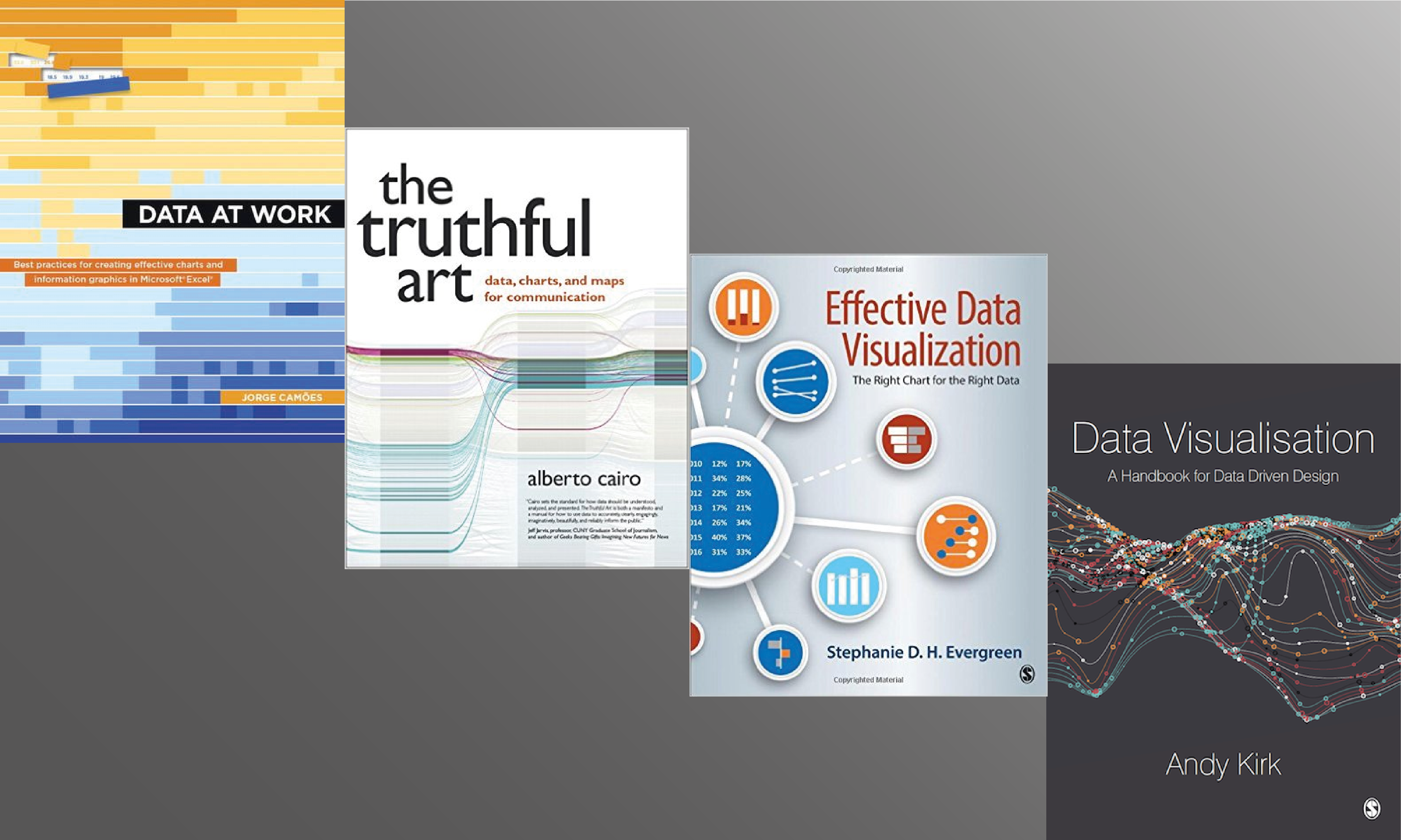
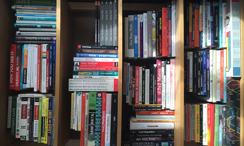
The book is printed and out now!
A rather nice last-day-before-holidays package has just arrived at my door: the first pair of copies of my book straight off the printing press!
Visualisingdata.com was originally launched in 2010 originally to serve as a blog to help continue the momentum of my learning from studying the subject via a Masters degree. I continue to publish articles and share announcements that track developments in my professional experiences as well as developments in the data visualisation field at large.
This is a collection of all my published posts, starting with the newest and dating back to 2010, tracking. These posts include articles, design commentaries, podcast updates, professional updates, and general news from across the data visualisation field.

A rather nice last-day-before-holidays package has just arrived at my door: the first pair of copies of my book straight off the printing press!

At the end of each month I pull together a collection of links to some of the most relevant, interesting or thought-provoking web content I’ve come across during the previous month. Here’s the latest collection from April 2016.

In order to sprinkle some star dust into the contents of my book I’ve been doing a few interviews with various professionals from data visualisation and related fields. These people span the spectrum of industries, backgrounds, roles and perspectives.

In order to sprinkle some star dust into the contents of my book I’ve been doing a few interviews with various professionals from data visualisation and related fields. These people span the spectrum of industries, backgrounds, roles and perspectives.

In order to sprinkle some star dust into the contents of my book I’ve been doing a few interviews with various professionals from data visualisation and related fields. These people span the spectrum of industries, backgrounds, roles and perspectives.

This week I have had the real privilege of visiting Vancouver to run a workshop, speak at a meetup event and, primarily, to attend and speak at the inaugural Information+ conference

In order to sprinkle some star dust into the contents of my book I’ve been doing a few interviews with various professionals from data visualisation and related fields. These people span the spectrum of industries, backgrounds, roles and perspectives.

In order to sprinkle some star dust into the contents of my book I’ve been doing a few interviews with various professionals from data visualisation and related fields. These people span the spectrum of industries, backgrounds, roles and perspectives.

I had the pleasure of joining Alberto Cairo, Jorge Camoes, and Stephanie Evergreen to record a special one-off ‘Book club’ discussing our respective experiences in recently working on new data visualisation books.

This was a short survey used to assess the appetite and needs for training in specific tools/applications/libraries for producing data visualisation work. The purpose was to quantify the challenges of training specific tools alongside the broader teaching of data visualisation.

In order to sprinkle some star dust into the contents of my book I’ve been doing a few interviews with various professionals from data visualisation and related fields. These people span the spectrum of industries, backgrounds, roles and perspectives.

Almost two years since the proposal was approved, last Friday, I finally completed the process of developing my new book. The relief and joy was expressed via a piece of impromptu early morning poetry.

This is part of a series of posts about the ‘little of visualisation design’, respecting the small decisions that make a big difference towards the good and bad of this discipline.

In order to sprinkle some star dust into the contents of my book I’ve been doing a few interviews with various professionals from data visualisation and related fields. These people span the spectrum of industries, backgrounds, roles and perspectives.

This week, I have been running a poll for readers to help decide the outcome of my third and final creative competition to win a copy of my book, namely the #BookShopped contest. The voting closed at 3PM UK time and I am delighted to announce…

Two weeks ago I launched the third and final creative contest to win a copy of my book. The theme of this challenge was #BookShopped, inviting people to creatively incorporate an image of my book cover into a famous movie scene.

This is part of a series of posts about the ‘little of visualisation design’, respecting the small decisions that make a big difference towards the good and bad of this discipline.

It has been a long time since I had the chance to undertake a self-initiated visualisation project but I blocked out a couple of days this week to work on a new graphic to mark the ending of the football season.

At the end of each month I pull together a collection of links to some of the most relevant, interesting or thought-provoking web content I’ve come across during the previous month. Here’s the latest collection from March 2016.

In order to sprinkle some star dust into the contents of my book I’ve been doing a few interviews with various professionals from data visualisation and related fields. These people span the spectrum of industries, backgrounds, roles and perspectives.

Over the past two months I have held contests (1 #Graphiti, 2 #BestWorstViz) for successful participants to win a free copy of my book when it is released in June. I was really impressed with the creativity exhibited in both these contests and so I am launching a third, and final, challenge.

In order to sprinkle some star dust into the contents of my book I’ve been doing a few interviews with various professionals from data visualisation and related fields. These people span the spectrum of industries, backgrounds, roles and perspectives.

This is part of a series of posts about the ‘little of visualisation design’, respecting the small decisions that make a big difference towards the good and bad of this discipline.

In order to sprinkle some star dust into the contents of my book I’ve been doing a few interviews with various professionals from data visualisation and related fields. These people span the spectrum of industries, backgrounds, roles and perspectives.

A couple of weeks ago I launched a second contest inviting people to send me examples of their best worst visualisation work. It had to be their work, though, not just submissions of bad visualisations they’ve seen elsewhere.

At the end of each month I pull together a collection of links to some of the most relevant, interesting or thought-provoking web content I’ve come across during the previous month. Here’s the latest collection from February 2016.

This is part of a series of posts about the ‘little of visualisation design’, respecting the small decisions that make a big difference towards the good and bad of this discipline.

This is part of a series of posts about the ‘little of visualisation design’, respecting the small decisions that make a big difference towards the good and bad of this discipline.