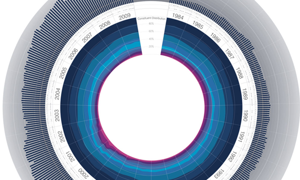
Radial plot of FTSE 100
A series of charts by Jeremy Christopher depicting the history, worth and composition of the FTSE 100 share index have been doing the rounds over the past 24 hours (first seen via DataVisualization.ch). The image below is probably the most discussed and shared of this short series of 3 charts. It visualises the FTSE’s index […]
Radial plot of FTSE 100 Read More »