Design

Bio.Diaspora: Visualising interactions between populations and travel

I want to share some impressive work I’ve recently come across from a Toronto-based project/group called Bio.Diaspora. Last week the team was featured in the Lancet Infectious Disease Journal as part of a special report on Mass Gatherings and Health. The report focused specifically on the potential health risks posed by the mass gathering and […]

Bio.Diaspora: Visualising interactions between populations and travel Read More »

Sightsmap provides interactive ‘sightseeing heatmap’

Just come across a really interesting interactive project from Estonian Professor, Tanel Tammet, called ‘Sightsmap‘ which overlays a heatmap onto a Google map platform allowing users to pan and zoom around the globe to see the locations where the most intensely photographed areas in the world. The heatmap is a representation of the number of available Panoramio photos for

Sightsmap provides interactive ‘sightseeing heatmap’ Read More »

Google+ launches ‘Ripples’ visualisation

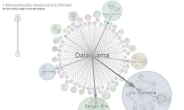
After what appears to be have been a rapid and widespread take-up of its Google+ social media service, Google has now launched details of its ‘Ripples’ feature. Significantly, news of the release was made by Fernanda Viegas, one of the most prominent names in the field and co-leader, with Martin Wattenberg, of Google’s “Big Picture” data visualization group.

Google+ launches ‘Ripples’ visualisation Read More »