Talk slides: The Design of Time (2019)
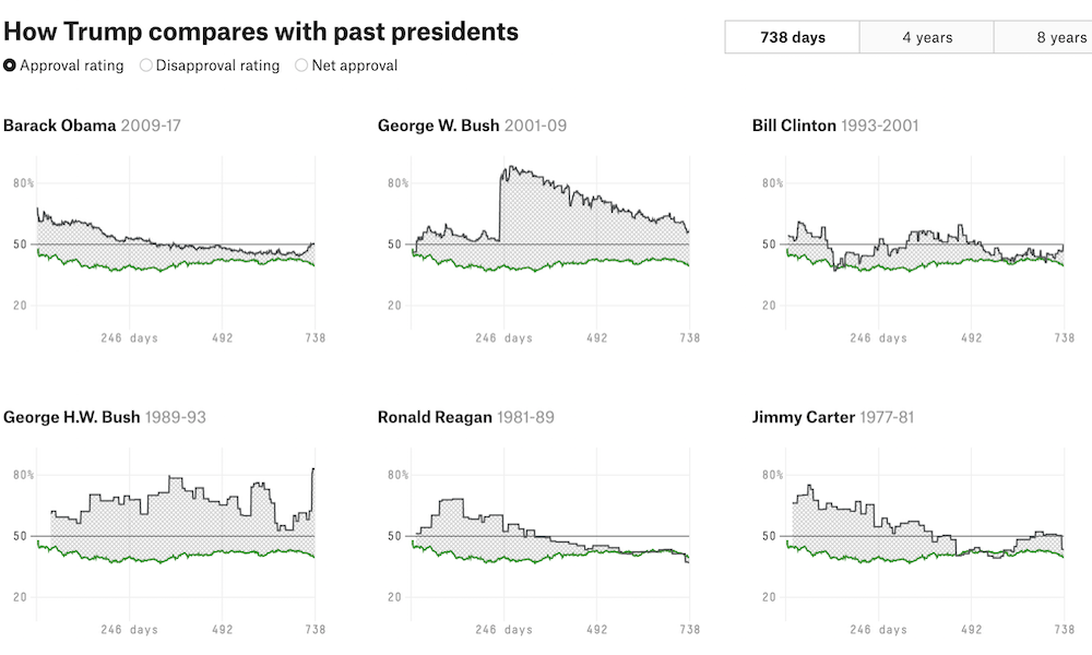
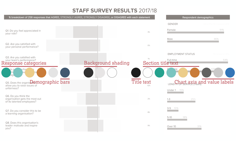
Earlier today I had the pleasure of delivering my first webinar presentation for Tableau this year. The title of my talk was ‘The Design of Time’.
Talk slides: The Design of Time (2019) Read More »
Earlier today I had the pleasure of delivering my first webinar presentation for Tableau this year. The title of my talk was ‘The Design of Time’.
Talk slides: The Design of Time (2019) Read More »
As consumers of visualisations, before we form interpretations and conclusions from the charts we see, we have to remember that they are only a visual display of the data that has been collected and the way that data has been transformed.
What do charts actually show us? Read More »
Whilst driving yesterday evening I was listening to BBC Radio 6 Music and heard an interesting interview with members of the band Field Music. They are doing a pair of performances at the Imperial War Museums inspired by a document called ‘The End of the War’.
Sound ranging and the end of war Read More »
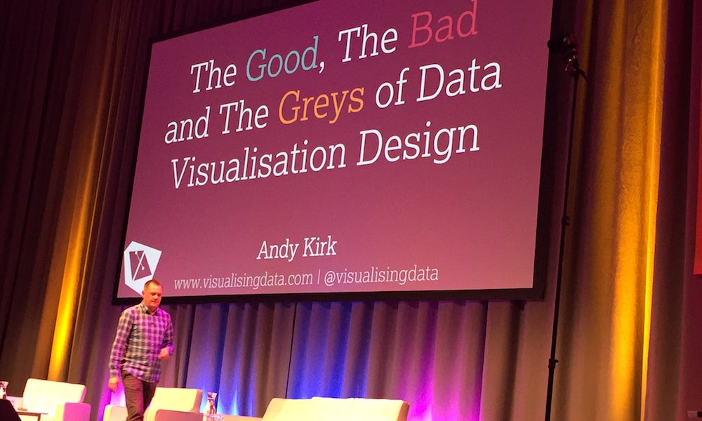
On Friday I had the pleasure of delivering a webinar presentation hosted by Sage, my book publishers and organisers of my new online training course. The title of my talk was ‘Data Visualisation: A Game of Decisions’.
Talk slides from Sage webinar Read More »
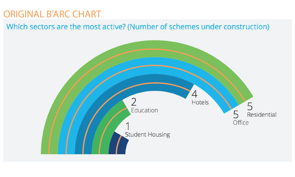
Almost one month ago I tweeted my contempt for radial bar charts, having come across a particularly egregious case. It seemed to gain a bit of traction on social media but was also met by genuine queries as to my reasoning for this disdain.
The problems with b’arc charts Read More »
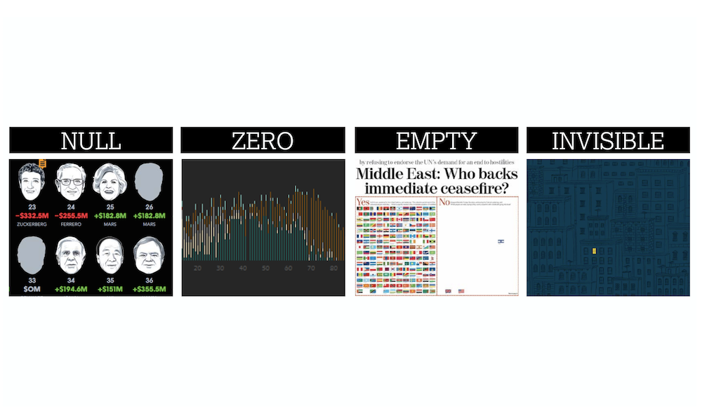
Earlier today I had the pleasure of delivering a second webinar presentation for Tableau this year. The title of my talk was ‘The Design of Nothing’.
Talk slides from second Tableau 2017 webinar Read More »
One of the standard pieces of advice I (and most others in a similar position) give to people looking to develop their data visualisation skills is to constantly seek opportunities to practice. Every task is different, every dataset presents new challenges
Think like a journalist Read More »
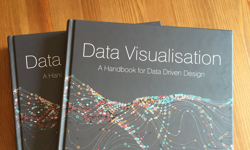
It is approaching the one year anniversary of my book being released in the wild. Though I will be doing something to mark this milestone in a couple of weeks, I wanted to share a one-page extract concerning a topic that has become ever more important since I wrote it.
Good data visualisation is trustworthy Read More »
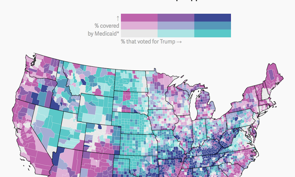
Yesterday, I came across an example of a bivariate choropleth map produced by Quartz. It isn’t an approach you see deployed too often so I was curious about what people thought about them on Twitter.
Bivariate choropleth maps Read More »
Earlier today I had the pleasure of being invited back by Tableau to deliver a webinar presentation. The title of my talk was ‘The Seven Hats of Visualisation Design: A 2017 Reboot’.
Talk slides from first Tableau 2017 webinar Read More »