
Essential Resources: The most influential visualisation books (part 1)
The contents of this post are now published on the References page
Essential Resources: The most influential visualisation books (part 1) Read More »

The contents of this post are now published on the References page
Essential Resources: The most influential visualisation books (part 1) Read More »
With only a few weeks to go until the first set of training workshops commence, I wanted to update you on the status of the events, specifically the credit card payment options, the confirmed venues and an early sense of the potential locations for workshops in 2012. Venues Training venues have now been confirmed for the
Workshops update: Credit card, venues and future schedule Read More »
One of the questions that I am most interested in when I approach my Visualisation Insights articles concerns how people discovered the subject of data visualisation: when was it and what was the situation that led them to suddenly recognise or appreciate the existance of the subject? The moment data visualisation appeared on my radar
Open thread: When did you discover data visualisation? Read More »

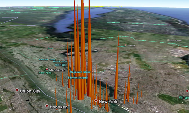
At the end of each month I pull together a collection of links to some of the most relevant, interesting or thought-provoking articles I’ve come across during the previous month. Here’s the latest collection from a very busy September 2011.
Best of the visualisation web… September 2011 Read More »
The news of Steve Jobs passing yesterday has been followed by a great flood of testimonials, eulogies and obituaries. Yet with the ink still drying from a similar outpouring of analysis from 6 weeks or so ago, when Jobs announced his departure from Apple, much of the narrative has already been well versed. One interesting piece of analysis
“Dullards who believe a distinction between style and subtance” Read More »
Just wanted to quickly share this. I can’t believe I’ve managed to miss this site for so long but, thanks to a profile on the superb Graphic Sociology, I’ve finally discovered Bill Rankin’s ‘Radical Cartography’ – a fascinating and inspirational collection of innovative map visualisation from his own portfolio and designs from a number of
Bill Rankin’s ‘Radical Cartography’ Read More »
Last month I shared details of the WordPress 2011 ‘State of the Word’ – founder Matt Mullenweg’s annual overview of the headlines, facts and figures relating to the utilisation of the opensource web/blog tool. I also shared news that data from the first ever WordPress user and developer survey was being made available and designers
Visualisation of the WordPress User Survey Read More »
I’d just got comfortable and in place to watch the Sunday afternoon football on Sky Sports, looking forward to having a bit of mental breathing space from all things data visualisation, when up pops these two graphics… The first graph compares results of QPR vs Aston Villa matches at Loftus Road (QPR’s home ground) and
Distorted and misleading graphics on Sky Sports Read More »
Friend of the site Nadia Amoroso has asked me to share details with readers of a great opportunity to have your visualisation projects exhibited in a potential new book about cities as information-scapes.
Contribute your City-related designs or information-scapes to new book Read More »
You may recall about a year ago a new concept was launched for the BBC by design consultancy Berg in collaboration with Max Gadney. This project was called BBC Dimensions and aimed to explore new ways of using digital media to relate stories and facts from history and current affairs. Today, Berg announced details of the
Berg and BBC Dimensions launches ‘How Many Really?’ Read More »