
Essential Resources: Tools and references for working with colour
The contents of this post are now published on the interactive Resources page
Essential Resources: Tools and references for working with colour Read More »

The contents of this post are now published on the interactive Resources page
Essential Resources: Tools and references for working with colour Read More »

Just a short post to log and share a really nice video. Titled ‘What Color is a Glacier?’, it is a submission for a student context run by the American Geophysical Union (AGU), a ‘nonprofit organization of geophysicists, consisting of over 61,000 members from over 146 countries’.
Video: ‘What color is a Glacier?’ Read More »
To mark the milestone of each mid-year and end of year I try to take a reflective glance over the previous 6 months period in the data visualisation field and compile a collection of some of the most significant developments.
10 significant visualisation developments: January to June 2013 Read More »

At the end of each month I pull together a collection of links to some of the most relevant, interesting or thought-provoking web content I’ve come across during the previous month. Here’s the latest collection from June 2013.
Best of the visualisation web… June 2013 Read More »
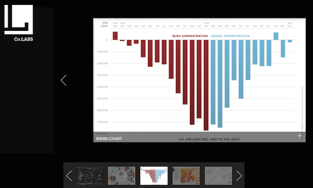
I was recently asked to contribute a selection of what I believe to be the five most iconic visualisations of the past 10 years for an article on FastCo Labs. The article has now been published and there are some really interesting other selections on there from Robert Kosara and Matt Stiles to make up a top 10 list.
My selections for FastCo Labs ‘Top 10 iconic data graphics’ Read More »
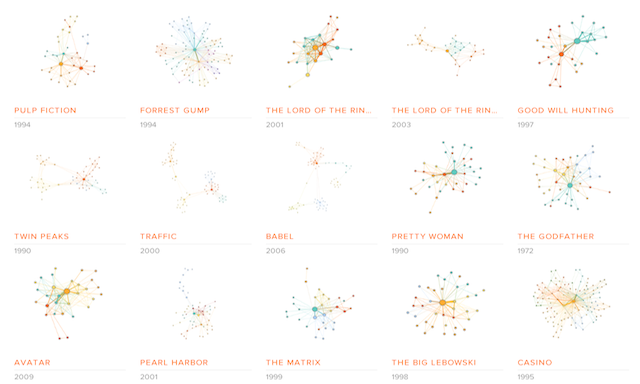
Jermain and Michael are co-founders of a data visualisation project called ‘Moviegalaxies’, “a place to discover the social graph in movies”. I recall I saw an early version of this project last year but it seems that the depth of movies now available has grown significantly.
‘Movie Galaxies’ social graphs in movies Read More »
The contents of this post are now published on the interactive Resources page
Essential Resources: A big collection of sites and services for accessing data Read More »

Thanks to Rob Rolleston for sharing this video with me. It came up through some analysis of the Hint FM Wind Map and, as you can see for yourself, it provides a mesmerising ambient display of local wind patterns, making the invisible visible.
Windswept: Mesmerising wind observation installation Read More »
Many thanks to Luis van den Ende from Submarine Channel for sending me details of this fascinating interactive documentary titled ‘Unspeak’ that combines film, data visualisation, technology and design to investigate the issue of language that deliberately manipulates public opinion.
Unspeak: Interactive documentary looks at manipulative power of language Read More »
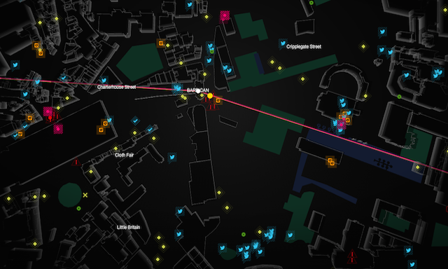
To accompany the launch of the Watch Dogs video game, ‘WatchDogs: WeAreData’ is a demonstration of some of the ‘smart cities’ concept that forms a major part of the game’s narrative.
‘Watch Dogs: WeAreData’ smart city data mapping Read More »