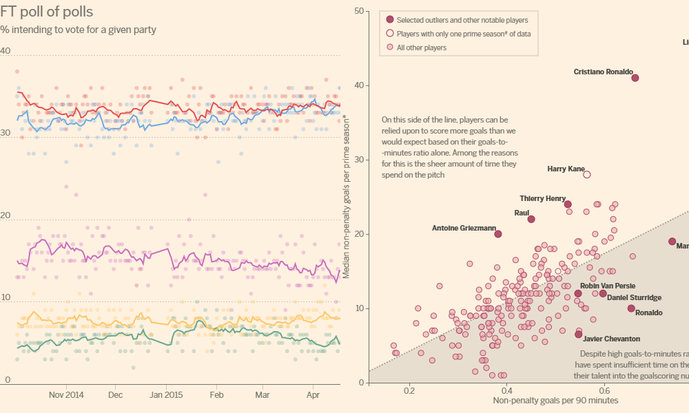
What’s happened to the trust?
I’m posting this as a separate discussion thread but in follow up to the previous post about the Gun Crimes chart and the issue of confusion vs. deception.
What’s happened to the trust? Read More »
I’m posting this as a separate discussion thread but in follow up to the previous post about the Gun Crimes chart and the issue of confusion vs. deception.
What’s happened to the trust? Read More »
Overnight I saw quite a few tweets spinning off an article ‘How to Lie with Data Visualisation’. Initially, I mistakenly thought this had been written by Aatish Bhatia but it was actually from Ravi Parikh. It is a good article picking up on some of the classic subjects of our ire (Fox News, truncated y-axes).
The fine line between confusion and deception Read More »
At the end of each month I pull together a collection of links to some of the most relevant, interesting or thought-provoking web content I’ve come across during the previous month. Here’s the latest collection from February 2014.
Best of the visualisation web… February 2014 Read More »
As I mentioned in my previous post, many moons ago, I am giving a talk at the OpenVisConf in 3 weeks’ time. The title of my talk is ‘The design of nothing’ and in this last post I reached out for people to send in stories or examples related to this matter.
Request for your 6-second acting skills! Read More »
In one month from now the 2014 OpenVisConf will be held in Boston, MA. Having watched coverage of the inaugural 2013 conference from afar (check out the highlight reel and watch the talks, it looked super) I am thrilled to be one of the chosen few to join the speaker line-up for this year’s two-day event.
The design of nothing: Contribute examples to my OpenVisConf talk Read More »
This morning I tweeted an interesting observation made on BBC News discussing the missing Malaysian airline “We are now not used to no information”. It is entirely true. In this age of so much, any gaps become so extraordinary.
Nice story about the impact of a visualisation Read More »
I was really interested to see the Sunlight Foundation share details of its internal ‘Data Visualization Style Guidelines’ the other day. Whilst I’ve not had chance to take a magnifying glass to the specific details of advice, I am impressed with how they have framed this document.
Visualisation style guide at the Sunlight Foundation Read More »
Just a little update about things relating to this site. I am currently working behind the scenes with a couple of bright design and developer minds on a brand new website and design identity.
Quick update on the site Read More »
At the end of each month I pull together a collection of links to some of the most relevant, interesting or thought-provoking web content I’ve come across during the previous month. Here’s the latest collection from January 2014.
Best of the visualisation web… January 2014 Read More »
They (human people) say the key to comedy is timing. Well timing is also a key factor with regards to blogging, certainly when covering particular subjects. So a write-up of Tapestry Conference 2014, which took place almost a week ago, is already tiptoeing sheepishly outside the ‘news cycle’.
A short reflection about Tapestry Conference Read More »