Updated data visualisation training schedule
I’ve recently added a number of new events and locations to my public data visualisation training workshop schedule.
Updated data visualisation training schedule Read More »


I’ve recently added a number of new events and locations to my public data visualisation training workshop schedule.
Updated data visualisation training schedule Read More »
To mark each mid-year and end of year milestone I try to take a reflective glance over the previous 6 months period in the data visualisation field and compile a collection of some of the most significant developments.
10 significant visualisation developments: January to June 2017 Read More »
At the end of each month I pull together a collection of links to some of the most relevant, interesting or thought-provoking web content I’ve come across during the previous month. Here’s the latest collection from June 2017.
Best of the visualisation web… June 2017 Read More »

After a long time sat patiently on my would-like-to-do list I am delighted to release a new project titled ‘The Chartmaker Directory’.
New project: The Chartmaker Directory Read More »

Sometimes, site editors like me are ignorant to the fact their RSS feed is not working and that thousands of keen readers and potentially valuable customers are cruelly being denied access to this rich array of award-winning and award-losing content.
Visualising Data RSS feed Read More »
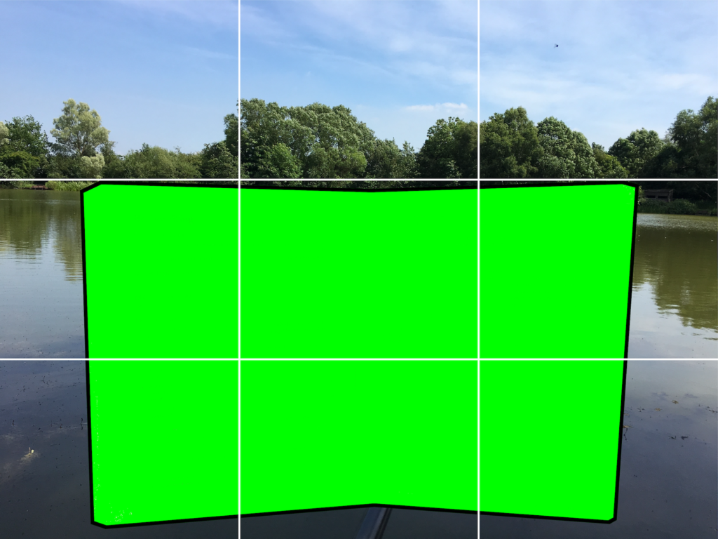
I recently passed the 1 year anniversary since my book was published and I was thinking about how I might mark this event. Regular visitors to the site over the past few years will know that I’m somebody who is up for running the occasional experimental or creative activity with my readers and followers.
Help me create a gif flipbook of my book Read More »
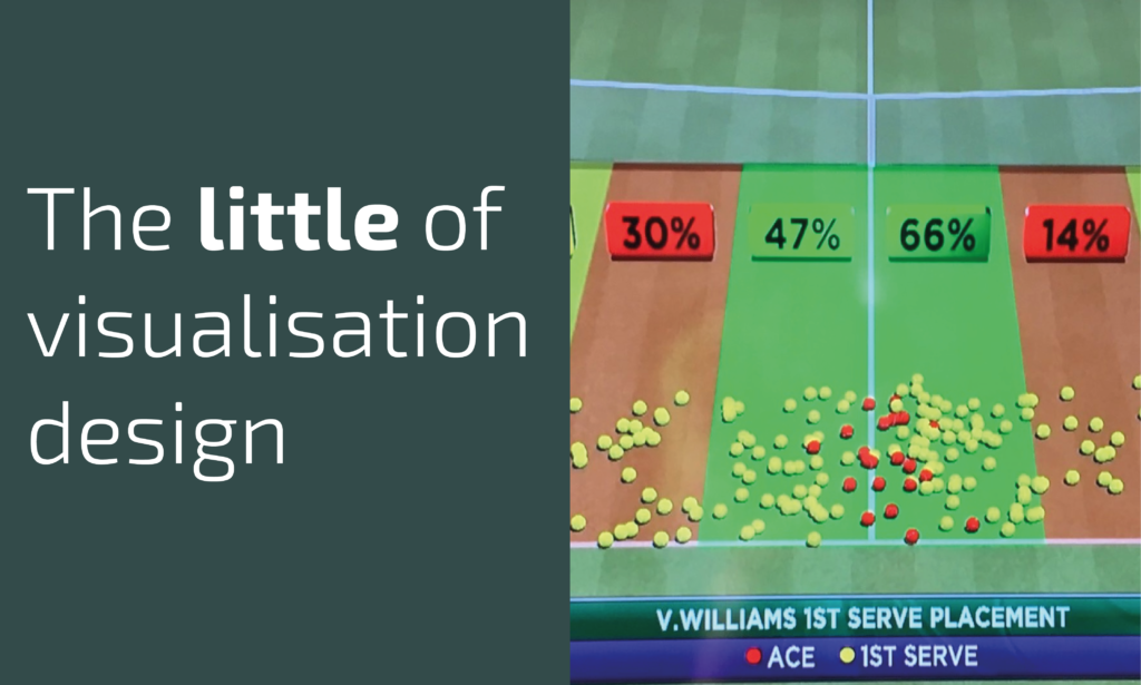
This is part of a series of posts about the ‘little of visualisation design’, respecting the small decisions that make a big difference towards the good and bad of this discipline.
The little of visualisation design: Part 41 Read More »
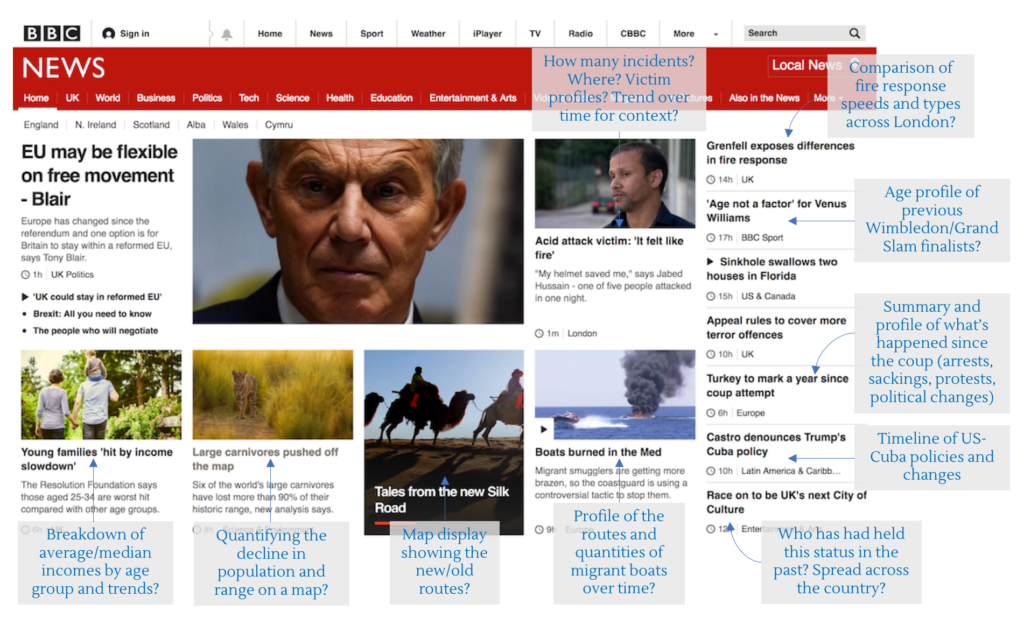
One of the standard pieces of advice I (and most others in a similar position) give to people looking to develop their data visualisation skills is to constantly seek opportunities to practice. Every task is different, every dataset presents new challenges
Think like a journalist Read More »
At the end of each month I pull together a collection of links to some of the most relevant, interesting or thought-provoking web content I’ve come across during the previous month. Here’s the latest collection from May 2017.
Best of the visualisation web… May 2017 Read More »
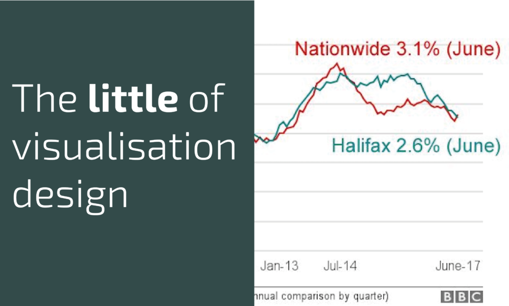
This is part of a series of posts about the ‘little of visualisation design’, respecting the small decisions that make a big difference towards the good and bad of this discipline.
The little of visualisation design: Part 40 Read More »