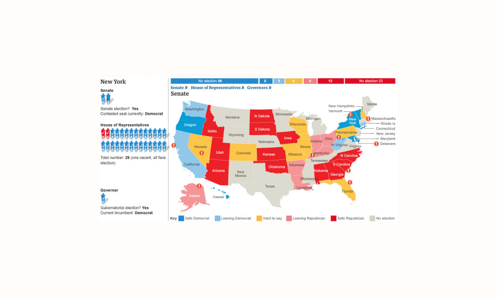
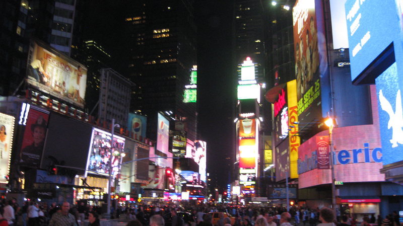
Andy Kirk

Newsweek’s ‘Best Countries’ interactive

Just come across a very slick interactive published on Newsweek, designed by Thomas Klepl and Adam Clarkson. The graphic presents information around Newsweek’s study of health, education, economy and politics to rank the world’s top nations. The interactive allows you to explore all the data for each country, based around a dynamic parallel coordinates type […]

Newsweek’s ‘Best Countries’ interactive Read More »

Visualisation Reflections: #1 The visualisation designer

This is a follow-up post to my first article in the Visualisation Insights series which I published last week. The purpose of this companion series is to optimise the learning opportunities from each insights article, reflecting on the ideas, issues and observations to emerge. Visualisation Reflections #1 Visualisation Designer | Michael Deal Why did I

Visualisation Reflections: #1 The visualisation designer Read More »

Visualising the Wikileak’s war logs using Tableau Public

Further to yesterday’s post about the Wikileaks Afghanistan War Logs, the Guardian datablog has published a post today describing how their data journalism operation worked. This reveals some interesting insights into the way the investigation team went about handling, analysing and interpreting all this data in order to unearth and present the key stories. They

Visualising the Wikileak’s war logs using Tableau Public Read More »