The last 72 hours or has been fairly crazy in the land of Visualising Data, with some notable visualisation stories and discussions popping up in various news and media channels.
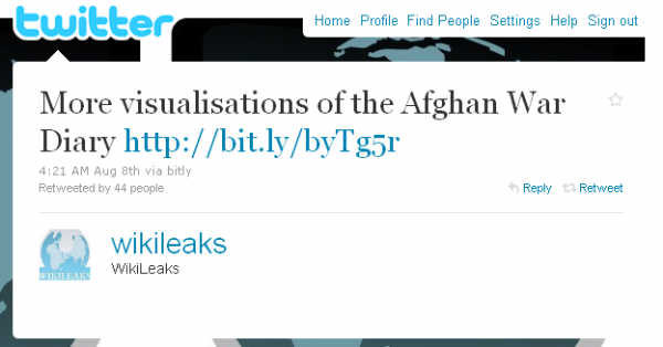
Firstly, on Sunday, the Wikileaks organisation picked up on my Tableau visualisations post and tweeted a URL to my site which led to visitor and page view counts going through the roof.

Then on Monday, Wired magazine’s Danger Room section did a piece entitled “Open Source Tools Turn WikiLeaks Into Illustrated Afghan Meltdown” which also featured my tableau visualisations alongside those of NYU political science Ph.D. student Drew Conway.

Last night on UK television Information is Beautiful designer David McCandless appeared on the BBC programme Newsnight to discuss the subject of visualisation. UK viewers can watch the debate here (it starts after 26 minutes).

As many others have already commented, it was disappointing to witness this potentially interesting discussion descend into an unnecessarily semi-confrontational debate. The host Kirsty Wark facilitated the discussion as if she was dealing with less-than-forthcoming politicians and the designer Neville Brody was obsessed by some cultural/political observation about the last 25 years since Thatcher came into government and seemed intent on undermining David’s work and observations, dismissively commenting that some of it was just “pretty pictures”.
The core reason for this segment was supposed to be about profiling the emergence of visualisation and its importance in making the vast amounts of data we are faced with these days more accessible and engaging through innovative and effective information design methods. Unfortunately, it didn’t quite work out this way, but at least it put the subject on a mainstream platform and stirred more debate which is always a good thing.
[Incidentally, David McCandless has kindly agreed to be the subject of a future Visualisation Insights article, so watch this space…]
Finally, Creative Review have followed up David’s appearance last night with their own article reflecting on the discussion, presented in the context of one of their previous posts concerning Barnbrook’s Little Book of Shocking Global Facts – they included a mention about my article about this subject ‘Worst graph design ever?‘.
They also took the opportunity to put down a marker for the September issue which will include an article by Nicholas Felton about visualisation design which should be a fascinating read.

