This is part of a series of posts about the ‘little of visualisation design’, respecting the small decisions that make a big difference towards the good and bad of this discipline. In each post I’m going to focus on just one small matter – a singular good or bad design choice – as demonstrated by a sample project. Each project may have many effective and ineffective aspects, but I’m just commenting on one.
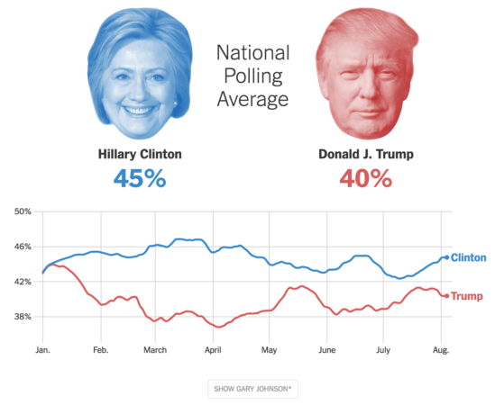
The ‘little’ of this next design concerns interactively handling outlier values or series. The project in focus here is the latest ‘2016 Election Polls‘ by Wilson Andrews and Josh Katz, plotting the ebb and flow of national polling averages for the presidential nominees over time.
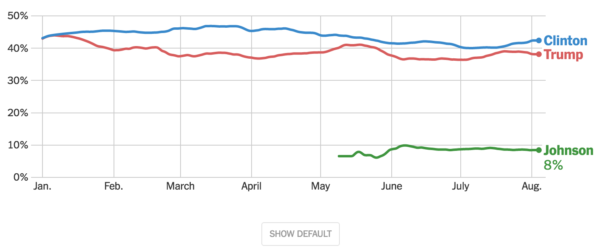
With T***p and Clinton dominating the election narrative, it is easy to forget (especially for non-US people like myself) that there are other independent candidates in the race, albeit with a significantly lower share of the polling numbers. That’s where the ‘Show Gary Johnson’ button comes in.
It makes sense to editorialise this project and just present analysis (in its default state at least) relating to the two main nominees. The chart’s y-axis scales are therefore designed to best fit these higher value series. However, by offering the ‘Show Gary Johnson’ button, readers can reveal the polling data for Johnson at which point the chart is reconfigured with the y-axis origin set to zero in order to reveal these lower value trends.
I love this feature so much I will do my utmost to ensure ‘Show Gary Johnson’ becomes permanently woven into the lexicon of this field.


