

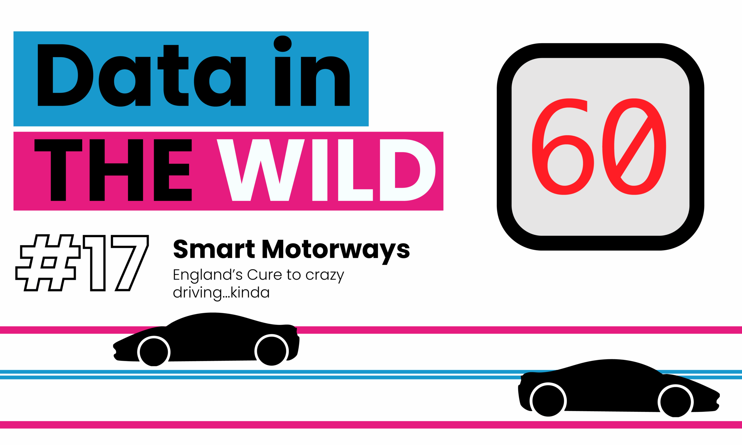
Data in the wild #17: Smart motorways
Smart motorways are quietly shaping how we drive. That sudden drop from 70 to 50? It’s not random. Sensors and systems are predicting traffic before it happens, slowing everyone down to prevent jams. It’s data controlling the road in real time… the question is, do we actually trust it?
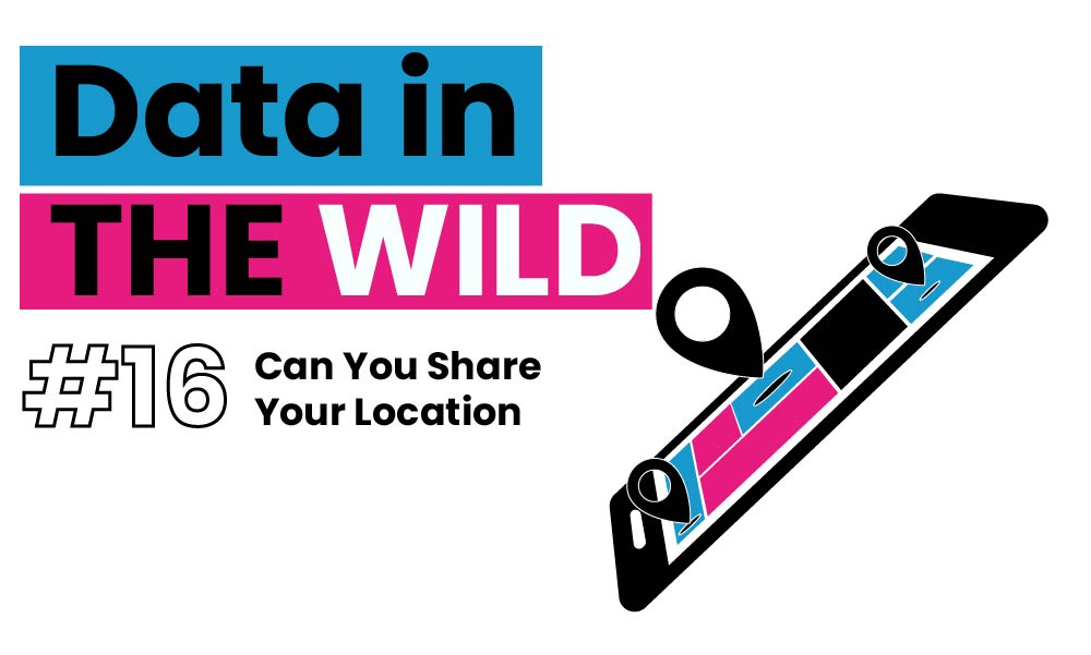
Data in the wild #16: Can You Share Your Location
In this edition of Data in the Wild, I explore what it really means to “share your location.” From GPS and Wi-Fi to ship tracking and TfL demand modelling, this piece unpacks how geolocation works, where it shows up in everyday life, and what we can build when movement becomes data.

Data in the wild #15: The Data Behind Fireworks
Fireworks don’t just light up the sky they’re shaped by data. From wind modelling to sound limits, invisible thresholds decide what counts as “safe fun.” This Data in the Wild piece explores how decibels, maths, and regulation quietly shape one of our most beloved celebrations.