
2023 has seen an explosion in the buzz of new developments and discourse surrounding all things to do with Artificial Intelligence.
After the recent hype surrounding the Metaverse and NFTs it can be tempting to dismiss all the talk around AI as just the latest passing gimmick, but when you cut through the distracting noise – and centre in on the specific products of AI – its clear we are facing a significant new era of technological progress.
In this series of posts I’m attempting to take stock of what I know, what I don’t know, what I think, and what I can only speculate about in relation to advancements in AI and what this means for my world: its impact on data visualisation.
I’ve been delaying writing this piece for months. The pace of change is so rapid, as is the expansion in the accompanying discourse and amount of reading to try learn from. There’s frankly too much to comprehend, but rather than delay further and wait for an elusive moment where I feel ‘on top’ of this subject (which will never arrive), its time to go ahead and publish.
To establish clarity in your conviction of what you know and don’t know about a subject, I always feel you can start by challenging yourself to write something about it for others. Having had a lot of discussions with colleagues in the field at various points over the year, I get the clear sense that there are lots of us trying to make sense of all this and probably struggling to easily box it all up into clear containers of understanding.
I see these posts as being akin to sharing my notes, passing on my bookmarks, and generally lowering the rope ladder to help others ascend to the next level of awareness, even if that is still somewhat scattered and rudimentary. I would expect some of this will be either obsolete, out-dated, or missing whole swathes of relevant references within months, as developments continue. But it can also serve to draw a line in time and say this is what I was thinking about now.
This post was a one-parter, then became a four-parter, then eventually back to two. There’s a fair amount of stuff to wade through here but it feels simpler to bundle it into two distinct companion pieces. Across each part there are several distinct headings as I attempt to bring some coherence and organisation to this wide-ranging topic:
In PART 1 I attempt to make general sense of the topic of Artificial Intelligence, presents the emerging common generative AI products, offers a further collection of somewhat-diverse general reading references about the subject that I’ve found helpful, and closes by highlights some of the techno-ethical issues and risks being raised.
In PART 2 I look at the subject more specifically through the lens of data visualisation, as I consider how AI could be applied or could be beneficial to any of the different discrete tasks that go into the preparation, conceiving, and production of a data visualisation solution. This section also includes a (current) collection of some of the data visualisation tools that have launched with explicit AI integrations.
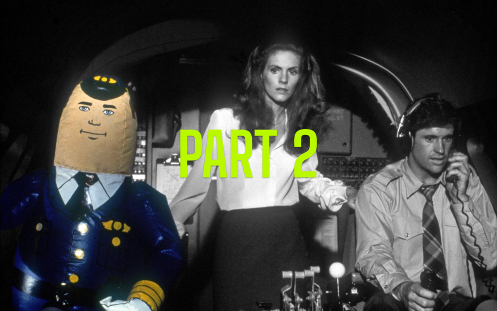
The choice of featured image for this article portrays Otto, the inflatable autopilot seen in the 1980 classic movie Airplane. It captures my summary feeling that the role of AI in data visualisation will be (should be) to offer smart assistance on objective, repetitive, or complicated tasks that then better enable human creators to focus their energy on tasks that are inherently subjective and/or creative.
PART 2
How might Artificial Intelligence affect the data visualisation design process?
This is a catalogue of thoughts about the ways Artificial Intelligence may have an affect on the data visualisation design process or, perhaps, how I hope it could have an affect. It is a mixture of applications relating to both the visible and the hidden steps of developing a visualisation, and covers both the perspective of benefits when creating and consuming visualisations as viewers.
I’m approaching this primarily from a hopeful perspective, considering positive ways our working practices may be helpfully assisted or enhanced. Some of the ideas logged are formed by my own speculation or imagination – certainly around things I would find helpful – others are applications or features already in evidence and/or proposed by others. In each case I’m thinking about things that I would find helpful to make my work more efficient, more reliable, and most suitable for its purpose.
It is reasonable to acknowledge that I might propose ideas here that already exist as a feature of a tool, but I’ve just not yet encountered them. Furthermore, I might be proposing some ideas that aren’t explicitly demonstrating an application of Artificial Intelligence, rather they’re just features of computational efficiency or power. Though I tried to make sense of that distinction in the first part, the boundaries can be somewhat blurred (not least by tools and vendors of those tools claiming their latest shiny thing is an AI thing when its probably just a conventional, but useful, feature of technology in general).
VISUALISATION DESIGN PROCESS
I can see the benefit of a standalone data visualisation AI co-pilot, not integrated into any vis-creating tool, that could assist a creator navigating through the whole data visualisation design process and facilitate the decision-making involved:
- Offering prompts for the immediate next steps in a process and the tasks ahead beyond that, given what creative path is/paths are emerging as informed by previous workflows (but not ignoring all possible paths, in case it mis-reads what your current project is shaping up to be)
- From a time-management perspective, helping to convey overall progress achieved and what remains in terms of potential time commitment, having monitored task durations from previous processes
- Learning from previous processes to advise on typical approaches (eg. usual preferred style of gridlines in a bar chart) or, when progress is slowing, offering suggestions for for going back a few steps to maybe explore new aspects of the data, if few new insights have been discovered so far
- Presenting a repertoire of potential options to enable progression at each step of the design process (akin to Tableau ‘show me‘ feature but widened to all steps). Those options offered should come with guidance about what will influence each choice, blending empirical rules, real-world context (‘it depends’), but also to nudge instinctive judgments where relevant.
PRE-LAUNCH EVALUATING / EVALUATING THE WORKS OF OTHERS
I can see a lot of value in having a near-final piece of work being evaluated by an automated device. Often this step would be done by the creator themselves, trying to detach from their proximity to their work and occupy the mindset of a typical audience member. It may instead be conducted by a colleague or nearby acquaintance. It could be very useful to have an AI-based process that acts as a viewer evaluating the effectiveness of a visualisation design. This could be applied both to the work you create (pre-launch) and the work you encounter (created by others).
- You could have different viewer profiles, from vis-expert-level, through domain-expert-level, to lay-person.
- The expert-level would be the equivalent of a visualisation designer, checking the finer details of the design through the prism of the universal principles of visualisation design, including matters like the level of trustworthiness, the degree of accessibility, and judgements around design elegance.
- Trustworthiness – Are there any reasons to doubt the reliability of the data material (sources, assumptions, handling, calculations, inclusions or exemptions) or the design of that data (distortions, incorrect chart construction, obfuscated design choices)
- Accessibility – The accessibility check would be especially beneficial for creators who do not have obstacles being able to anticipate and understand what barriers may inadvertently be present – assessing different layers of visual accessibility, physical accessibility, technical accessibility, perceptual accessibility, and interpretive accessibility.
- Elegance – This would always be extremely subjective, even for humans, but you could calibrate the evaluation to specify context-relevant definitions in order to check if your desired design aims have been accomplished, such as is it beautiful, is it balanced, is it memorable, is it appealing, is it attention-grabbing, does it feel authoritative? Very subjective but could be useful assistance in a ‘quick-pass’ sense.
FACILITATING UNDERSTANDING
The purpose of a (useful) visualisation is to facilitate understanding so an AI assistant that enhances this process would be invaluable. This could be applied again to check the work you create (pre-launch) – to check the things you are expecting to be seen and understood are indeed the things that will be. It will mainly be, though, to assist recipients of visualisations to aid their reading, interpreting, and comprehending, especially if they have accessibility obstacles. I’ve seen enough snippets of examples to suggest this is already being demonstrated in certain tools, especially with voice assistance developments, so not a new idea but logging for completeness.
- This could be delivered as text output (via some integrated chat box) and/or voice audio output.
- What does it show (perceiving) – going through the charts apparatus (title, what’s on the x-axis, y-axis), using pattern recognition to describe the key features of the data plotted (stand out shape, size observations, trends, commonalities or differences)
- What does it mean (interpreting) – given the subject matter what can we derive from this display, what is significant or notable? What is good or bad?
- What does it mean to me (comprehending) – humanising it, what could the viewer take from this, do with this, feel about this, act on this?
- This could naturally be extended to help with translating visualisations created in a different language, both for recipients and for creators.
CONTEXT AND INTENT
These are contextual matters to do with definitions, requirements, and the aims of any given visualisation creating task, whether it be for a one-off bespoke solution or something that will be more recurring.
Audience: Picking up on features alluded to above, could an AI feature emulate the characteristics of a target audience profile to check if the visualisation is designed appropriate for them? Maybe, looking at it from a different side, AI assistance could propose what kind of audience characteristic your work would seem to align with.
Deliverables: This is a feature that is partially available in certain tools already (such as device previews in Tableau dashboard design mode) but could be enhanced significantly to help you envision your visualisation design output as previewed in a wide range of different formats, dimensions, and settings.
- For digital this would preview the output from mobile, tablet, laptop, desktop, meeting room monitor or projector, a home TV screen, to conference hall, and across different output channels like social media, within the page of a web article, as a backdrop to a TV news report etc.
- For print it would naturally be to preview a range of output sizes but extend to envision these in different physical contexts like a printed report being flicked through in a meeting or a newspaper graphic being read at a coffee table, a poster being seen on a wall, a map being used on the move, a physicalisation being explored in a gallery
- For digital or print, scenarios of them being seen inside vs. outside, day time vs. night time, in busy situations or calm, with other people or alone.
- As you simulate these different outputs it could then make suggestions for how each could be refined to be responsive to each (such as suggesting different font sizing, chart orientation, content sequencing, transitions, level of detail included or excluded.
- Assistance could be provided to help anticipate how long a visualisation may take to fully read, interpret, and comprehend so you can, perhaps especially, shorten the potential encounter.
Presenting: If the work being produced is intended as a visual aid to accompany a person presenting the key insights verbally, it isn’t hard to imagine having presenter’s commentary notes being prepared to help narrate the discoveries. It could also be a nice feature to imagine a static chart being unveiled in a way that makes it appear animated (and would normally require such choreography to deliver this) so as you present, more chart features and contents begin to show up on screen.
Frequency: The ability to update the data behind an otherwise one-off or very bespoke, hand-crafted visualisation design, would be transformative for many I’m sure.
Sensitivities: Throughout the design process, useful prompts could be offered to suggest any potential consequences of existing design choices with respect to external matters like political, cultural, legal, environmental sensitivities.
Technological: I’ll come more on to chart-making tools later but one feature that would be helpful is anticipation of how particularly heavy technical solutions may risk causing platform compatibility issues, speed reliability and performance consistency concerns, or data processing loads that would undermine the user’s experience.
Creative ideas: Any generative tool that offers enhanced means to digitally sketch concepts and initiate creative thinking, quickly and convincingly, will be useful. Furthermore, using smarter searching (which in many ways is what a lot of the AI products do) you could more surgically source examples other relevant works for inspiration, whether it be about the topic you’re analysing or the style of work you’re pursuing.
Styling: Could AI learn your techniques, your design style, or preferences, in order to suggest refinements as you work through the process? This would be especially relevant when working in a corporate environment that has with formalised design guidelines and branding rules to observe (and therefore these parameters would be fed into the AI tool). With further developments in gen-AI tools like DALLE-2 or Midjourney it isn’t inconceivable to imagine them being used to offer styling suggestions based on prompts (this is a fairly primitive demonstration but gives a clue to the direction of travel).
SOURCING, HANDLING, AND EXPLORING DATA
Data examination: Tools with features that summarise the statistical descriptions and characteristics of data, or assist in configuring them to prepare for the chart creation stages, already exist, though I’m sure AI tools can make this process slicker.
Insights: The loudest noise about AI-based data tools – as you’ll see covered by those compiled below – tends to concern how they will make discoveries automated, to provide rapid insights on demand, and to extend the possibilities of predictive analytics. Though all that will be useful on many levels, though perhaps only with certain datasets or problem contexts, I’m less interested in that stuff because I have trust issues and would always want to and need to check those things myself. Maybe if such trust is earned then my opinion and attitude to these types of features will evolve. I can of course see the benefit, when working with new and/or big datasets, of at least receiving some automated ‘first pass’ discoveries or suggestions of relevant exploratory enquiries to pursue further.
Qualitative sources: What I find most intriguing is the possibility of being able to unlock more potential from unstructured qualitative sources. To be able to accelerate the acquisition of structured data from source material like text, printed artefacts, imagery, audio, and video would be hugely beneficial.
Data finding: Receiving smarter suggestions for sourcing data will also be a great enhancement to the data vis process, especially when looking at niche topics or about subjects for which data will be fragmented and requires extensive manual foraging.
Advanced calculations: Using AI to enhance the data you have, and the calculations you draw from data, is unquestionably exciting, as demonstrated by this great piece by Harry Stevens for Washington Post – ‘A boat went dark. Finding it could help save the world’s fish.‘ – in which he describes using machine learning to find trends in illegal fishing that have been otherwise invisible.
Chart data extracting: I’m pretty sure something like this has existed for a while (maybe for d3.js generated visualisations?) but a feature that could reverse engineer a visualisation and output the data values plotted in to tabulated form could be useful, especially then to check the reliability of what’s been included.
VISUAL DESIGN
How might AI-tools assist in the creation of data visualisation designs is perhaps the ultimate question in all this. Again, this is a somewhat complex section to compile ideas for as the distinction between what computing, in general, can assist with and what AI, specifically, will assist with isn’t so clear cut.
My starting point will always be that my personal wish for any visualisation tool or feature (AI branded or otherwise) is for it to enable me to make (1) as many different charts as possible, and/or (2) to enable me to concoct recipes out of as many different encoding ingredients as possible, and (3) enable me to customise all aspects of a visualisation’s presentation design, and (4) do all the above with accuracy, with consistency, with flair, and with efficiency, in a user-friendly no-code/low-code way. Not asking much, am I!
Data representation: Some features I would find helpful on the chart-making front:
- Quick prototyping of different chart options to explore data from different angles but to also try out variation in chart designs in the sense of a ‘surprise me!’ type features. May be less about switching through individual ideas but seeing a large panel of mockup variations in a single browsable view for quick consideration (like the response to a Google images enquiry).
- Creating charts from written prompts, structured around data questions or ‘show me…’ commands, already is a thing (as you’ll see lower down, especially with tools like Bard and Noteable.io) and that is great because, for me, questions and curiosity are what this practice should be driven by
- Chart coaching, as you consider viable options beyond the binary “is this chart even remotely applicable?”, when there’s pros and cons for different paths, AI could articulate those pros and cons and help you weigh up your thinking around the trade-offs involved, especially based on possible adjustments such as “what if we added another 10 years of data to this analysis or included 10 further categories, would another option prove better”?
- Enhanced methods for generating non-visual representations, such as accessible tools for creating sonification based outputs (see AudioCraft below).
Interactivity: The potential inclusion of features that enable user-initiated dynamic adjustments, navigation through, and/or interrogation of data visualisations.
- The greatest potential assistance from AI features would be to enable the creating of interactive experiences to be more accessible (via no-code/low-code methods). Tools like ‘Make real‘, featured below, offer a very promising sketchy-point-and-click interface to achieve automated interface designs.
- Similarly, language-led prompts to describe what interactive features you want to enable and then the tool generates them in the design would be the most obvious enhancement I would consider extremely valuable.
- Offering smarter assistance in helping the user to consider and deploying potential features of interactivity by, once again, offering pros and cons and ways to navigate the trade-offs.
- Ignoring the no-code/low-code desire, there are new opportunities for people like me, who do not possess advanced skills in programming, to possibly more quickly find and deploy programmatic solutions, in languages we do not know, through the power of environments like Chat GPT. I have already found rapid solutions to help me automate a technical and repetitive task, using a specific package in Python, which I’d never had any experience with using.
Annotation: When developing visualisations annotation relates to the layer of assistance that helps the viewer’s understanding, so includes features like titles, intros, summaries, user guides, labels, chart apparatus, method statements etc.
- Lower down this page I include links to research that could offer automated means for writing better captions, which would be immensely useful – especially if it extends to the clever styling and positioning of such captions within a chart’s area. Even if these suggested captions only offer ‘first-pass’ draft text, the task of editing and refining is going to make things quicker than writing from scratch.
- These features for auto-generating captions could extend to title generating, whereby automatically proposing chart and/or overall visualisation project titles would be really useful, perhaps offering variations of question-style headings, statement/findings-based headlines, or more descriptive titles.
- Through the release of custom GPTs there is now scope for taking the language-driven prompting as experienced with ChatGPT built and trained on your own model to serve a specific defined purpose. This approach could be used to offer a dynamic environment for sharing and accessing information pertaining to user guides, chart-reading instructions, data definitions, data handling descriptions, source data access, method statements, and other FAQs.
- Making decisions about chart apparatus like axes, scales, tick marks, and gridlines is a combination of ‘do I need to include them’ and ‘if so, how will I include them design wise?’. AI assistance could be very helpful to preview the inclusion extent and design styling of different apparatus variations (ranging from heavy-duty with an emphasis on readability and precision, through to light-touch with an emphasis on ‘gist’)
- Auto-generating footnotes relating to data caveats, the basis of calculations etc. is something already available in some tools albeit in
- Auto-generating of data handling process descriptions could be recorded into plain-English based on all your actions from gathering, to cleaning, to calculating, and through to configuring your data behind the charts you include
- Auto-generating of body text (“copy”) is already a widely demonstrable feature of generative AI, such as with Elementor AI, albeit in the context of writing content for websites.
- Already mentioned above but the possibility of auto-translating into other languages would be an excellent enhancement, though possibly a slight risk in terms of probably not being something most creators could easily check for accuracy and/or appropriate meaning.
- It is a bit beyond the scope of my intention for this article but worth noting that, of course, there are many opportunities for the inclusion of photography, imagery, illustrations, video, and audio files to enhance a visualisation work. In their own way these separate creative media will each be exposed to/affected by/disrupted by/jeopardised by generative AI developments, with matters of copyright and the ethics of how they are created at the forefront of that concern, though beyond all that there could be some interesting enhanced avenues of creativity offered.
Colour: Data associations with colour scales and the overall functional decoration of your work are the primary concerns here
- Researching appropriate colour scales for different types of data is already established in many long-standing tools but its not hard to imagine how this could be integrated more seamlessly and more automatically into visualisation-creating tool environments.
- Suggesting colour palettes based on subject matter and/or tone could be a useful feature. Again, I can imagine a display offering a Google images type page full of preview mockup variations to enable you to compare and contrast the options. This wouldn’t just be about the data colours, but extend to the overall colour scheme of the background, the text, the interactive controls, all the chart apparatus etc.
- Perhaps an extended smart search could offer inspiration from other visualisation projects that have been based on topic X, technique Y, or style Z (read this demo of similar kind of prompting in ChatGPT by T from Data Rocks).
- AI-driven checks would help to automatically ensure compliance and/or compatibility with corporate colours, with visual accessibility, with the potential setting/environment a piece of work will be consumed in (eg. a large dark conference hall will require different colours for a visualisation compared to a small light meeting room)
Composition: Optimising the arrangement – the relative size, positioning, and ordering – of all your visualisation design elements, including charts, interactive controls and annotations within the space available comes down to that first word: optimising.
- I could imagine prompts for automatically arranging the layout of a dashboard or infographic based on layout suggestions like “make it breathe with plenty of empty space”, “organise around a five-column architecture” or platform requirements like “redesign for mobile” or “present over 5 discrete pages”.
- Modifying the layout to suit the regional differences in direction of reading, for example, could be easily handled by a smart tool (again, whether that is necessarily an AI thing or not, it’s going to be useful).
- So much work around composition comes down to nudging things, aligning things, resizing things to find that elusive visual balance, so the more this can be done automatically without having to try grab the edge of a selection range and shift it 1 pixel to the left, whilst on a dodgy tray table on a moving train, the better.
Some data visualisation tools with AI integrations
To offer a flavour of some the technical developments reaching the market to date this is a non-exhaustive compilation of some data visualisation tools now being released that are integrated with Artificial Intelligence based enhancements. It starts with some of the established ‘big hitter’ vendors and then briefly lists some other emerging offerings.
A warning: as many of these tools are emerging initially from the business intelligence/visual analytics corner of the technology market, there’s an awful lot of buzz-word bingo at play. It is common to find much identikit language and recurring terms being used like ‘augmented analytics’ and ‘automated insights’, or claims of enhancements married to words like ‘faster’, ‘deeper’, ‘quicker’, and ‘easier’. I’m always suspicious of such claims, especially when they are demonstrated only by using uncannily clean, simplistic, and conveniently optimum datasets (think of the classic products/sales/regions type demo).
Most data-related work I’ve experienced is complex, imperfect, and/or nuanced. Making easier the handling, analysing, and communicating understanding from such data sure sounds appealing. Far too often, though, processes that promise ‘easier’ often lead to things being made worse or overly-simplistic. Its unfair and overly cynical to presume that will be the case with these new developments, but its just a cautionary note to always judge each tool’s propositions of AI-driven enhancements based on proven, demonstrable merit and not just derived from its polished marketing speak…
Microsoft Copilot | Specifically, for data visualisation work, ‘Copilot in Excel’ which “works alongside you to help analyze and explore your data. Ask Copilot questions about your data set in natural language, not just formulas. It will reveal correlations, propose what-if scenarios, and suggest new formulas based on your questions-generating models based on your questions that help you explore your data without modifying it. Identify trends, create powerful visualizations, or ask for recommendations to drive different outcomes.”
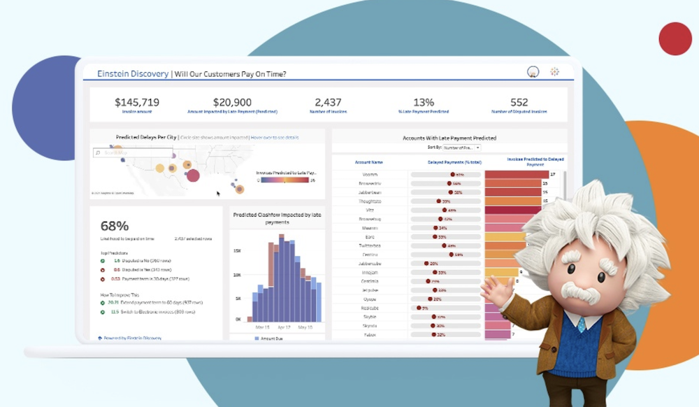
Tableau AI + Analytics Including AI-driven features such as ‘Explain Data‘, ‘Ask Data’, and ‘Einstein Discovery‘ | “Our approach to artificial intelligence (AI) is more than just an algorithm, it is driven by practical applications to help people and organisations answer pressing questions. Tableau builds transparent AI into its platform so everyone can easily understand how predictions and insights are surfaced and why they are relevant – helping you make smarter decisions right in the flow of analysis.”
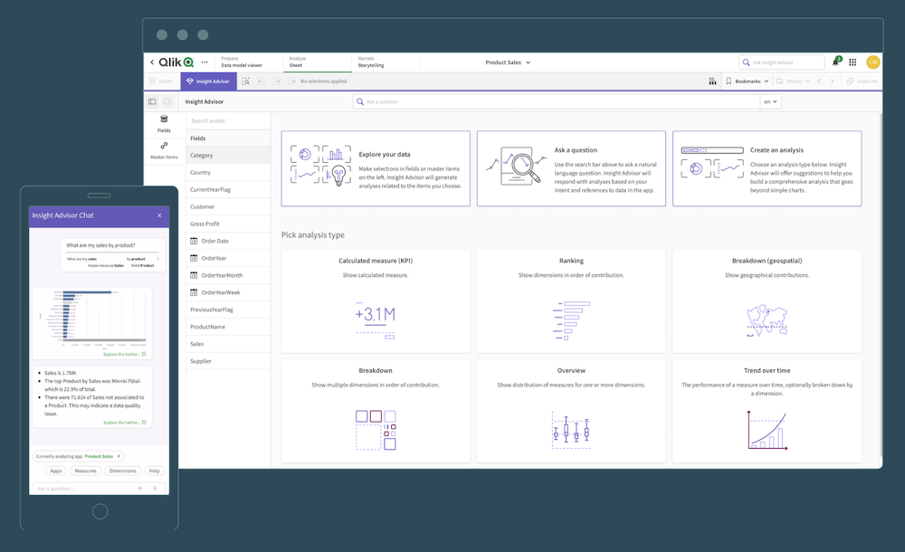
Qlik | “Qlik Sense enhances nearly everything you do with AI. Auto-generate advanced analytics and insights. Get assistance with analytics creation and data prep. And explore data more easily with natural language search, conversational analytics, and NLG.”
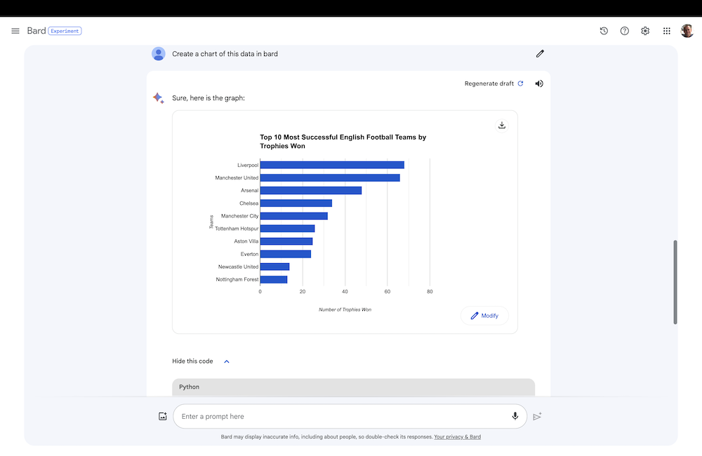
Google Bard | This is a demo using Bard to find data in response to a written prompt, create a table, then chart that data (also revealing the generated Python code). Here’s a written tutorial about a similar process.
Notable.io | “Now, users from all backgrounds can use natural language prompts to create computational notebooks with exploratory analysis, visualization, machine learning, and data manipulation.” (Read more here and here)
Advanced Data Analysis (ChatGPT Enterprise version) | This was until recently called Code Interpreter but has now been renamed. “A game-changing feature for not just programmers and data experts, but general users as well. Analyze data, test code, make charts, solve math, and more.” (read more here and here)
Highcharts GPT | “Create reliable and secure data visualizations in seconds with natural language inputs using human-like conversations.”
Columns.ai | “At Columns, we have integrated GPT-4 to enable us to type a single short prompt to get a data visualization.” (read more)
ThoughtSpot Sage | “An AI-powered search experience that puts LLMs to work on your business data.”
VizGPT | “Make contextual data visualization with Chat Interface from tabular datasets.”
KAWA 2.0 AI Assistant | “We believe generative AI will revolutionize the way you interact with applications. KAWA AI Assistant helps you analyze your data like never before, providing actionable insights and valuable recommendations. Make informed decisions with ease.”
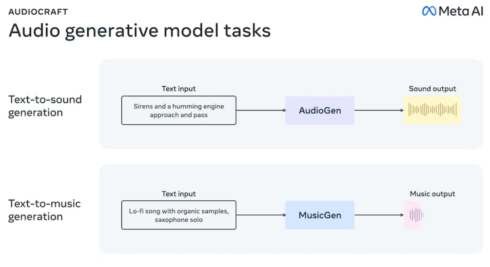
AudioCraft | “AudioCraft is a single-stop code base for all your generative audio needs: music, sound effects, and compression after training on raw audio signals.”
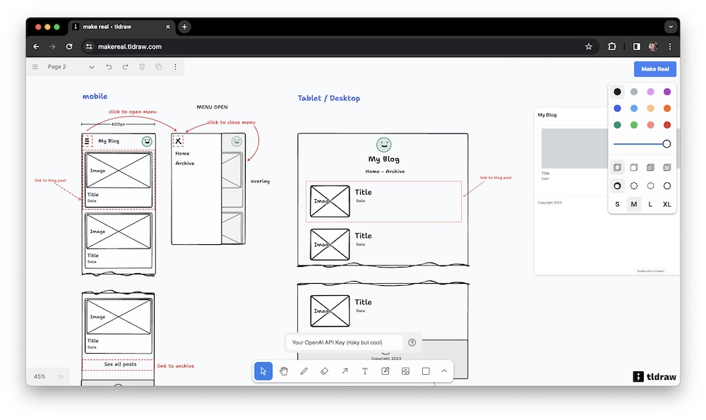
Make Real | “Ever wanted to just sketch an interface, press a button, and get a working website?”. Whether you wish to actually create a working website or more just develop the concept sketch, this tool, with its Excalidraw echoes, could be a very useful.
VisText | “Researchers teach an AI to write better chart captions: A new dataset can help scientists develop automatic systems that generate richer, more descriptive captions for online charts.”
Further general reading about AI and data visualisation
This is a collection of links to articles and videos about the intersection of data visualisation and Artificial Intelligence that I’ve found to be helpful, both for broader understanding as well as relevance to thinking about its impact on specific aspects of data visualisation.
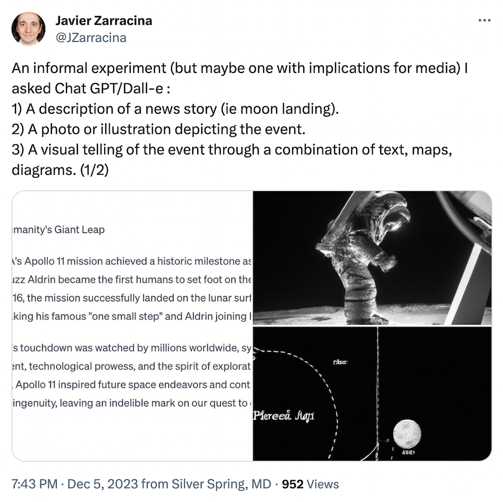
Javier Zarracina | ‘An informal experiment (but maybe one with implications for media)…’
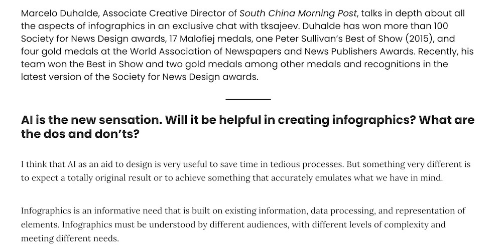
Nightingale Magazine | [Interview] ‘Marcelo Duhalde’s Graphics Bring Journalistic Investigations to Life’
Chad Skelton | [Video] ‘ChatGPT Code Interpreter vs Noteable Plugin: Which is best for data analysis?’
Tim Ngwena | [Video] ‘ChatGPT Code Interpreter vs Tableau | ChatGPT, Tableau GPT & LLMs’
The Information Lab | [Video] ‘How To Use AI To Help You Viz Something As Big As A Conference’
“Taking our AI challenge to the next level as Will Sutton tests if his AI co-pilot can help him visualise something as a complex as a conference!”
Data Viz Society Fireside Chat | [Video] ‘Data Viz: The Art of Insightful AI-llumination’