Welcome to the second episode of the fourth season of Explore Explain, a long-form video and podcast series about data visualisation design.
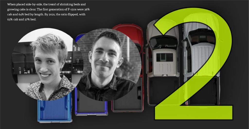
In this episode I am delighted to welcome Will Chase, Visual Stories Editor, and Jared Whalen, Data Visual Journalist, both working at Axios and based in the US. We explore the story behind their work on a project to visualise the changing trends in popularity and dimensions of pickup trucks ‘Pickup Trucks: From Workhorse to Joyride‘.
- Will’s tweeted process thread with loads of detail about creating the animated trucks sequence
- The copied ‘FuckCarsReddit’ version
- Nice article by Chesca Kirkland on Nightingale ‘Behind the Scenes with Axios Data Visualization‘
Video Conversation
You can watch this episode using the embedded player below or over on the dedicated Explore Explain Youtube channel, where you’ll find all the other video-based episodes and curated playlists.
Audio Conversation
To listen directly, visit this link or use the embedded podcast player below. The audio podcast is published across all common platforms (such as Apple, Acast, Spotify etc.), so you will find this series listed in their respective directories by searching for ‘Explore Explain’ or by manually entering – or copying/pasting – this url to your subscriptions – https://feed.pod.co/exploreexplain.

