This is part of a series of posts about the ‘little of visualisation design’, respecting the small decisions that make a big difference towards the good and bad of this discipline. In each post I’m going to focus on just one small matter – a singular good or bad design choice – as demonstrated by a sample project. Each project may have many effective and ineffective aspects, but I’m just commenting on one.
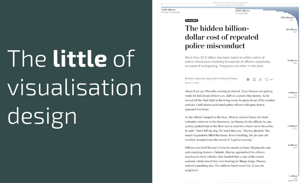
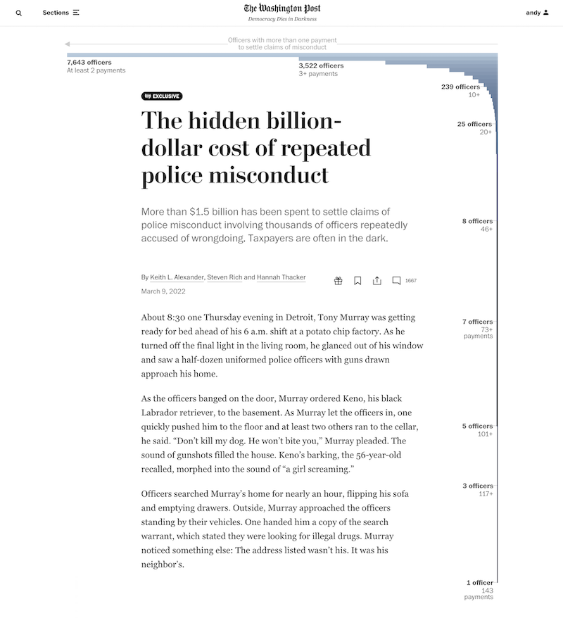
The ‘little’ of this design concerns a clever composition method to elegantly accommodate a very skewed chart shape into an optimum space on the page. The work in question comes from a Washington Post article titled ‘The hidden billion-dollar cost of repeated police misconduct‘ with the specific chart being the very first one you see starting at the top of the page.
This histogram presents analysis of the number of ‘officers with more than one payment to settle claims of misconduct’. As you can see, most officers have incurred 2 or 3 claim settlements, but as you glance further to the right, there are some staggering outlier values, with several officers being involved in over 100 settlement claims each, and one reaching the maximum of 143 settlements.
The decision to invert this chart and wrap it around the headings and opening sections of the article is very clever. Given its inherent ‘L’ shape, positioning this chart in any other location within the standard body of the (already very detailed and long) article would have occupied a large amount of space with much residual emptiness. Although this imagined emptiness could have been filled with captions, by going with this decision to position it at the top, as your eye embarks on reading the article, they simultaneously follow the chart’s plunging journey down the page and this, usefully, sets the scene for the topic.


