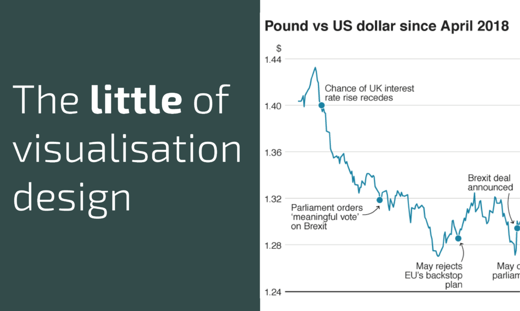
This is part of a series of posts about the ‘little of visualisation design’, respecting the small decisions that make a big difference towards the good and bad of this discipline. In each post I’m going to focus on just one small matter – a singular good or bad design choice – as demonstrated by a sample project. Each project may have many effective and ineffective aspects, but I’m just commenting on one.
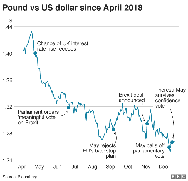
The ‘little’ of this next design concerns the often-discussed issue of a non-zero baseline. The work in question is a chart found in this article published on the BBC News website about the decline in the value of the pound vs. the dollar.
There is lots of debate about whether a line chart needs to start from a zero baseline position. Unlike the bar chart, for which the encoding is based on the perceived size of a ‘bar’ line, the line chart is based on a series of point marks along a quantitative scale joined by connecting line to reveal localised trends. It is the perceived slope of these connecting lines that really stirs the debate because any change in the y-axis, and indeed x-axis, scales alters the apparent steepness or flatness of the trend lines. My approach is, boringly, to take each chart on a case-by-case basis and focus on ensuring no confusion is created in the eyes and mind of the audience. More broadly, I tend to only commence from zero when zero means something significant to that subject.
Anyway, this post isn’t about covering that debate as such as pointing out how the simple use of a thicker, prominent stroke across the x-axis baseline can inadvertently imply that the associated y-axis value is zero. As you see in the chart above, the lowest value range is 1.24 not zero which can alter the interpretation of the relative downturn in the pounds fortune if you don’t pay close attention. I would have presented the baseline using the same style as the other gridlines, a thinner grey line, and maybe added a bit more empty space below to avoid any potential confusion (good further proposal here)./p>


