This is part of a series of posts about the ‘little of visualisation design’, respecting the small decisions that make a big difference towards the good and bad of this discipline. In each post I’m going to focus on just one small matter – a singular good or bad design choice – as demonstrated by a sample project. Each project may have many effective and ineffective aspects, but I’m just commenting on one.
The ‘little’ of this next design relates to a neat way of using redundant encoding in the design of football league tables published on The Guardian’s sports pages.
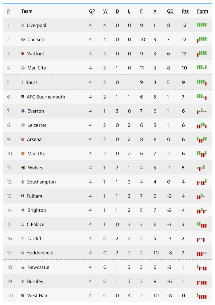
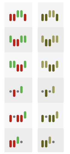
In the final column the table displays a recent form guide showing each team’s results over the previous five league fixtures. A green, grey and red markers indicate a win, draw or loss respectively. To help those viewers with red-green colour blindness you will see ‘redundant’ encoding (multiple attributes to represent the same thing) used in the form of a tall green marker pointing up for a win, a grey dot for a draw, a tall red marker pointing down for a loss.
Using the free colour-blindness simulator, Color Oracle, it seems the existing red green combination is not the worst pairing, with a darker red offset against a lighter green offering at least some degree of discernibility but probably not obvious association. With the additional encoding of marker lengths and direction, this helps to make it more so.