This is part of a series of posts about the ‘little of visualisation design’, respecting the small decisions that make a big difference towards the good and bad of this discipline. In each post I’m going to focus on just one small matter – a singular good or bad design choice – as demonstrated by a sample project. Each project may have many effective and ineffective aspects, but I’m just commenting on one.
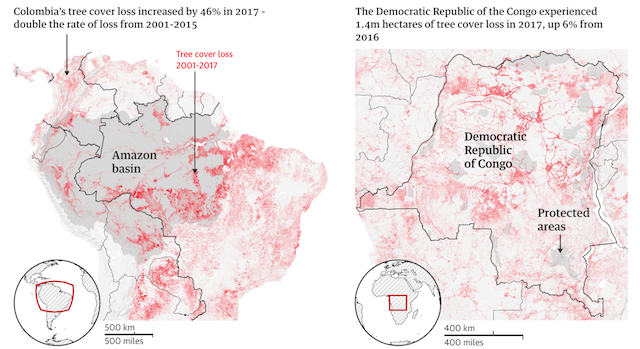
The ‘little’ of this next design relates to a subtle but smart thumbnail image that helps orientate the reader and demonstrates an important mapping principle. The visualisation in question is from a Guardian article about deforestation.
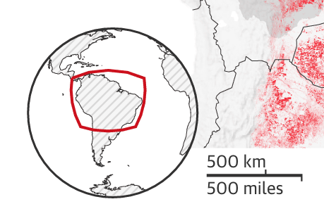
There are two adjacent maps showing areas where trees are and where trees have been lossed to deforestation across the Amazon basin on the left and Democratic Republic of Congo on the right. As you will see to the bottom left of each map, there is a thumbnail world view that orientates the reader to remind (or acquaint) them with the part of the world the view relates to.
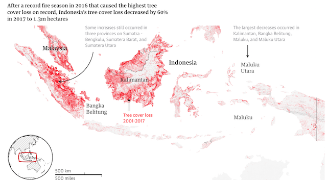
If you notice, the red marker showing the relevant map frame is a standard rectangle on the right but is a curved-sided rectangle on the left. This preserves the accurate representation of the underlying mapping projections that would have been used to form the related larger maps. The DR Congo is close in so maybe this would have been the Mercator, a different orthogonal projection is used for the Amazon view as it is almost continent-sized and you would want to minimise the distortion. There is a third map view, looking at Indonesia and Malaysia, that again offers a different shaped region highlighted in the thumbnail.


