This is part of a series of posts about the ‘little of visualisation design’, respecting the small decisions that make a big difference towards the good and bad of this discipline. In each post I’m going to focus on just one small matter – a singular good or bad design choice – as demonstrated by a sample project. Each project may have many effective and ineffective aspects, but I’m just commenting on one.
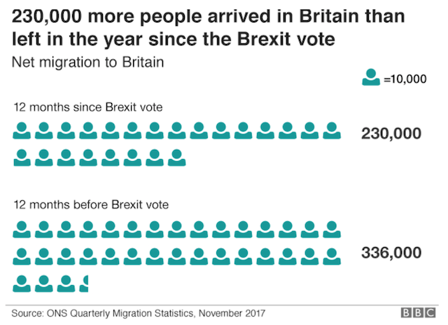
The ‘little’ of this next design comments on the unnecessary burden we can put on our readers’ brains to read what should otherwise be simple charts. The graphic in question is a pictogram taken from an article on the BBC titled ‘Brexit: What’s happening to migration?‘, illustrating the UK’s net migration figures in the 12 months before and after the Brexit vote.
There are two perceptual obstacles with the design of this chart. Firstly, the small icons representing units of 10,000 people works fine for the first value but not for the second, where the final icon has to be sliced up to 60% of its width to represent a unit of 6,000 people to make the final total count of 336,000.
The second issue relates to the composition of the chart and how it uses row blocks of up to 15 icons. As readers we can’t just fall back on our natural counting heuristic, grouping ‘chunks’ of units into 10s to quickly arrive at a total count, instead we have to count out the icons one-by-one to learn that there are up to 15 per row. This takes far too much time to make it worth the effort. You might argue the value labels tell us the values and the chart just offers a quick visual portrayal but in offering the units the eye is inevitably lured in to counting. It could have been so much quicker and easier using two sized-bars or shapes.


