With one week to go until a Christmas and New Year’s break that can’t come soon enough (I’m sure I’m not alone) I’ve been taking stock of the unfinished projects and not-yet-started work that intimidatingly occupy space on my to-do list. It has been a breathless year – a very good year – but one that has certainly led me to be behind schedule with a lot of things.
As much for myself as anybody else, here’s a list of ongoing, imminent and upcoming projects I’m working towards:
New website – The first version of visualisingdata.com was a classic off-the-shelf wordpress blog: very long, very narrow, very hobbyist in style. In 2014, I unveiled a totally new design reflecting a more professional and contemporary style but this too has now reached a point of needing not just a new lick of paint but a whole new structure. I particularly need to improve the mobile-friendliness and probably just lighten the content a little. Anyway, this will be something I want to launch in the first quarter of 2018.
Blog posts – My busy year has had most negative impact on this website which I feel has suffered from insufficient attention and a below average stream of postings. I have so many draft posts building many of which I fear may be easier to discard than convert into a full piece but I do have some ideas for new series of articles that make it much easier to keep the momentum going, like the (thankfully) popular #LittleVis series. Watch this space for those… I will be continuing, for ever I suspect, the usual monthly compilations of the ‘best visualisation content’ and in the next week will be publishing my latest 6-monthly view of the ’10 most significant developments…’.
The Chartmaker Directory – I will be redoubling efforts in 2018 to continue populating and expanding this directory with a particular goal being to grow it closer to a state whereby the empty cells truly mean a tool cannot offer a means to make a given chart. Again, a reminder that this directory is open to contributions from people out there – if you have an example or a solution of a chart being made in a given tool then please submit your reference! Also need to address one or two minor bugs.
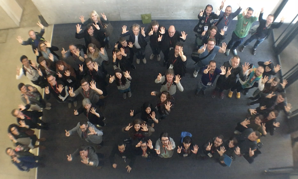
Malofiej documentary – You may have seen me tweeting about this project – and from this post in April. This was a personal project to return to Malofiej 25, after having been a judge and speaker at M20, and record a relatively informal, lo-fi documentary about what makes this event such a special experience. Matt, my fellow producer, and I have been working to edit down the huge amount of footage we took to create a series of thematic episode videos. We have been trying to work out the most fitting time to release them and the current thinking is to align with the build up to Malofiej 26 which takes place March 14-16.

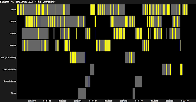
Seinfeld visualisation – I have been trailing my work on this project for a while now, especially in my training workshops, but for everybody else this is a passion project of mine motivated by a curiosity about the rhythm and structure of Seinfeld, all 180 episodes. My brother in law has done a wonderful job collecting primary data, at 5 second intervals, about the scene structures, which characters appear in a scene, who gets the laughs, which locations they are in etc. I now have a dataset comprising ~250,000 records offering a rich exploratory pool to work with but a diary that offers almost no spare capacity to undertake it. I therefore expect to seriously commit time on this from April onwards with the intention of a summer time project release.

Second edition of my book – Although you might feel that my book was only published quite recently (and I certainly do!), due to the long timescales involved, from around Spring 2018 I will commence work on the second edition of this title ahead of a 2019 publication. Any new edition will always and only ever be a refinement of the content, an updating of examples, a tweaking of concepts and the correcting of any mistakes so please don’t NOT buy the current edition waiting for this next one to emerge!
#VisBookFlipBook – Having strode past the critical 50% completion mark I will be continuing to invite, encourage and demand contributions to this (possibly) groundbreaking project, compiling reader photographs of every 2-page spread in my book. If you own the book then please consider submitting! When completed I will be looking to create an interactive device to let people sneak-peek through every page of the book via these photographs possibly with some accompanying map interface to plot the parts of the world from where the photos came.
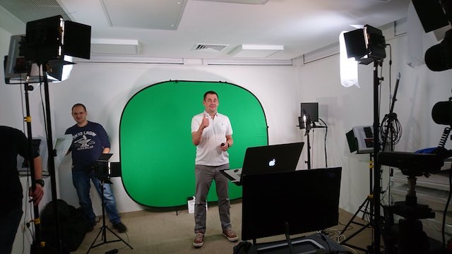
SAGE Campus – Another large activity I’m working on now with my publishers Sage is to develop an online data visualisation course as part of their new ‘SAGE Campus‘ venture. This has been an entirely different type of teaching design and delivery experience to my normal in-class sessions but I’m working with some excellent instructional designers and technicians Nick, Sibila, James and Ryan.
Social Science Foo Camp – I am really delighted to receive a special invitation to participate in a new chapter of the O’Reilly ‘Foo Camp‘ focusing on matters around social science. The event takes place early February 2018 at Facebook HQ in California and I’m sure will be a very interesting, rewarding and probably unusual experience!
Normal work stuff – beyond all this I will be continuing to flood my diary with public and private data visualisation training workshops. Having done 34 during 2017, I have managed to line up 11 alone in the first quarter of 2018, which runs alongside my teaching on the MSc Business Analytics programme at Imperial during February. I may be looking to broaden my public event locations, especially in the US later in the year but if you have a burning desire for me to schedule an event in a location near you, please just get in touch! As well as several client consultancy projects to juggle early in 2018 I have ongoing and growing commitments on some really fascinating projects with Arsenal FC. Would love to share them publicly (as many ask me to) but alas I can not.


