This is part of a series of posts about the ‘little of visualisation design’, respecting the small decisions that make a big difference towards the good and bad of this discipline. In each post I’m going to focus on just one small matter – a singular good or bad design choice – as demonstrated by a sample project. Each project may have many effective and ineffective aspects, but I’m just commenting on one.
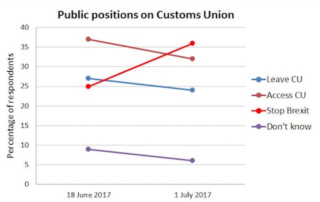
The ‘little’ of this next design concerns making small changes to eliminate unnecessary brainwork imposed on your reader. The chart in question was published by Mike Galsworthy on Twitter and analyses some data from Survation’s tracker on the Customs Union.
As you can see there is a colour legend positioned on the right that explains the series representation of each line in the chart. The inefficiency here is created by the distance that exists between the legend and the series lines themselves. There is an unnecessary amount of extra brainwork required to store the colour meanings from the legend and then retrieve these associations when focus is moved over to the task of reading the chart. With the colour hues being quite similar it is quite easy to forget which line represents which opinion, especially as the legend ordering does not match any value ranking.

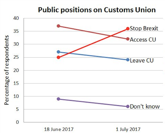
This is a very crude cut-and-paste reworking to illustrate how the burden on the brain can be reduced by moving the series labels alongside the relevant lines. In this case I felt positioning them to the right of the more recent values would be the most logical placement.
This is not a big issue (hence the post series title), the chart published is clearly intended to be a quickly turned-around piece of analysis and you can still see and process what the chart is showing. This is about how small decisions influence the optimisation of a visualisation’s accessibility: always seek to eliminate unnecessary thinking so that the brain can instead focus on the task of understanding what it is saying and what this means.


