This is part of a series of posts about the ‘little of visualisation design’, respecting the small decisions that make a big difference towards the good and bad of this discipline. In each post I’m going to focus on just one small matter – a singular good or bad design choice – as demonstrated by a sample project. Each project may have many effective and ineffective aspects, but I’m just commenting on one.
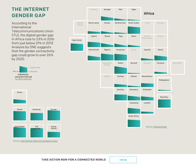
The ‘little’ of this next design concerns the inclusion of tangible ‘call to action’ instructions/invitations. For this I’m referring to a project developed by FFunction for the ONE campaign titled ‘Making the connection: How the internet can help end extreme poverty‘. This work, presented as a scrollable visual article, explores the inequalities of world wide access to the Internet, focusing on the fact that ~75% of Africa is offline and, of those who are online, there is a clear gender disparity.
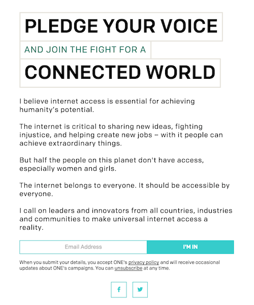
There are several aspects of design in this project I like but one small component that particularly struck me of interest was the inclusion (after having scrolled through about half the report) of a prominent ‘call to action’ event, initially in the page footer but eventually as the final stop on the scrollable path.
Not every visualisation has the intent of driving action to change behaviours, to change beliefs or even to directly influence immediate decision-making processes. Many can only, will only and need only aspire to inform, leaving consequential actions down to the capacity and appetite of the reader. However, when your purpose is clearly aimed at trying to motivate action then making clear what this action is through visible, obvious and seamless instructions is clearly clever thinking.
Again, your own work may not involve such tangible or simple actions (as in, ‘logging your email address’ simple) like this but, on those occasions when it is relevant, think about not just what you want your readers to learn from your work but also what you want them to do.


