This is part of a series of posts about the ‘little of visualisation design’, respecting the small decisions that make a big difference towards the good and bad of this discipline. In each post I’m going to focus on just one small matter – a singular good or bad design choice – as demonstrated by a sample project. Each project may have many effective and ineffective aspects, but I’m just commenting on one.
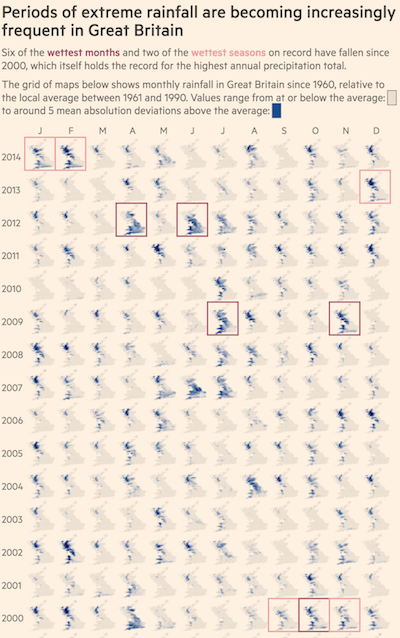
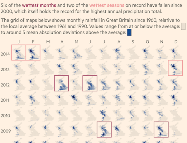
The ‘little’ of this next design concerns the use of small annotated marks to help draw a reader towards exceptional ‘values’. For the second consecutive #LittleVis piece I’m referring to work from the Financial Times, this time from an article titled ‘How prepared is Britain for extreme weather?‘ written by Oliver Ralph. The graphic is at the bottom of the page and was produced by John Burn-Murdoch. It looks at the patterns of monthly rainfall across Great Britain up to 2014 and going back to 1960. It is tall in dimension so this is just an excerpt from the top.
With such a dense display formed by 660 individual map panels, there is a lot for the readers’ eyes to process. Even with the known capability of the eye to efficiently scan such displays for the key patterns, it significantly helps the reader to include annotated markings (‘editorial overlays’), in this case colour-coded squares, to quickly emphasise the main periods of significance to this story.


