This is part of a series of posts about the ‘little of visualisation design’, respecting the small decisions that make a big difference towards the good and bad of this discipline. In each post I’m going to focus on just one small matter – a singular good or bad design choice – as demonstrated by a sample project. Each project may have many effective and ineffective aspects, but I’m just commenting on one.
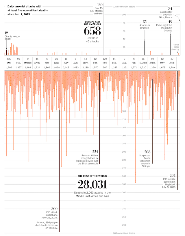
The ‘little’ of this next design concerns an interesting approach to labelling y-axis scale values. The project in focus here comes from the Washington Post, titled ‘How terrorism in the West compares to terrorism everywhere else‘ by Lazaro Gamio and Tim Meko, putting into context the relative levels of terrorist-related deaths in the West.
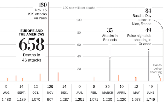
As you will see, the labels for the y-axis intervals are located within the chart. Specifically, they occupy the vertical space aligned with January 2016. Normally, we would locate these annotations to the left of the chart, maybe to the right, sometimes on both sides to assist the reader perceiving the chart’s values. It has never occurred to me before to think about positioning these labelling devices somewhere in the middle of the chart but I think it is a really innovative way of optimising their value.
The specific choice of using the January 2016 horizontal position to present these labels is interesting because January isn’t right in the middle of the chart. It may be a logical month to choose in order to create a subtle breakpoint or divide between judgments of 2015 and 2016 values. Most likely, it could be influenced by the presence of ‘nothing’ – the zero value of terrorist-related deaths in Europe/North America during this month creates the ideal (*) emptiness to occupy the labels. This approach continues in the bottom chart, where there ARE values to plot in this space, but the interval labels only begin from where the bar heights end, thus there is no obfuscation.
(* yes, I’m aware how the notion of design decisions being helped by zero death values and, conversely, being impeded by higher death values sounds – just remember I am just looking at this solely through the lens of a design challenge, not what the subject represents)


