This is part of a series of posts about the ‘little of visualisation design’, respecting the small decisions that make a big difference towards the good and bad of this discipline. In each post I’m going to focus on just one small matter – a singular good or bad design choice – as demonstrated by a sample project. Each project may have many effective and ineffective aspects, but I’m just commenting on one.
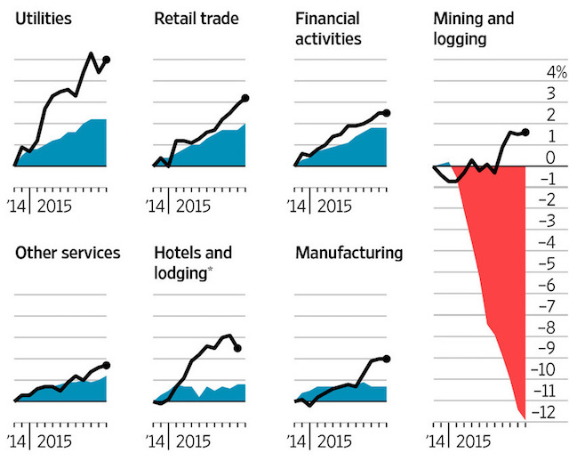
The ‘little’ of this next design concerns the challenge of composition: how you judge the relative and absolute size and position of all your design assets. I came across this graphic titled ‘Where the Labor Market is Tightening‘ by the Wall Street Journal and was, naturally, drawn to the exceptional nature of the chart in the bottom right corner. As you can see this final chart is the single exception that shows a stark decline in the payroll numbers in the mining and logging industries in contrast to the other industries displayed.
The cleverness of the ‘LittleVis’ in this work is how the creators have managed to find a common scale size and arrangement of all the charts so that this singular case of a deep negative vertical axis is able to span across two rows of space and still be neatly aligned with the baselines of the bottom row of charts. It is probably hard to appreciate on the surface just how incredibly fiddly this kind of attempted composition can prove to be and just how many tweaks and nudges will have gone in to its various iterations.


