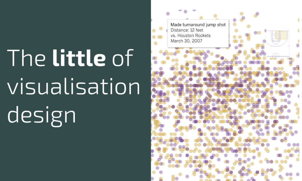
This is part of a series of posts about the ‘little of visualisation design’, respecting the small decisions that make a big difference towards the good and bad of this discipline. In each post I’m going to focus on just one small matter – a singular good or bad design choice – as demonstrated by a sample project. Each project may have many effective and ineffective aspects, but I’m just commenting on one.
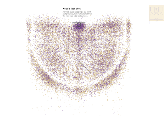
The ‘little’ of this next design was a hard one to select, such were the range of great features (see here, here, here, here and here) demonstrated by this project by the LA Times graphics team showing ‘Every shot Kobe Bryant ever took. All 30,699 of them.‘. I decided to focus on the matter of orientation assistance, as it is something relevant in my thinking right now.
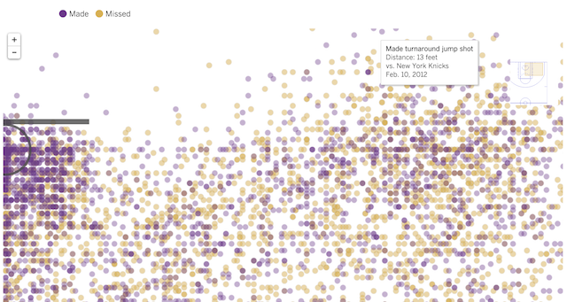
When you zoom into the display, using the traditional navigation buttons or double click over the space of interest, you can quickly lose a sense of where you are spatially. Plotting 30,000+ data points gets busy and so to preserve visibility of these points you cannot really afford to incorporate much – if anything – in the way of background colouring or annotation to draw out the court markings.
The designers of this project therefore provide a useful thumbnail map of the court which provides a highlighted rectangle to indicate the portion of the court you are currently looking at. As you zoom in further the thumbnail pitch position changes so that it is always centred on where you are.


