This is part of a series of posts about the ‘little of visualisation design’, respecting the small decisions that make a big difference towards the good and bad of this discipline. In each post I’m going to focus on just one small matter – a singular good or bad design choice – as demonstrated by a sample project. Each project may have many effective and ineffective aspects, but I’m just commenting on one.
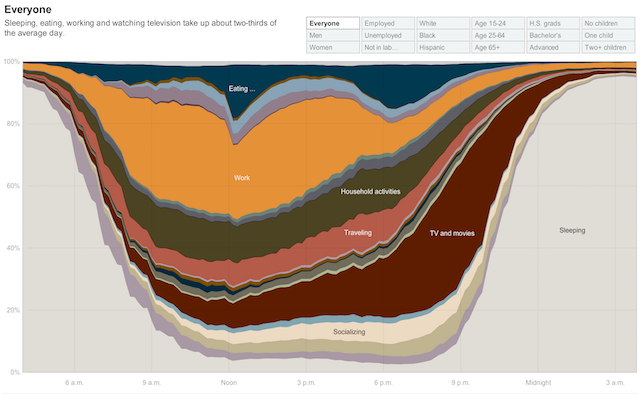
The ‘little’ of this next design concerns the use of interactive visual guides to help readers perceive values in a stacked area chart, specifically the classic ‘How Different Groups Spend Their Day‘ produced by the New York Times all the way back in 2009.
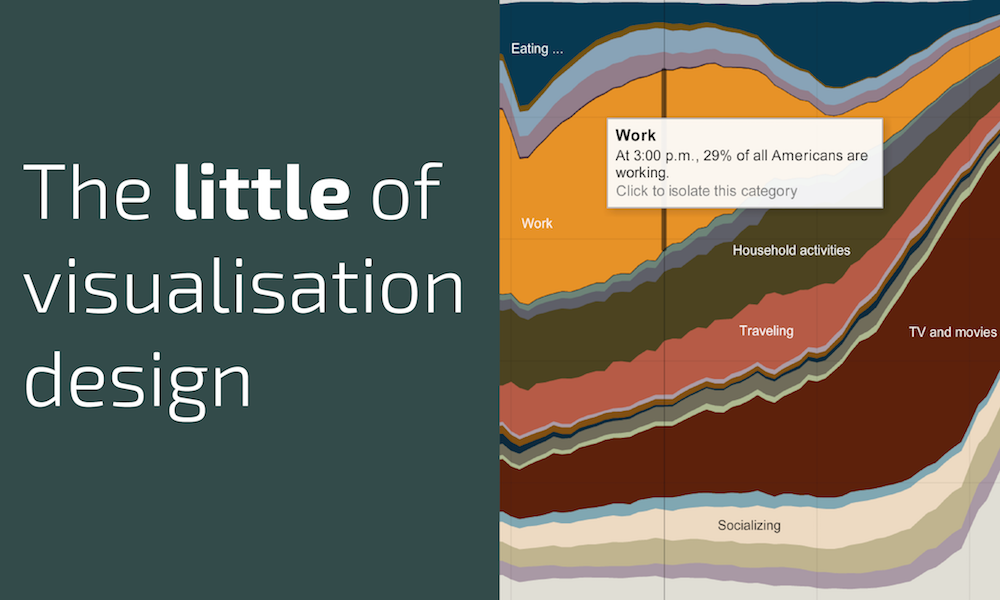
Wherever the user’s cursor is positioned on the chart (it sensibly snaps to only 10 minute intervals), a vertical guide is illustrated to help assist the eye towards the true height of each layer at that position on the chart. It also thickens the stroke width of the line for the specific layer they are focusing on reading.
This type of annotated chart assistance is helpful because judging the plotted value on an area chart at any given point is open to be misreading – as explained by this nice post.


