This is part of a series of posts about the ‘little of visualisation design’, respecting the small decisions that make a big difference towards the good and bad of this discipline. In each post I’m going to focus on just one small matter – a singular good or bad design choice – as demonstrated by a sample project. Each project may have many effective and ineffective aspects, but I’m just commenting on one.
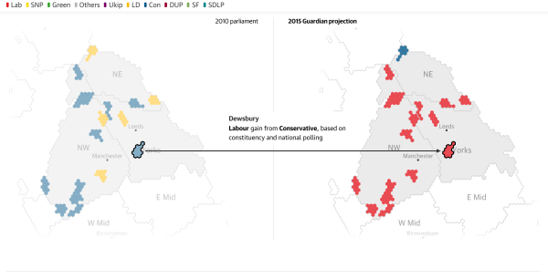
The ‘little’ of this next design concerns a clever (but quite simple) way of helping to guide a viewer’s eye towards changes on a map between two points in time. This project from the Guardian plots the results of the UK Election in 2010 compared to the projected results for 2015 using adjacent cartograms.
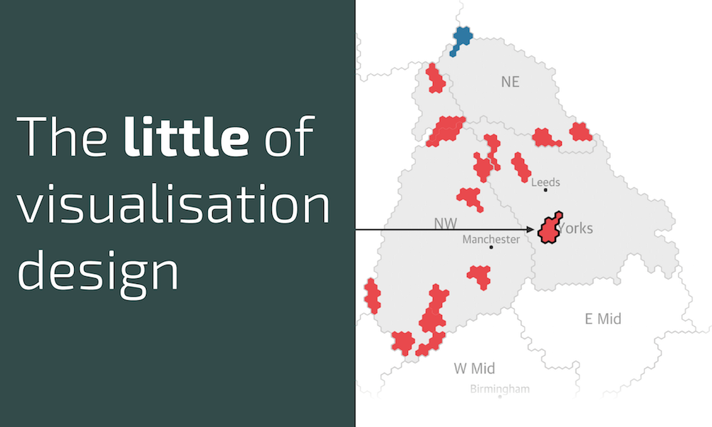
Only the constituencies that are forecasted to switch to a different political party are emphasised in colour – the exceptions – but it is the inclusion of the arrow and the shape outlining, as you hover over each area, to draw focus towards the related pairs that I find works ever so well.
Think of this as the equivalent of using your arm/hand/fingers to draw attention to a key feature in a display if you were presenting a visualisation in person.


