
This is part of a series of posts about the ‘little of visualisation design’, respecting the small decisions that make a big difference towards the good and bad of this discipline. In each post I’m going to focus on just one small matter – a singular good or bad design choice – as demonstrated by a sample project. Each project may have many effective and ineffective aspects, but I’m just commenting on one.
The ‘little’ of this next design concerns colour choices for divergent scales, ie. when you are showing quantitative scales in two directions either side of a pivot/breakpoint (often zero or an average). In this analysis by the Washington Post, we see a choropleth map showing the gender gap in adult employment rates for children of low-income families, based on the county where they grew up.
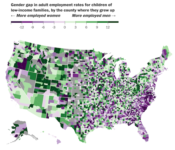
The little issue here concerns the respective shade of purple/green used for the extremes – the highest value colour bands – which, inevitably, tend to represent the most interesting insights of such analysis. Whilst the underlying choice of a purple > green colour scheme makes loads of sense (and importantly will be colour-blindness friendly) the darkest shades of the purple and green are very similar upon scanning the map.

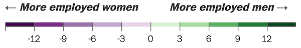
Sure, you *can* distinguish between these shades but it is perhaps more effort for the eye to perform this separation, quickly, than it needs to be. Maybe making the second darkest shade of purple/green representative of the highest value banding would make it a little easier.
