A couple of weeks ago I shared news that this site had made it onto the shortlist in the ‘Best Dataviz Website’ category for the 2015 Kantar Information is Beautiful Awards. I am enormously surprised and equally delighted to have discovered that visualisingdata.com has been announced as the winner!
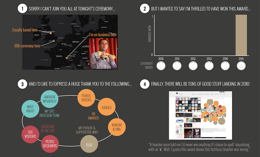
The ceremony took place in London this (Wednesday) evening but I am stranded over in Geneva on business so could not attend. In my absence, having been given a slight heads up by the organisers, I had time to prepare some form of award acceptance speech! Rather than send through a script of words or record a video I decided during my flights this morning to compile a quick rudimentary infographic – or infographankyou as I have termed it (sorry) – that expresses my surprise, delight and appreciation.
I won’t repeat all the same ‘thankyous’ in written form here but I do want to directly thank all visitors to this site throughout the past (nearly) six years. If nobody read this blog I would not continue the blog so my appreciation of your value it is quite fundamental. As is my sincere gratitude to all designers, developers, journalists, authors, teachers and anybody else whose work I have profiled on here or, at the very least, included in my various and frequent curations. This site aims to hold both a mirror and a window up to the state and progress of the data visualisation field. The content you see on here is explicitly shaped by the brilliance of the people doing their stuff out there.
High fives to my fellow website editors who made it on to both the long and shortlists – they are all terrific sites and could easily and deservedly won this award. Finally, big congratulations all the other winners from the event, you will find them listed here when the ceremony is over – as a judge (but not, let me make clear, for my own category) I know how tricky it was to decide upon the winners.


