
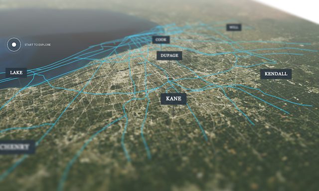
There’s a smart new project from the team at Clever Franke who have created a digital package of visual content around the topics of ‘Mobility, Economy and Livability’ for CMAP, the regional planning agency for metropolitan Chicago.
The overall aim was to develop innovative approaches to data visualisation and information content. The project comprises a series of micro-sites discussing the past, present and future of Chicago’s plans around roads, transit, freight and how all this will move forward.
The micro-sites serve the primary purpose to educate and influence various stakeholders ranging from political decision makers, news media and business leaders. Of equal importance is the general publics’ need to access engaging content that relates to their everyday lives without requiring them to be professional planners. The micro-sites are an integral aspect of the agency’s commitment to transparency and to engaging the public.
As with many other long form/multi-faceted digital projects of recent years this work demonstrates a really rich blend of textual content, embedded movies, photo-imagery and interactive work structured around these 4 key chapters.
I really like the approach they have taken to visualise a number of selectable mapping layers in relation to ‘The Access to Transit’ index, which offers echoes of Moritz Stefaner’s Stadtbuilder and Zeit Online’s ‘A Nation Divided‘ as well as generally rocking a Roy Lichtenstein vibe (incidentally, check out the wonderfully gratuitous CF team profiles!).

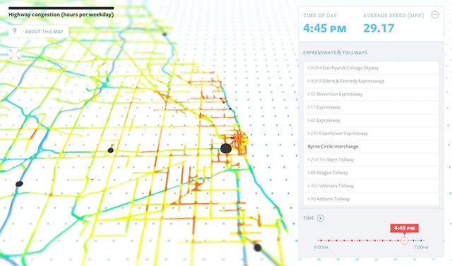
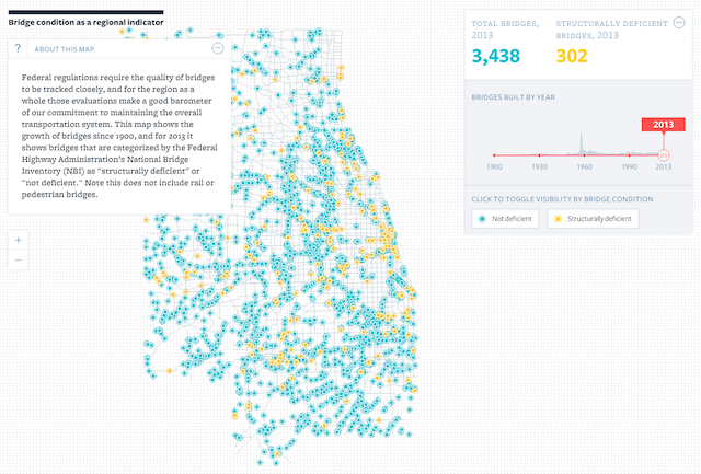
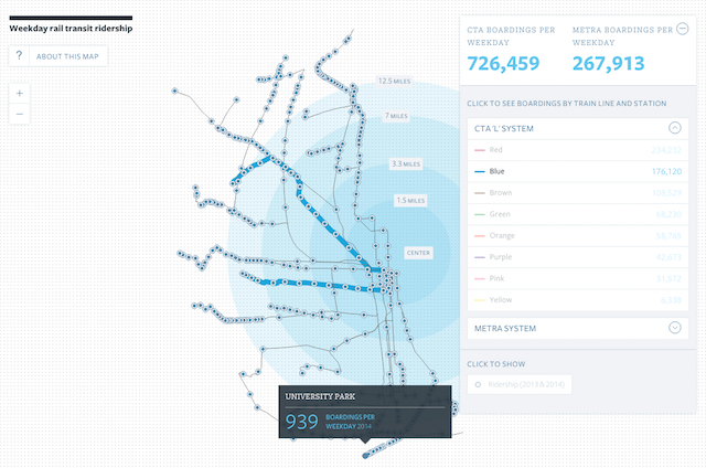
Each chapter has the same structure with a short intro, followed by a central interactive piece, a text-narrated video and then a final simple chart displaying the relevant statistical indicator.
Aside from the neat visualisation work, I think this project highlights the increasing importance of good photo and video imagery: obtaining high-quality and permission-granted images can not always be taken for granted. Furthermore, the way such media are deployed and integrated into a digital work involves some fairly critical design choices. As technology continues to blur the boundaries between visualisation, infographics and digital content I feel there will be more need for us to understand the best practices around communication ‘beyond the chart’.

There is a great process description with loads more screenshots about Clever Franke’s design work here.
