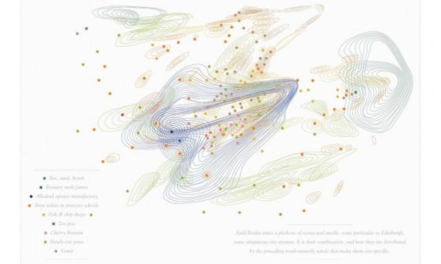
Smell Maps: Beyond the visualisation of data
In my most recent ’10 most significant blah blah blah’ posts at the end of last year I included (at number 8) examples of where designers were going beyond solely the visual representation of data. Some of these examples included Moritz’ Data Cuisine Workshop, experiments like Tasty Tweets and fun pieces like Pumpkin Pie Charts.
Smell Maps: Beyond the visualisation of data Read More »

