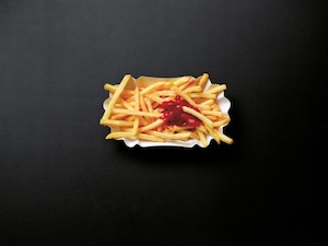
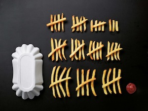
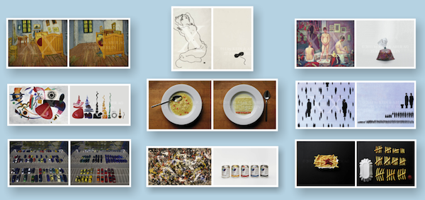
“The Art of Clean Up: Life Made Neat and Tidy” is a new book by Swiss artist Ursus Wehrli presenting his wonderfully perfectionist’s eye for obsessively creating order where there is none.
I talked about physical visualisation in yesterday’s post about the tactile wood maps but this work goes a stage further, reorganising and laying out elements of everyday life and imagery based on size, colour, shape and any other ‘orderable’ physical variable.
What I find intriguing about these works is the idea of looking at a scene in a completely fresh perspective, breaking it down in to non-cohesive components and isolating all the individual constructing elements. I wonder if there is something we can learn from this approach (or at least mindset) and apply to our visualisation design techniques. Perhaps by looking more forensically at our designs we can isolate those elements that represent data, those that are purely chart apparatus, the colour schemes, the hierarchy of sizes, the text usage etc. From this analysis we could then judge the suitability and justifiability of what we include in our work, what is redundant and what is superfluous.


