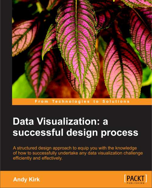
I’m delighted to announce that my book ‘Data Visualization: A Successful Design Process‘ has finally been completed and is now ready to be published!
Overview
I was approached in January 2012 by an Acquisitions Editor from Packt Publishing to develop an 80 to 90 page eBook on the subject of data visualisation and, specifically, about the process of designing a data visualisation. Packt are apparently one of the most prolific and fast-growing tech book publishers and their business model is digitally-focused (not just in terms of subject matter but also their focus on electronic publication).
Over the course of writing the book over the past few months it has grown and grown in size (large through my own coverage-creep!) and now exists as a 206 page eBook and printed book.
You will learn more about the structure and content of the book below but it is worth saying that this material is very complementary to my data visualisation training courses and inn many ways they have informed each other.
I was immensely fortunate to have secured the input of Alberto Cairo, Ben Jones, Jerome Cukier and Santiago Ortiz as my esteemed peer reviewers and their feedback was highly valued and advice extremely welcome.
It is scheduled to be published on 28th December and will be available, of course, from Packt’s own website as well as Amazon (.com and .co.uk etc.) and Barnes & Noble, amongst others. You should expect to get the best deal direct from Packt’s site. I expect the option to pre-order will be available in the next day or two.
(Note that the details and prices currently shown on these various sites is months out of date and is awaiting a final update in the next 24 hours).
Introduction
Welcome to the craft of data visualisation: a multi-disciplinary recipe of art, science, math, technology and many other interesting ingredients. Not too long ago we might have associated charting or graphing data as a specialist or fringe activity: it was something that scientists, engineers and statisticians did.
Nowadays, the analysis and presentation of data is a mainstream pursuit. Yet, very few of us have been taught how to do these types of tasks well. Taste and instinct normally prove to be reliable guiding principles but they aren’t sufficient alone to effectively and efficiently navigate through all the different challenges we face and the choices we have to make.
This book offers a handy strategy guide to help you approach your data visualisation work with greater know-how and increased confidence. It is a practical book structured around a proven methodology that will equip you with the knowledge, skills and resources required to make sense of data, to find stories and to tell stories from your data.
It will provide you with a comprehensive framework of concerns, presenting step-by-step all the things you have to think about, advising you when to think about them and guiding you through how to decide what to do about them.
Once you have worked through this book you will be able to tackle any project – big, small, simple, complex, individual, collaborative, one-off or regular – with an assurance that you have all the tactics and guidance needed to deliver the best results possible.
Who is this book for?
Regardless of whether you are an experienced visualizer or a rookie just starting out, this book should provide useful and practical guidance to anyone who is looking to learn about data visualisation design and/or wants to optimise his or her techniques.
If you are satisfied with the effectiveness and efficiency of your design approach, it may not be for you. Likewise, if you are looking for deep levels of theory, software/code tutorials, or coffee-table glossy galleries, once again, this isn’t the book for you.
The aim is for it to be something for everyone: you might be coming into data visualization as a designer and want to bolster your data skills, you might be strong analytically but want inspiration for the design side of things, you might have a great nose for a story but don’t quite possess the means for handling or executing a data driven design.
Furthermore, you may never actually fulfil the role of a designer and might have other interests in learning about data visualization. You may be commissioning work or coordinating a project team and want to know how to successfully handle and evaluate a design process.
Hopefully, it will inform and inspire all who wish to get involved in data visualization design work regardless of role, background or expertise.
You don’t need to be a gifted polymath to get the most out of this book but ideally you will have reasonable computer skills (software and programming), have a good basis in mathematics, and statistics, in particular, and have a good design instinct.
There are many other facets that will of course be advantageous but the most important trait is just having a natural creativity and curiosity to use data as a means of unlocking insights and communicating stories. These will be key to getting the maximum benefit from this text.
You cannot become skilled by reading this book alone, so you need to have a realistic perspective about the journey you are taking and the distance you have made already. As with most skills in life that are worth pursuing, to become a capable data visualization practitioner takes time, patience and practice. However, through applying the techniques presented, then learning and developing from your experiences, you will enjoy a continued and successful process of improvement.
Contents
1. The Context of Data Visualization (21 pages)
Chapter 1 provides an introduction to the subject, its value and relevance today, including some foundation understanding around the theoretical and practical basis of data visualization. This chapter introduces the data visualization methodology and the step-by-step approach recommended to achieve effective and efficient designs. We finish off with a discussion about some of the fundamental design objectives that provide a valuable reference for the suitability of the choices we subsequently make.
- Exploiting the digital age
- Visualization as a discovery tool
- The bedrock of visualization knowledge
- Defining data visualization
- Visualization skills for the masses
- The data visualization methodology
- Visualization design objectives
2. Setting the Purpose and Identifying Key Factors (23)
Chapter 2 launches the methodology with the first stage concerned with the vital task of identifying the purpose of your visualization: what is its reason for existing and what is its intended effect? We will look closely at the definition of a visualization’s function and its tone in order to shape our design decision-making at the earliest possible opportunity. To complete this scoping stage we will identify and assess the impact of other key factors that will have an effect on your project. We will pay particularly close attention to the skills, knowledge and general capabilities that are necessary to accomplish an effective visualization solution.
- Clarifying the purpose of your project
- Establishing intent: the visualization’s function
- Establishing intent: the visualization’s tone
- Key factors surrounding a visualization project
- The ‘eight hats’ of data visualization design
3. Demonstrating Editorial Focus and Learning About Your Data (26)
Chapter 3 looks at the intertwining issues of the data we’re working with and the stories we aim to extract and present. We will look at the importance of demonstrating editorial focus around what it is we are trying to say and then work through the most time-consuming aspect of any data visualization project: the preparation of data. To cement the learning in this chapter we will look at an example of how we use visualization methods to find and tell stories.
- The importance of editorial focus
- Preparing and familiarizing with your data
- Refining your editorial focus
- Using visual analysis to find stories
- An example of finding stories and telling stories
4. Conceiving and Reasoning Visualization Design Options (39)
Chapter 4 takes us beyond the vital preparatory and scoping stages of the methodology and towards the design issues involved in establishing an effective visualization solution. This is arguably the focal point of the book as we look to identify all the design options we have to consider and what choices to make. We will work through this stage by forensically analyzing the anatomy of a visualization design, separating our challenge into the complementary dimensions of the representation and presentation of data.
- Data visualization design is all about choices
- Some helpful tips
- The visualization anatomy: data representation
- The visualization anatomy: data presentation (color, interactivity, annotation, arrangement)
5. Taxonomy of Data Visualization Methods (40)
Chapter 5 goes hand-in-hand with the previous chapter as it explores the taxonomy of data visualization methods as defined by the primary communication purpose. Within this chapter we will see an organized collection of some of the most common chart types and graphical methods being used that will provide you with a gallery of ideas to apply to your own projects.
- Data visualization methods
- Choosing the appropriate chart type
- Comparing categories
- Assessing hierarchies and part-to-whole relationships
- Showing changes over time
- Plotting connections and relationships
- Mapping geo-spatial data
6. Constructing and Evaluating Your Design Solution (23)
Chapter 6 concludes the methodology by focusing on the final tasks involved in constructing your solution. This chapter will outline a selection of the most common and useful software applications and programming environments. It will present some of the key issues to think about when testing, finishing and launching a design solution as well as the important matter of evaluating the success of your project post-launch. Finally, the book comes to a close by sharing some of the best ways for you to continue to learn, develop, and refine your data visualization design skills.
- For constructing visualizations, technology matters
- Visualization software, applications and programs
- The construction process
- Approaching the finishing line
- Post-launch evaluation
- Developing your capabilities
Printed book
As I said above, the eBook was the primary intended format but the print option emerged as an additional development during the course of writing it. Just so any potential buyer is completely informed about their purchase, please note that, whilst the eBook is produced in full colour, the printed book is published in black and white.
As far as I am aware no Packt title is available in colour in the printed version so this is standard practice for them and many other publishing houses as they content with the costs of printing and handle the transition of the industry towards a print and digital platform mix.
Of course a printed book about data visualisation would ideally be available in full colour but the benefit to the customer is that the price of the book is reduced quite significantly. Packt have created an attractive bundle option that allows you to buy both eBook and print book for a very reasonable sub-£20 (sub-$30) price. If you can stretch that far, I would recommend that as the best option.
Thank you!
I know a number of people who have generously stated they will be buying the book as soon as it comes out and it will be a recurring pleasant surprise to hear of anyone who does spend their hard-earned money on my book. I will be immensely grateful for anyone who does this so please allow me to thank you in advance, if I don’t get chance to do so in person or electronically at the time!
Finally, as the publishing progresses over the next few days I will be inviting peers across the field to read and review the book. More information will be sent out in due course.


