The issue of plagiarism vs. inspiration is not a new topic, it has been with us for years and is the fundamental basis of copyright and IP, but it is an increasingly important consideration for us in the visualisation field.
This came up at my data visualisation training event in Washington DC last week. I’m not going to focus on the specific case that was being discussed because I don’t want to put the attention unnecessarily on the person in question but I think it is an issue worth exploring and discussing, because I’m not sure what the right call is.
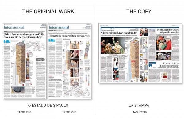
Recently, Alberto Cairo wrote a great piece about this matter in relation to an information graphic published in the newspaper ‘O Estado De S.Paulo’ and then allegedly copied a few days later and published in ‘La Stampa’.
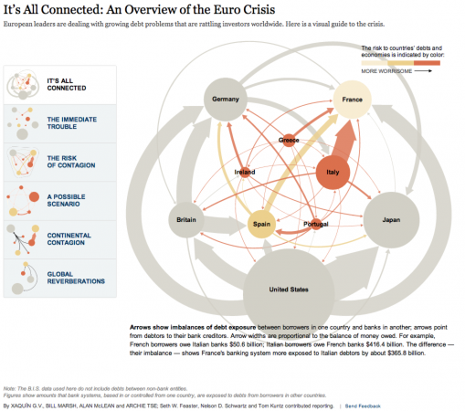
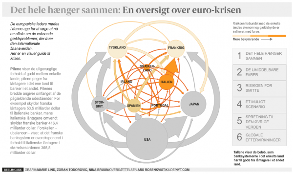
In information graphics, with its greater scope for inclusion of illustrations and non-visualisation elements, there is arguably a broader range of potential creative solutions than there are with visualisation. So when you see the same thing twice, there is something more inherently blatant, especially when there are no acknowledgements, as in the example below where the New York Time’s piece is almost exactly repeated in the Danish Berlingske publication.
Furthermore, during the judging process at Malofiej 20, there were a number of examples where you could clearly see a large amount of design reference to other pieces (some present in the awards contest, others not) but without any acknowledgement. Some, like the above were almost straight copies and only with the intervention of those who had seen previous, similar works were we able to root out the offending pieces from the medal reckoning.
Returning specifically to data visualisation. As new and innovative ways of representing data are conceived and as the field expands more and more in terms of participation, there will naturally be a great deal of inspiration going on. As people see new methods being adopted, allowing them an escape route away from the ubiquity of the bar and pie charts, there is a risk that some of this inspiration could be perceived as plagiarism.
The first thing, of course, is to consider including an acknowledgement and this will largely take the sting out of any potential situation and may even be seen be the originator of that method as a positive recognition.
But for how long should we need to maintain these acknowledgements? Where is the line drawn after which it is fine to just go ahead and pursue a method that was once rare but now is increasingly common?
Let’s take an extreme example. It is generally accepted that William Playfair was the first to conceive and utilise the bar chart, but how many of us acknowledge Playfair in our work whenever we use the dashboard. None of us, of course we don’t.
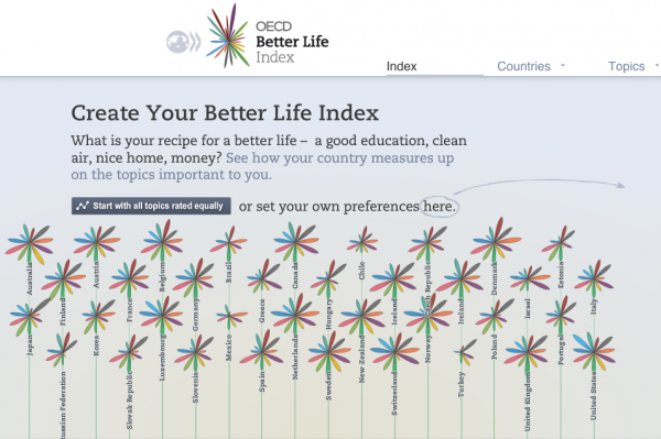
Yet, if I churned out a piece today that drew inspiration from the OECD Better Life Index’s floral design, a work that has only been around for the past year, I would and should acknowledge those who were behind it.
But what about those in-between? The Treemap? The Streamgraph?
What are the most appropriate and sustainable guidelines for this particular branch of design ethics that we can all agree on and practice. Let me know your thoughts in the comments below…


