A couple of months ago I launched my appeal for data visualisation stories from around the world. The purpose of this series is to invite designers, journalists, academics, bloggers, analysts or just simply residents, from as many different countries as possible, to illuminate the rest of us with their observations about the visualisation scene in their country or region. You can see the growing collection of articles in this series here.
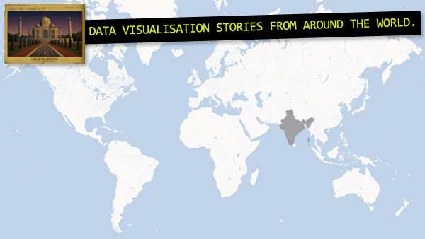
After reading about Alberto Cairo’s experiences from Brazil in the first part of this series, in this second article we hear from another major emerging economy, namely India. Specifically, we speak to Ananth Mani from Chennai where he is CEO of Report Bee, a new start-up aimed at developing data visualization reporting solutions for schools around report cards and student performance.
Here, Ananth provides some background about his own experiences of data visualisation and the motivation and ideas behind Report Bee.
Visualisation Perceptions
Ananth, how did you personally get into data visualisation? Have you been trained, who have you learnt from etc.?
I understand things better when presented visually and I like digging out patterns. It started with playing with charts in excel. I used to stare in awe for long duration the music visualization by winamp player, but I guess the tipping point was Hans Rosling’s legendary TEDTalk. Seeing the talk I realized data visualization is great opportunity knocking the door. That single spark is enough to start a wild fire, I hunted around to know more about creating similar data visualization. Started to incorporate or encourage to team to built nice data visualization chart in the applications we built.
I’ve not been trained formally – I have largely learned from reading on internet and following great blogs on this subject. However I feel the data science is mature enough to be taught and I insist that people should do some kind of practical training.
How would you describe the visualisation scene in India? Is it something growing in line with the economic growth, for example? What are the most prominent contemporary examples?
It is at nascent stage at hobbyist level. It would grow because of the same reasons world wide, the sheer amount of data is growing rapidly and there is huge in efficiency in the current set of MIS, Data mining, Reports. Not just the volume of data but data is also getting real-time, we need new set of systems and tools to process the data and make quick decision. It is going to be competitive edge.
The government has taken steps to open up census, whole saleprice index, rainfall etc again these are at still early stage, much needs to be done.
How is visualisation being used in the media, in corporate world, in sport, science, government etc.? Are there any key gaps or barriers to progress? Cultural, technical, capabilities?
Assuming this question is set for Indian context. Sports has been front running in visualization, you can see it in Cricket. The media has been using visualization and analysis during elections.
The key barriers are the tools and talent which are at early stage with respect to data visualization, so I would rate technical capability to be key challenge.
Report Bee
Tell me about Report Bee?
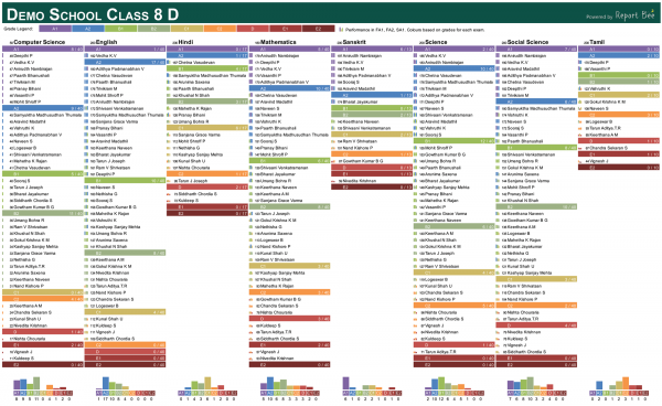
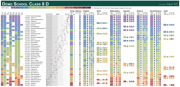
Report Bee was created with the vision to get useful and actionable insights from data. While there are software available that can give some of the above information. We have found that the information given is very cumbersome for daily use and decision making. There is real need for simple but powerful data visualization that can make information consumption a pleasure. Here’s an example:
This short video provides more detail:
What inspired you to develop Report Bee? What was the real need or problem you were hoping to solve through visualisation?
Education is undergoing rapid change and one un-intended side effects is that there is lot of data that teacher and school management needs to handle. I was walking in one of the schools and saw huge pile of students annual report card dump, being a data junkie my heart sunk at seeing all valuable student data rot away silently. In the same school we wanted to help students who have consistently been in a specific range of grades, to get this list of students the school took 3 weeks and the teacher who toiled to get the list request us to never ask such things.
I believe we can help school management to get the pulse of school progress at a student/class level without having to dig and go through reams of paper reports. Report Bee has set out to radically improve the way students’ performance data is used for interpretation and analysis by teachers and school staff. Our aim is to create a great tool that makes a teachers’ life easy by helping them understand every student’s strengths and weaknesses over the span of his/her tenure in the school – at a single click.
Can you briefly describe your typical design and development process behind your visualisation work? How do you move through idea > data > analysis > design > presentation etc.?
It is highly iterative process. It starts with available data, we develop sample visualization and what insights can be derived. We showcase this to teachers/school management and students for feedback. Based on the feedback we not only re-design the visualization we design new set of data that needs to be captured.
Tools are Python, MS Excel and Photoshop during the ideation and prototype stage. Python, HTML, CSS for visualization. Web application is on Rails.
What has been the impact of Report Bee? What are your future plans/ambitions for Report Bee?
The feedback from teachers and school management has been overwhelming. We have been growing rapidly since inception – adding 2-3 new schools every week.
Report Bee’s vision is to make teachers, students and school management completely aware of their performance and progress. We don’t just specialize in data visualization and analysis but also focus on making it fun to understand.
We plan to create reports for students and parents. We also plan to partner and work with existing systems schools may have.
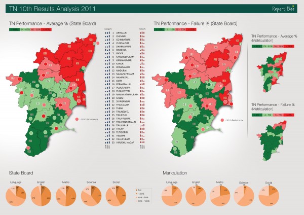
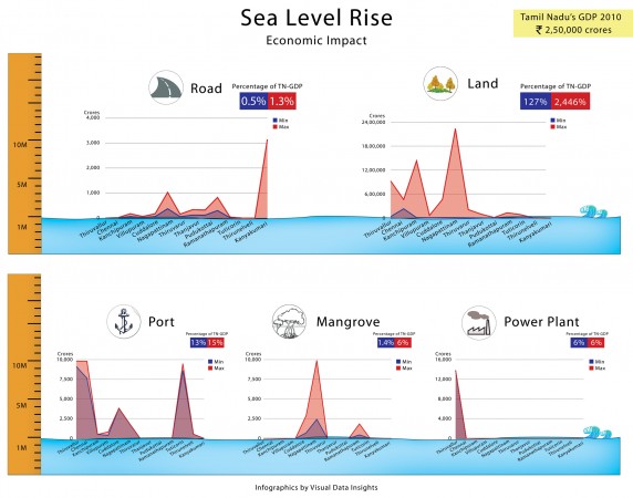
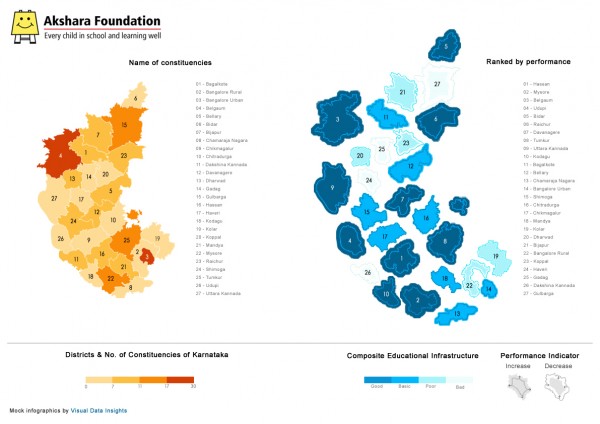
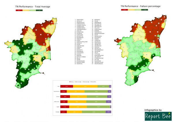
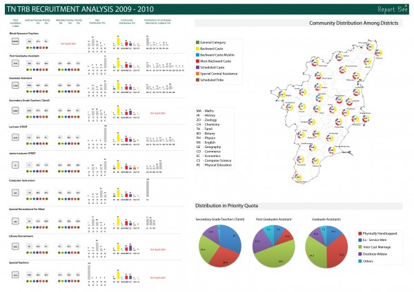
Here is some of the work we had done.
1) SSLC Results 2011: Tamilnadu Government
2) Sea Level Rise: British High Commission
3) District performance: Akshara Foundation
4) TN SSLC 2009-10: Tamilnadu Government
5) TN TRB 2010-11: Tamilnadu Government
Finally, Ananth has a request for any interested readers:
1) As a start-up based out of India with limited resources, we need interns who can help us in working with next set of data visualization. If you know of any students interested for internship please refer to us.
2) We are interested in visualisation experts to join our advisory board.
You can find contact details for Ananth at Report Bee here.
I’ve a number of volunteer reporters lined up from the four corners of the planet, but I’m always on the look out for more! If you’ve got any sort of interest or involvement in data visualisation, regardless of how professional or casual this may be, feel free to send me a visualisation story from your part of the world. It can be as long, short, complicated, deep or simple as you like, the remit is very much decided by you. I’m also looking to publish multiple stories from the same regions – there is great value from having more than one perspective. Read more about my ideas here or drop me a note at andy@visualisingdata.com.

