
A couple of months ago I launched my appeal for data visualisation stories from around the world. The purpose of this series is to invite designers, journalists, academics, bloggers, analysts or just simply residents, from as many different countries as possible, to illuminate the rest of us with their observations about the visualisation scene in their country or region. You can see the growing collection of articles in this series here.

In this first article of the series we hear from Alberto Cairo. Alberto is an exceptionally prolific and active contributor to the development and practice of the visualisation field. He is Director of Infographics and Multimedia at Época-Editora Globo, in São Paulo, Brazil, a writer for El Pais, he works for several other Brazilian magazines, he is an information graphics and visualisation teacher, a consultant, an author – the list goes on!
Here, Alberto provides a snapshot of data visualisation practice specifically from within the world of data journalism, detailing a project he has recently produced for Época, the magazine he works for, and through other prominent designs and designers.
Interactive and print visualisation project [Época]
One of the main political conversation in Brazil is how candidates to the House and the Senate get the money for their campaigns. The main claim of many critics is that the biggest the funding you get from private donors, the higher your chances to get elected. The thing is that the data to prove that is a bit hard to get, and no one before has visualized that relationship. So we did it here at Época!

(click image for larger version)
The main element of the online version is a tool that allows you to see the correlation between campaign funding (vertical axis) and number of votes (horizontal axis). We are representing just candidates for Congress (we will do something similar with other politicians in the future). There were more than 3,000 in the country in the 2010 election. The interactive graphic includes a search engine, so you can locate the guy you want to see, and you can filter, state by state, party by party.
Additionally, the scatter-plot doesn’t allow you to see rankings, so we also created a table (the Tabela tab) where you can organize the entire list of candidates by party, by funding, by votes and by cos per vote (an interesting number, there is people who, proportionally, spent a lot of money for each vote they got). This is something we try over and over – for each kind of question the reader may want to answer with the tool, the data should be represented in a different form.
Our main focus is not to create something visually striking, but useful.
At the bottom of the HTML page, we included several jpgs published in the print magazine where we highlight the most interesting cases. Also, data can be downloaded in Excel format, so any reader can play with them.
So far, it has been a success down here. We had responses from readers both on Facebook and Twitter. Besides, it was highlighted by two important media commentators that happen to specialize in data journalism. One of them was Jose Roberto de Toledo, who made a video clip for the newspaper he works for about the story and why it was relevant.
The impact has been more qualitative than quantitative (although it has had a generous amount of readers, Facebook likes and Tweets) – the relationship between campaign expenses and the chances of being elected had never been so clearly represented before, even when it was a common discussion in the media. We are gathering the data already to expand this and show same relationships with every single candidate in the country. Let´s see if we can handle it!
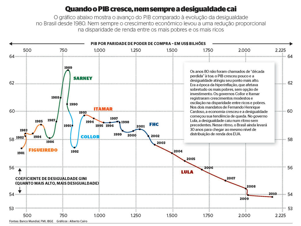
At Época we try to use unusual graphic forms when its appropriate. In the graphic below I used a Philips Curve to display the co-evolution of GDP (horizontal scale) and inequality (vertical scale), presidency after presidency (color-coded), so you can see how the country stabilized in a continuous downward trend only with Fernando Henrique Cardoso (FHC) and Lula, the ones that put inflation and the economy en general under control:
Another example of a project we worked on was around this interactive work which presented the history and projections of the world population with a slider which allows the reader to explore the key milestones.

Sometimes I even write about how we do our projects at Época (which usually are low-tech). I translated one of those making of articles to English a while ago – you can find it on my Visualopolis blog. We also write articles in Portuguese for a blog of the Design and Infographics departments (they work together, but are separate), that is called Faz Caber (“make it fit“, a local joke – it’s a sentence that layout designers hear all the time) explaining how we do our graphics. The second current article describes the making of the politics visualisation project outlined above.
Visualisation examples from other publications
Some other important Brazilian publications include Estado de São Paulo newspaper. They have a very, very innovative graphics department, and they did an excellent job with the 2010 elections, and other recent topics. Here are some examples of their web based work:


And here are some of their print works:


I would also mention Folha de São Paulo, the other big newspaper here, particularly the work of Simon Ducroquet. You can see from the examples below what the guy does:
Political Party genealogy –

Elections mapping –


So, in conclusion, I would say Brazil’s graphics and visualizations are flourishing!
I’ve a number of volunteer reporters lined up from the four corners of the planet, but I’m always on the look out for more! If you’ve got any sort of interest or involvement in data visualisation, regardless of how professional or casual this may be, feel free to send me a visualisation story from your part of the world. It can be as long, short, complicated, deep or simple as you like, the remit is very much decided by you. I’m also looking to publish multiple stories from the same regions – there is great value from having more than one perspective. Read more about my ideas here or drop me a note at andy@visualisingdata.com.
