The OFCOM Communications Market Report 2010 has been published today. For those who don’t know about OFCOM it is the independent regulator and competition authority for the UK communications industries and this is arguably their most important and influential annual report.

At 379 pages it represents a significant volume of work and, not surprisingly, contains a huge amount of data and analysis accompanied by a plethora of graphs and tables. Unfortunately, much of these graphical devices add little value to the reader because their purpose hasn’t been identified – a case of graphs for graph’s sake.
I have a great deal of sympathy with the people who have compiled the report, you can just imagine the instructions coming down to them from managers along the lines of “put in plenty of nice fancy graphs, make them colourful”.
We’ve all been there and what’s more we’ve all had to succumb to such requests against our better judgement. This post is not about criticising those who have to produce graphics such as these, it should be seen as an arm around the shoulder for those who have to dance to the tune of clueless people in senior positions. You just would hope that the body responsible for standards and practices concerning communication issues would be able to set the bar a little bit higher with its report presentation.
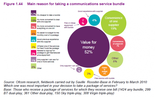
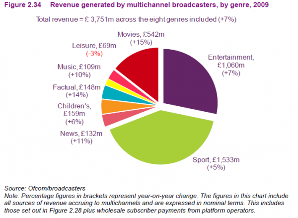
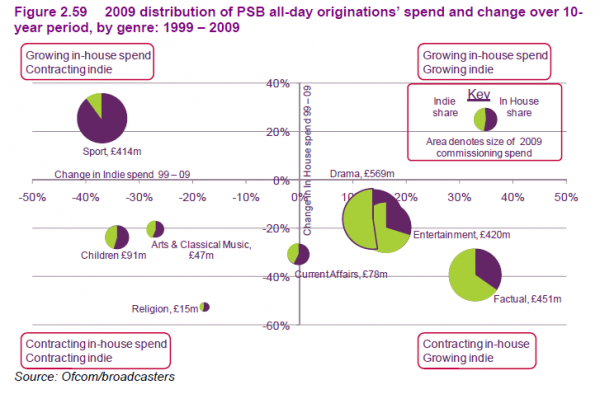
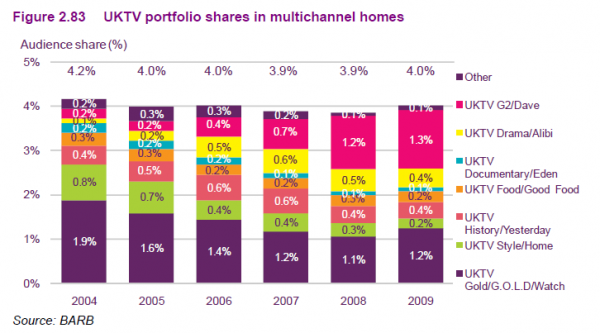
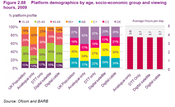
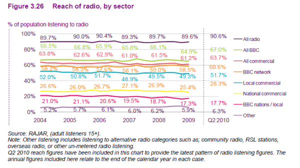
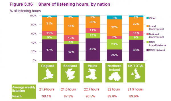
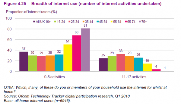
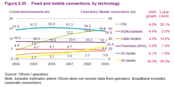
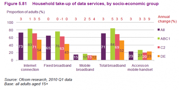
Anyway, here are some of the graphical lowlights from this report – some of the busiest, confusing and unnecessary graphics from the 100’s presented in this report, see what you make of them:

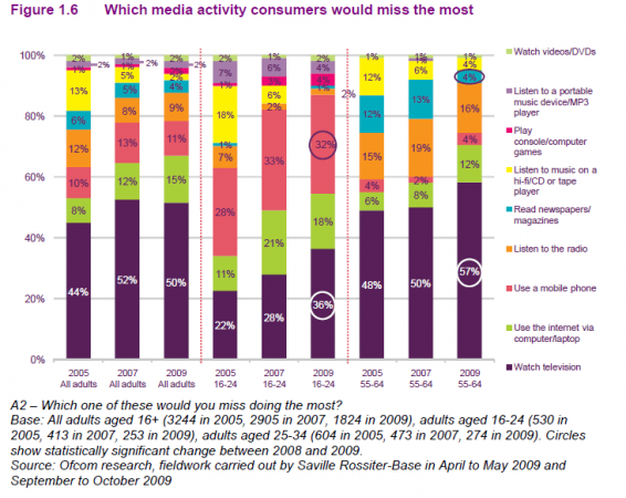
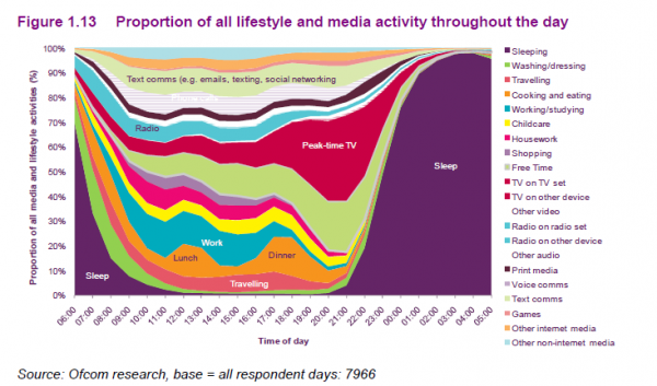
I don’t dislike the above graphic – I just included it because it was very similar to the NYT item about “How Different Groups Spent Their Day“
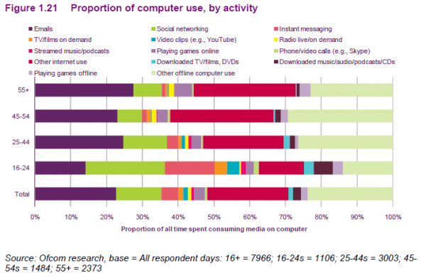
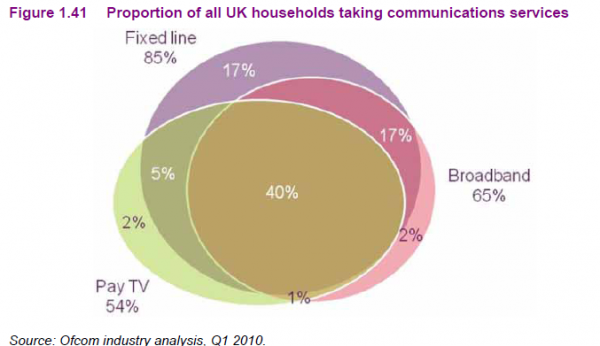
For a more useful and helpful analysis and narrative about the key findings from this report can be found on the BBC, the Guardian and the Online Journalism Blog.

