When 3D works
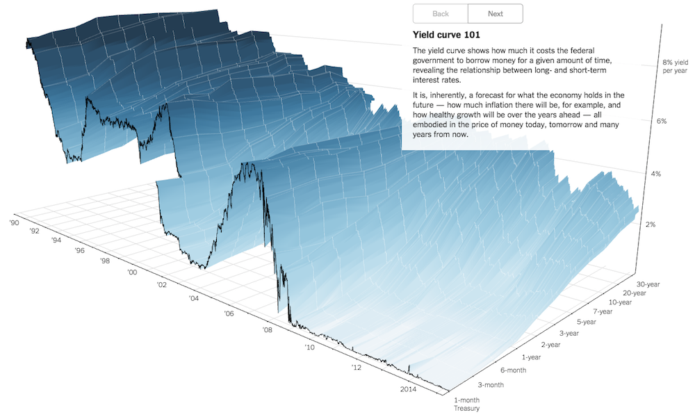
Earlier this week TheUpshot published a new interactive project visualising the ‘Yield Curve’. Created by Gregor Aisch and Amanda Cox the work provides a “3-D view of a chart that predicts the economic future”.

Earlier this week TheUpshot published a new interactive project visualising the ‘Yield Curve’. Created by Gregor Aisch and Amanda Cox the work provides a “3-D view of a chart that predicts the economic future”.
Last week I had the pleasure, as always of having a brief discussion with Jon Schwabish about life in the data visualisation scene. Helpfully the chat was recorded by NSA, Jon retrieved the audio and published it on his site.
PolicyViz podcast: Talking data vis with Jon Schwabish Read More »
It has taken a while to pull together but I’ve finally arrived at my final schedule of public data visualisation training events for the rest of 2015. For more information on the formats, types and coverage of each different event, visit the training page.
Announcing my 2015 public training schedule Read More »

At the end of each month I pull together a collection of links to some of the most relevant, interesting or thought-provoking web content I’ve come across during the previous month. Here’s the latest collection from January 2015.
Best of the visualisation web… January 2015 Read More »
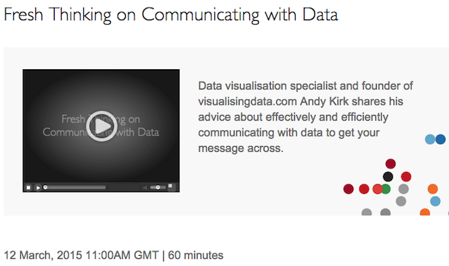
Next Thursday 12th March I will be doing a 60 minute webinar hosted by Tableau. The title of the talk is “Fresh Thinking on Communicating with Data” and is based around the theme of some of my recent talks.
Promoting an upcoming Tableau webinar Read More »
This is an announcement for anyone interested in sponsoring this website. I have decided to open up three new banner spaces on the Home page for interested parties to advertise their product, services or general offerings.
New site sponsorship opportunities Read More »

During the week I posted an article about some of the issues and options around using colour to represent gender (that is, the binary of Male or Female). I included a one-question poll to gather some insights about the attitudes out there towards the use of colour with gender.
Poll results: Let’s have a think about blue-pink Read More »

A quick post to share something that I’ve been really in to this past week or so: dendrochronology. Also known as tree-ring dating, it is the “scientific method of dating based on the analysis of patterns of tree rings”.
Dendrochronology and visualisation literacy Read More »

You work you’re way through the data, come up with an idea for the most interesting angle of analysis, chart your data, and delight yourself with the compelling emerging display: look how clearly it shows the difference between men vs. women!
Let’s have a think about blue-pink Read More »

The Bank of England has announced details of its first data visualisation competition, in conjunction with the One Bank Research Agenda conference and the release of new publicly available Bank data sets. The winning entry will receive £5000.
The Bank of England’s data visualisation competition Read More »