Design
NYT European debt levels
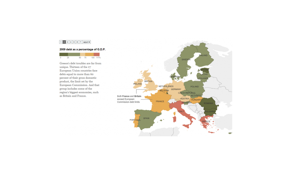
Via The Big Picture website I’ve come across a New York Times graphic sequence explaining the national debt levels across European states. The sequence presents

Via The Big Picture website I’ve come across a New York Times graphic sequence explaining the national debt levels across European states. The sequence presents

The trickle of government bodies and large-scale organisations freeing up their data for transparency, scrutiny and creative exploration is quickly turning into something of a flow.

Here are some of the most relevant, interesting and useful articles I’ve come across during April 2010. I don’t necessarily agree with all the principles, opinions or advice presented in these links but sometimes consuming such information can only help enhance your knowledge on a subject:
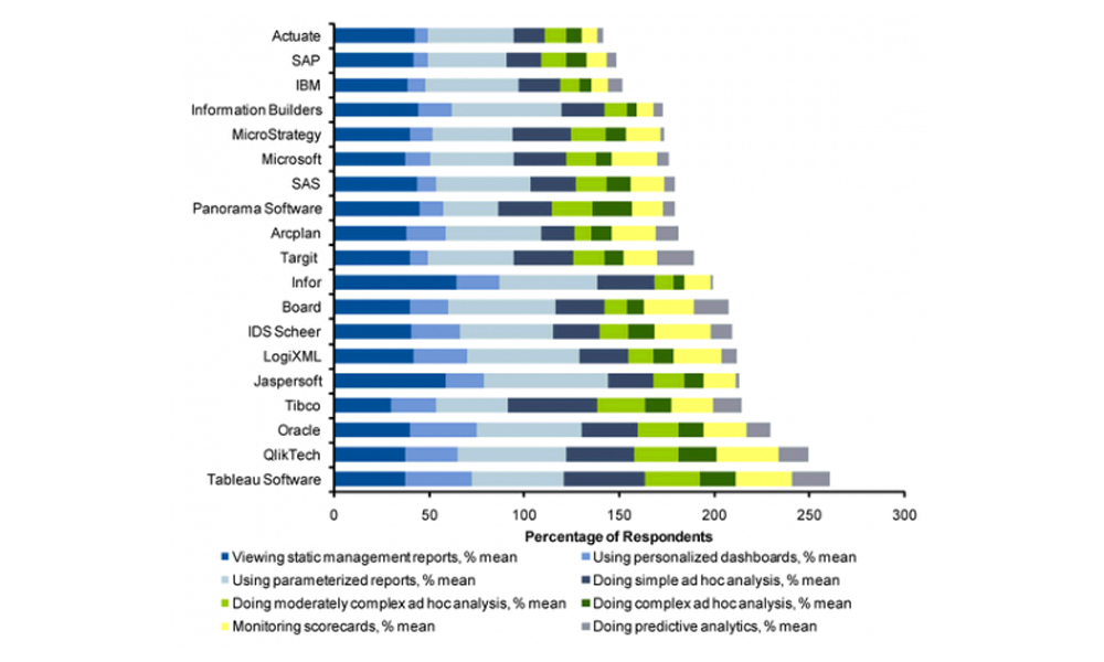
I’ve come across an infographic today (via cool infographics) that was originally published in February on Focus.com, a business expertise exchange and research service. I’ve shown the full length of the graphic below, a larger version can be accessed here.

The Guardian has put together a photo gallery showing shots of some of the election night TV coverage through the years right up to some of

Visitors to the site will notice a new collection of icons and links on the right sidebar that connect to the Visualising Data social web

With only a few hours to go before the UK general election polls open, the level of interest and media exposure is reaching fever pitch.
Here are some of the most relevant, interesting and useful articles I’ve come across during March 2010

Another interesting challenge presented by Nathan at FlowingData to improve the design and clarity of message of the graph presented below which displays the results of a study investigating obesity rates at different ages across people who were born in different cohorts of years.
There has already been a great deal of coverage across visualisation-related blogs and news sites about the reaction of General McChrystal, the leader of American
It is disappointing to hear about the escalation of the stand-off between Adobe and Apple with regards to Flash, the multimedia platform that enables designers
As I have mentioned several times before, my post strategy for this blog aims to minimise lazy repackaging and regurgitating of posts from other sites. It gets very boring when you end up reading about the same article several times across different sites and so I don’t want to add to this.

Bit of a tangent from normal posts but I was interested in this promotional campaign by IKEA for their kitchen design service. They have rendered
With the UK election process very much reaching its peak in terms of anticipation, discussion, debate and spin I thought I’d follow up my earlier
Throughout the financial crisis broadcasters, politicians, journalists, authors, academics and other communicators have tried various techniques to try help make their message come of this complex
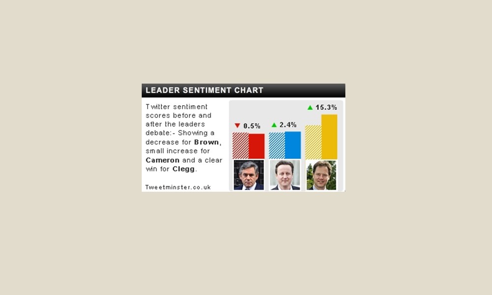
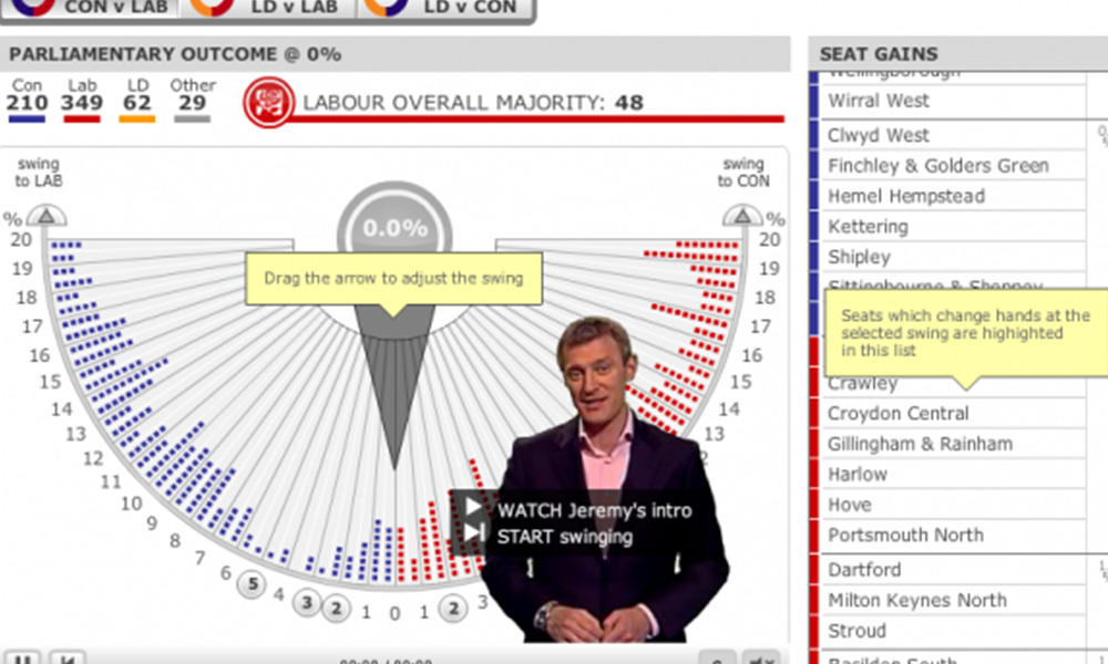
In today’s Guardian are details about some of the interactive tools that will be available for viewers who watch Thursday evening’s first prime-ministerial debate at www.itv.com/electiondebate.
Having immersed myself in the world of data visualisation through research and practice over the past 3 to 4 years, it’s emergence and continued growth is very clear for me to witness.
With yesterday’s announcement that the general election will take place on Thursday 6th May, the media has wasted no time in launching a glut of

I wrote a post in early March entitled ‘One month in…‘ which provided some observations about the site’s progress at the end of its first
Delighted that Elissa Fink, VP Marketing at Tableau Software, has taken the time to comment on my recent post ‘Tableau graph showing Gartner’s customer survey
Very disappointed in Tableau for the production of this graph on their most recent blog post. I’m a big fan of their software and their

Intersting to see in the Telegraph newspaper a report about the Top 50 University spin-out companies and, in particular, the use of sparklines. The graphs

I’m currently making a few cosmetic changes to the site, refining the header and some of the WordPress templates , developing a logo, installing a range
Fine tune Design of Nothing for Utrecht event

A few weeks ago I posted some screenshots from the O2 ‘My Account’ app for the iPhone. I suggested that the design could be much
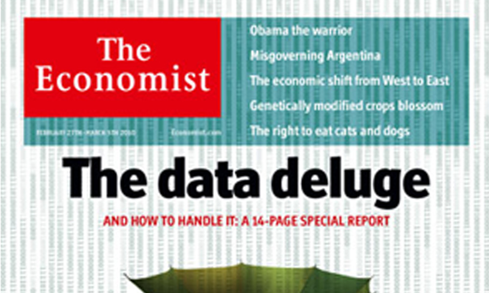
Providing some fantastic contextual information about the value of skills and services like data visualisation, the 27th February edition of The Ecomomist focuses on information

I wanted to share some general observations following the FlowingData challenge from last Friday which has provoked a large response. Readers were invited to comment on and offer makeover designs for the above 3D pyramid diagram
Good to see that the Guardian newspaper’s graphics team has one a handful of awards at the Malofiej18 graphic design competition. From the UK perspective

Wanted to share this from Smashing Magazine who have published a post compiling some of the most creative uses of plasticine in fields such as
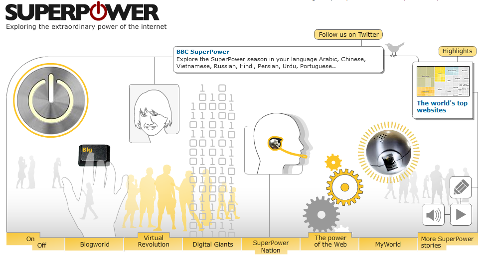
The BBC has launched its ‘Superpower’ season, broadcasting a series of interesting programmes exploring the power of the internet. The image below is taken from
