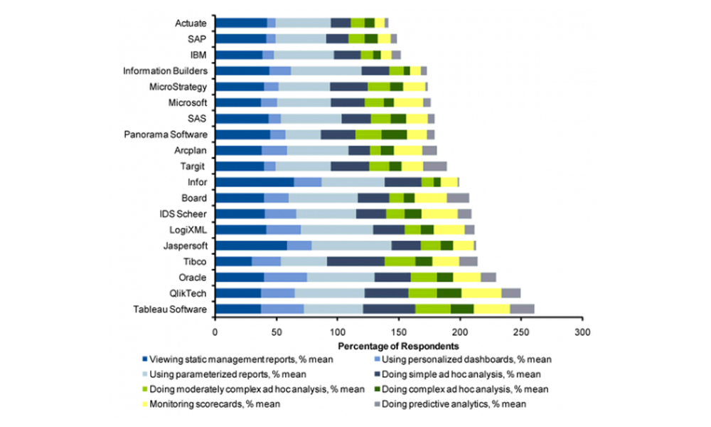
Articles

Napoleon’s Moscow march never seems to end

Well I’ve managed to hold off for 53 posts but finally I’m compelled to discuss Minard’s 1869 graph depicting Napoleon’s 1812 march on Moscow, a graph famously described by Edward Tufte as possibly being “the best statistical graphic ever drawn“. It has come up now because Andrew Arbela on The Extreme Presentation Method blog has published a […]

Napoleon’s Moscow march never seems to end Read More »

PowerPoint hysteria

There has already been a great deal of coverage across visualisation-related blogs and news sites about the reaction of General McChrystal, the leader of American and NATO forces in Afghanistan, to a slide he was was presented portraying the complexity of American military strategy. I can’t avoid the temptation to add my own contribution to

PowerPoint hysteria Read More »

The ‘Tesco’

Throughout the financial crisis broadcasters, politicians, journalists, authors, academics and other communicators have tried various techniques to try help make their message come of this complex subject as accessible and as digestable as possible. One of the key attributes of effective communication, as suggested by Dan and Chip Heath, is to make the message concrete. That

The ‘Tesco’ Read More »

Tableau graph showing Gartner’s customer survey results

Very disappointed in Tableau for the production of this graph on their most recent blog post. I’m a big fan of their software and their credible stance on principles relating to data visualisation but, on this occasion, they’ve produced something which breaks a number of their championed best practices. The graph displayed relates to the

Tableau graph showing Gartner’s customer survey results Read More »