The shared principles and motives between visualisation and other forms or channels of communication always intrigue me.
The craft of the cartoonist especially fascinates me. Their incredible ability to communicate, deliver humour, inform, tell a story and capture the essence of mood about a subject matter – often within extremely tight timescales and faced with the constraints of space, colour and form – is something we can surely learn from.
I’m sure many of your are familiar with the work of Scott McLoud and his great books offering a theoretical treatment of comics (Understanding Comics and Making Comics: Storytelling Secrets of Comics, Manga and Graphic Novels).
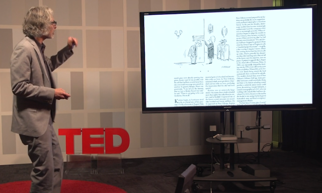
I just came across this interesting video of a TEDSalon talk by Bob Mankoff, of the New Yorker, who provides a breakdown of the anatomy of a New Yorker cartoon. Sure, it is not all relevant and directly applicable to data visualisation but there are certainly parallels.

