I’m in the midst of inviting a few folks to contribute guest posts to profile their work, ideas or knowledge. This guest post comes from Jurian Baas of Silk, who explains how you can use his tool to create and publish simple data visualisations.
It’s exciting to see how people start to recognize the importance of data visualisations. Good data journalism and visualisations help to make sense of the enormous amounts of data being made available each day. But while there is a much needed growth in visualisation tools, their learning curve is steep. Unless you are a mathematician or programmer, it’s hard to know where to begin.
We are building Silk to make it easier for everyone to get to work with collections of data. A Silk site lets you import or create datasets, and publish articles and interactive visualisations. The data and analysis’s live in one place, so your visitors can be encouraged to play around with the parameters of the visualisations. We aspire to make working with data available to everyone, just like blogging platforms like WordPress and Tumblr did for publishing.

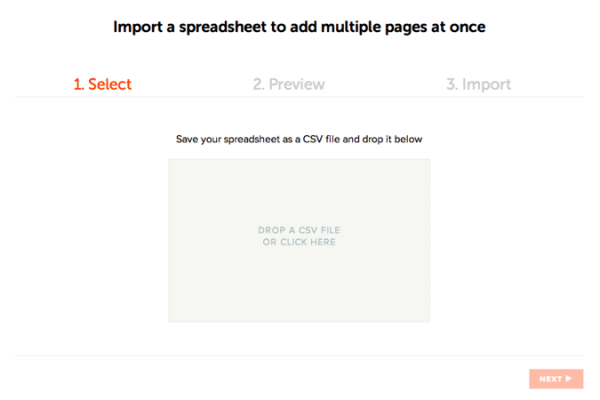
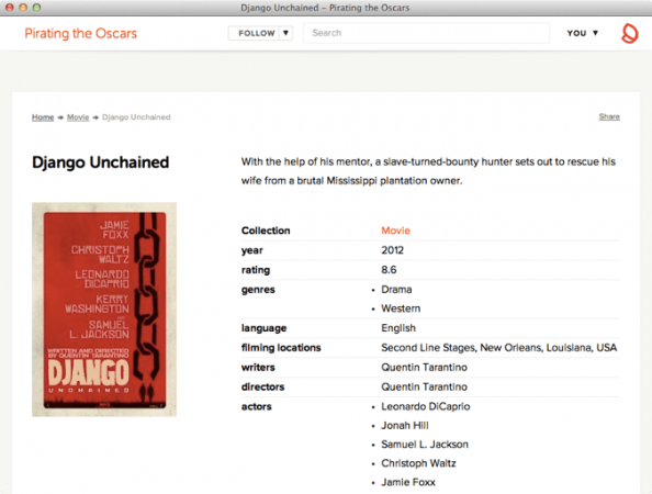
To show you how our platform works, let’s see how a Silk site gets made. I’ll use myself as an example. I’m a big movie fan, and I created a Silk site about pirated Oscar movies. I found a dataset with information about when Oscar nominated movies got leaked on piracy sites, and imported the spreadsheet into his Silk site. For each row in the spreadsheet, a page is created that holds all the information from the columns.

I used the IMDB to add actors, directors and other information to the movie pages. This makes each movie page interesting in itself.

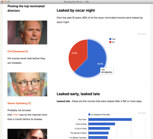
On the homepage, I placed interactive visualisations to show which movies are leaked early, and which genres are leaked the most. The graphs use the properties on the imported pages. Anyone visiting the site can hit the ‘explore’ button on each widget and play around with the data. In addition to graphs, you can also insert interactive maps if your site has location data (see The Guardian’s Silk site for an example).

That’s all there is to it! I hope some of the readers of Visualising Data find value in our platform. We are constantly trying to improve it, and welcome any kind of suggestion and commentary. You can read more about the tool here, or check out this collection of Silk sites. I’m on Twitter as @jurb.

