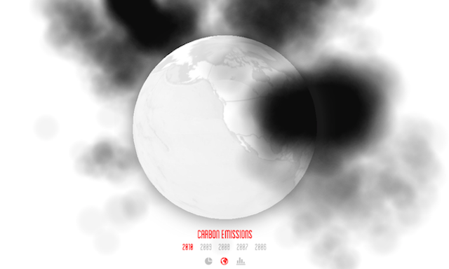
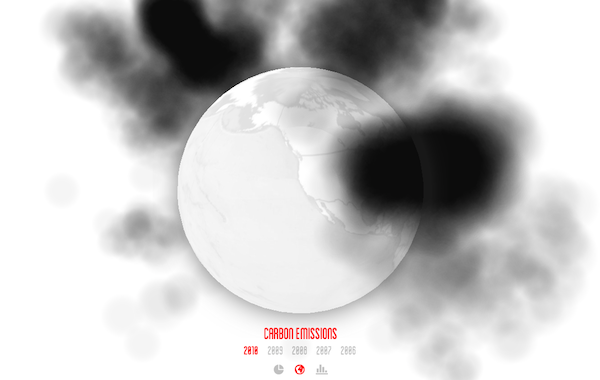
Thanks to FastCo Exist I’ve come across this interesting use of WebGL to create a 3D interactive visualisation of the world’s carbon emissions.
Designed by Robbie Tilton, the extent of each country’s carbon impact is portrayed through the simulation of a plume of black smoke, with the usual suspects such as China and US thundering huge smoggy towers into the sky. The globe is fully interactive (navigable not zoomable) and you can view across the past 5 years’ of data to see how things are changing (more than you’d expect in such a relatively short space of time).
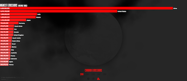
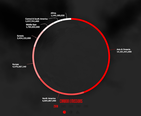
You can also view a more pragmatic bar chart view to see the comparison of countries and a slightly less effective doughnut chart to see the part-to-whole story of the continents’ contributions.
OK, maybe it doesn’t offer anything we didn’t already know in terms of the dire situation we’re facing and those that are most responsible but I do think design concepts like this, using the logical and impactive dark metaphor of sinister black choking clouds, probably have a greater chance of succeeding to reach and affect people.
Similar examples spring to mind including this Black Balloons ad, this WWF image and this Carbon Visuals project.


