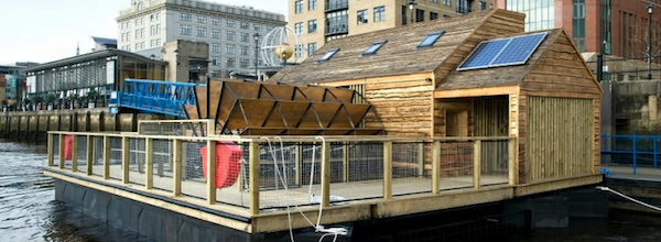
We’ve seen a number of recent developments where particle flow has been visualised in fascinating ways to depict natural phenomena such as wind, the Oceans and water. Today sees the latest example, but this time of a more abstract concept, with an exciting new project launched in a collaboration between Stephan Thiel, of Studio NAND, and Moritz Stefaner. Entitled Tyne, this project visualises data from 5 sensor values recorded by ~Flow, a tidemill floating building on the River Tyne (pictured below) in Newcastle-upon-Tyne, north east England.
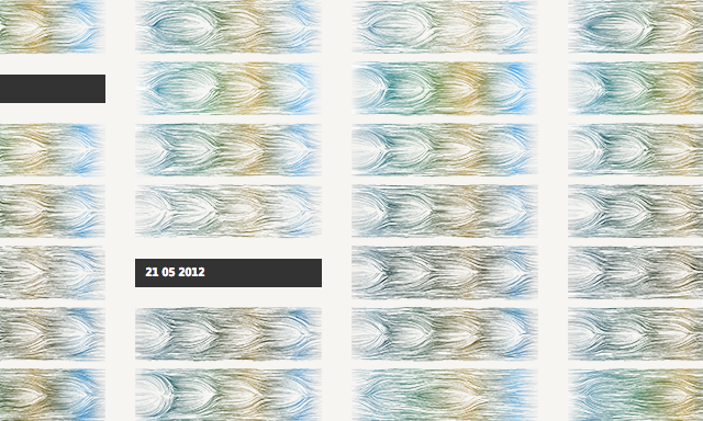
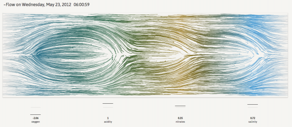
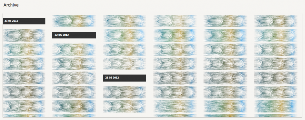
The visualisation is generated from data captured about the levels of oxygen, acidity, nitrates and salinity values in the water as well as the turning speed of the waterwheel. This data is then processed into a flow simulation which generates a unique image for every measurement, taken typically about every 30 minutes, as shown above for one measurement event and below for the archives.
The designers themselves are best placed to articulate the data representation:
Particles are continuously moving from right to left, being attracted or repelled by four circular zones representing the sensor values. The overall behavior of the particles is influenced by the turning speed of the waterwheel. If the value of one sensor is above its mean value, particles are repelled. If the value is below the mean, particles are attracted towards the center of the zone.
Below is the tidemill floating building on the River Tyne that generates its own power using a tidal waterwheel. It was initiated by Owl Project and Ed Carter in collaboration with Modular.
This is a highly technical visualisation concept so I recommend you carefully read the accompanying design and process narrative.


